Vexip UI for Vue 3 Customization and Installation
A Vue 3 UI library, highly customizability, full TypeScript, performance pretty good.
At a glance
- What is it?
- Vexip UI is a Vue 3 component library centered on TypeScript, configurable defaults, theming, internationalization, and SSR. It is most relevant to teams that need conventional Vue components with extensive control over their default props and styles.
- Who is it for?
- Adopt Vexip UI when a Vue 3 application needs typed components with centrally configurable defaults, CSS variables, dark themes, i18n, or SSR. Do not choose it solely from the component count, because the README does not provide a component catalog or detailed usage examples.
- Can I use it commercially?
- Yes. MIT is a permissive licence: you can use, modify and sell software built on it, as long as you keep its copyright and licence notices.
- Is it still maintained?
- Yes. The repository last received commits 56 days ago.
- What is it written in?
- Mainly TypeScript, according to GitHub's language statistics.
Answers come from the project's GitHub data, last synced on November 6, 2026, and from our analysis. They are not legal advice.
Star history
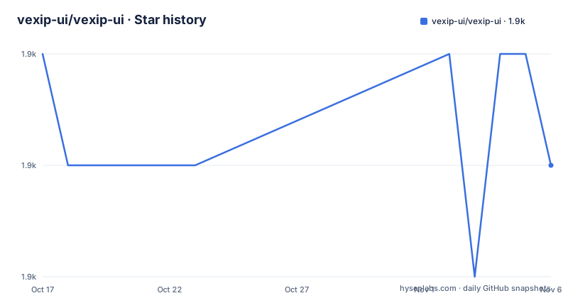
- vexip-ui/vexip-ui1,886 ★ · -1
| Repository | 2026-10-17 | 2026-11-06 |
|---|---|---|
| vexip-ui/vexip-ui | 1.9k | 1.9k |
-1 Stars in the last 20 days, measured from the daily GitHub snapshot. Compare with other projects
Editorial analysis
Vexip UI's Configuration Model for Vue Applications
Vexip UI addresses a specific problem in Vue application development: teams often need a component library that can supply ready-made controls while still allowing application-level defaults to vary. The project provides 78 components, according to the README, and describes its customization model as configurable default prop values delivered through injected configurations. That is different from a library that exposes only component-level props. The distinction matters when a design system expects buttons, form controls, or other shared components to inherit application defaults instead of repeating the same configuration in many templates.
The intended users are Vue 3 developers who want a TypeScript-oriented component library and need to alter library behavior without replacing every component. The README says the components use the Composition API and full TypeScript support. It also says the API is intended to remain intuitive and minimalistic, although the repository excerpt does not include enough examples to assess the consistency of that API across all 78 components.
Vexip UI is therefore best understood as a configurable Vue component foundation rather than a fixed visual design system. Its usefulness depends on whether injected defaults and CSS variables align with the way the consuming application organizes design tokens and shared configuration.
Composition API, Configuration Injection, and Theme Styling
The documented architecture has two layers. The first is the Vue component layer, written with the Composition API. The second is the configuration layer, where default property values can be customized through injected configurations. The README also lists CSS variable support and a built-in dark theme, so presentation is not limited to hard-coded component props.
This combination can reduce repeated application setup. A consuming project can establish shared defaults once, then let individual component props override them where a screen requires different behavior. The README does not provide a concrete configuration file or show the exact injection API, so the precise precedence rules and supported configuration shape must be checked in the online documentation before implementation.
The repository layout supports the library's broad product surface. It contains `components/`, `directives/`, `style/`, and `common/` directories, alongside `full-lib.ts`, `index.ts`, and build scripts under `package.json`. That layout suggests a library assembled from components, directives, styles, and shared utilities rather than a single application. The same layout also means adoption may involve more than installing the package. Consumers may need to account for styles, resolver behavior, icons, or other package entry points, depending on the import strategy documented for a particular build.
Installing Vexip UI and Reaching the Documentation
The README recommends pnpm or yarn and gives the following installation commands. The package is published under the name `vexip-ui`.
pnpm add vexip-uiThis installs the library into the current project. The repository identifies `[email protected]` as its package manager, but the README does not document a separate bootstrap command for consumers.
Alternatively, use yarn:
yarn add vexip-uiAfter installation, the README directs users to the online documentation for component details and usage. It does not include a first application import, Vite configuration, Nuxt configuration, or component example in the README. Consequently, there is no safe basis here for inventing the first code sample. The first practical use should be taken from the component documentation at `https://www.vexipui.com`, selecting a component used by the application, checking its required imports and styles, and then applying the application's configured defaults. The project also provides `https://play.vexipui.com/` for minimal reproductions of possible bugs, according to the README.
TypeScript, SSR, i18n, and Accessibility Constraints
Vexip UI lists full TypeScript support, SSR support, i18n, and accessibility as project features. These are relevant for application teams whose components must survive server rendering, expose predictable types, support translated interfaces, or remain usable with assistive technologies. The README also reports more than 1100 unit tests, which indicates that the project includes a substantial automated test suite, although it does not explain test coverage for individual components.
TypeScript support should not be read as a guarantee that every consumer configuration will type-check without adjustment. The README does not show the exported types, Vue version compatibility matrix, or compiler settings. Likewise, SSR support does not by itself establish that every component can run in a particular framework. Browser-only behavior, such as components that depend on client-only browser APIs, would still require verification in the target SSR environment.
Internationalization is also a capability rather than a complete adoption guide. The README does not document message keys, locale registration, translation loading, or the relationship between i18n support and application-provided dictionaries. Teams with existing localization infrastructure should check those details before committing to the library.
Vexip UI Compared with a Conventional Vue Component Suite
The real alternative is a conventional Vue 3 component suite whose controls are primarily configured through props at each call site, with theming handled through a separate theme layer or a fixed set of CSS classes. The practical difference is where shared behavior lives. Vexip UI's documented injected configuration model is designed to customize almost all default property values globally or locally, while a prop-first library can require each application component to pass values explicitly.
That difference can simplify large applications with many repeated controls, especially when defaults differ by product area. It also creates a dependency on understanding configuration precedence and the library's injection lifecycle. A conventional component suite may be easier to adopt when the application wants a stricter visual system, requires a very small dependency surface, or prefers to own all shared styling outside the component library.
The choice should not be based on the phrase “performance pretty good” in the README. The README supplies no benchmark method, workload, runtime version, bundle measurement, or comparison target. Vexip UI may be suitable for a Vue application, but the documented evidence supports evaluating its configuration model and project fit rather than accepting an unquantified performance claim.
Maintenance, Release History, and MIT Usage
The repository is not archived, and its last push was on 2026-09-13. The latest listed release is `v2.3.40` dated 2026-05-06, followed by `v2.3.39` dated 2025-10-28 and `v2.3.38` dated 2025-09-15. This release history shows that versions have continued to appear, but the README and repository facts do not define a compatibility policy or a long-term support window. Upgrades therefore need version comparison rather than an assumption that every patch is safe for every application.
The package is licensed under the MIT License. That gives the project a permissive licensing model, but the license file and package metadata should be reviewed for the exact distribution conditions and notices. The repository includes `LICENSE.md`, and `package.json` records the same MIT identifier. This is a usage note rather than legal advice.
The repository also contains extensive development infrastructure, including `vitest.config.ts`, `vitest.workspace.js`, `vite.config.ts`, `gulpfile.mjs`, and scripts for building, linting, changelog generation, and documentation. For maintainers or contributors, `CONTRIBUTING.md`, `AGENTS.md`, and `CHANGELOG.md` are the relevant files to inspect before changing code or preparing a release.
Editorial conclusion
Adopt Vexip UI when a Vue 3 application needs typed components with centrally configurable defaults, CSS variables, dark themes, i18n, or SSR. Do not choose it solely from the component count, because the README does not provide a component catalog or detailed usage examples. Verify first that the documented configuration model matches the customization work required, then confirm the current release works with the application's Vue and build setup.
Frequently asked questions
How do I install Vexip UI in a Vue 3 project?
The README recommends pnpm or yarn. Install the `vexip-ui` package with `pnpm add vexip-ui` or `yarn add vexip-ui`, then consult the online documentation for component imports and configuration.
Does Vexip UI support TypeScript and SSR?
Yes, according to the README, Vexip UI provides full TypeScript support and supports SSR. The excerpt does not document the supported Vue versions, compiler configuration, or framework-specific setup.
Can I customize Vexip UI component defaults globally?
The README states that almost all default property values can be customized through injected configurations for global or local changes. It does not include the exact configuration syntax, so the online documentation is required to implement it correctly.
Official sources
Add this badge to your README
If you maintain this project, the badge below links readers to this analysis and shows its maintenance status from the daily GitHub snapshot. Paste the markdown into your README; add ?metric=license or ?metric=stars to the image URL for a different field.

[](https://hysenlabs.com/projects/vexip-ui-vexip-ui)Star history chart for your README
[](https://hysenlabs.com/projects/vexip-ui-vexip-ui)Was this useful?