css-loader: a gallery of pure CSS loading spinners
This is a library having a collection of different types of CSS loaders, spinners
At a glance
- What is it?
- css-loader is a collection of CSS loading spinners and loaders, each built on a single HTML element with no image dependencies, published as a browsable gallery site rather than a package. It suits anyone who wants a spinner to drop into a page quickly, and it suits nobody who wants versioned dependencies.
- Who is it for?
- css-loader is a practical source of loading spinners when a page needs one now and the design can live with copied CSS rather than a managed dependency. It is the wrong tool for a product with a strict asset pipeline, a design system that forbids borrowed styles, or a requirement to pin and audit every dependency.
- Can I use it commercially?
- Yes. MIT is a permissive licence: you can use, modify and sell software built on it, as long as you keep its copyright and licence notices.
- Is it still maintained?
- Yes. The repository last received commits 132 days ago.
- What is it written in?
- Mainly CSS, according to GitHub's language statistics.
Answers come from the project's GitHub data, last synced on November 6, 2026, and from our analysis. They are not legal advice.
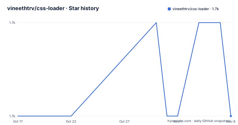
Star history
- vineethtrv/css-loader1,734 ★ · +0
| Repository | 2026-10-17 | 2026-11-06 |
|---|---|---|
| vineethtrv/css-loader | 1.7k | 1.7k |
0 Stars in the last 20 days, measured from the daily GitHub snapshot. Compare with other projects
Editorial analysis
One div per spinner and no image files
The problem css-loader addresses is a small, common one: a page needs to say that something is loading, and the team has no spinner. The usual answer is a loader or a spinner so the user knows work is happening in the background, and the project set out to collect those in one place. What makes the collection unusual is the constraint behind it. There are no image dependencies, everything is developed in pure CSS, and each loader is built on top of a single HTML tag so it is portable and easy to integrate.
The audience is a developer who wants a working animation in the next ten minutes rather than a component library to configure. The homepage at cssloaders.github.io is the product. You find a shape you like, copy the markup, copy the stylesheet, and the animation runs. Because the animation is CSS, it can be recoloured and resized by overriding rules, and it does not drag a script or a sprite sheet into the page.
The project is MIT licensed, and the repository is a single-owner project by the look of it, with the author maintaining a demo site as the way the work is presented. The last push was on 2026-06-28, and the repository has no GitHub releases at all, so the version history is effectively the commit history.
The repository is a showcase site, not a library package
The layout of the tree explains the distribution model. The root holds index.html, a vite.config.ts, a browserconfig.xml, a site.webmanifest and a public directory, and the source lives in src. The package.json names the project css-loaders at version 1.1.0, but the key field is private set to true, which means this package is not published to a registry for others to install. The scripts confirm the intent: dev runs vite, build runs tsc -b and then vite build, and deploy publishes the dist directory with gh-pages.
So the artefact is a website. The loader styles are what you copy out of it. That has two consequences. There is no semver contract to upgrade against, and there is no package entry point, no exports field and no type definitions for the loaders, because the deliverable is CSS rather than an API. The TypeScript configuration files split into app and node projects, and the dependencies pull in React and React DOM alongside react-colorful, the colour picker used by the gallery interface.
The tooling is worth a second look if you plan to fork it. Sass is a dev dependency, so styles can be authored in a preprocessor, and the lint and format setup combines eslint with a typescript-eslint parser, the react-hooks and react-refresh plugins, and prettier configured to handle js, ts, jsx, tsx, json, css and md files. The build script compiles TypeScript before Vite bundles, so a type error stops the site from building.
How a loader is put together
The markup contract is deliberately minimal. Every loader in the collection is built on a single tag, so the integration is one element with one class name:
<div class="loader"></div>That is the whole usage instruction in the project documentation. The class name is a starting point rather than a fixed contract, since a page can have several loaders and the stylesheet that defines each animation is what carries the visual result. The design intent stated in the documentation is portability: because the loader does not depend on a wrapper structure or a script, it can be dropped into any page, any framework's markup, or a server-rendered template.
The mechanics are ordinary CSS animation, which is the point of the no-image rule. Since the shapes are drawn with CSS rather than loaded as assets, there is no extra request, no sprite to cache, and nothing to decode. The trade is that the visual vocabulary is limited to what borders, backgrounds, transforms and keyframes can express. When a designer wants a bespoke loading animation that cannot be drawn that way, this collection has nothing to offer.
Colour is the other axis of customisation, and the same rule applies. The animations are recolourable through the stylesheet rather than through parameters, so the same loader can appear in a brand colour in one place and a neutral tone in another, but the work is done in your CSS, not through an API call.
Running the gallery on your machine
To browse the collection locally, clone the repository and use the dev script, which starts the Vite server:
npm install
npm run dev
The production path compiles the TypeScript project and then bundles the site:
npm run buildThat produces the dist directory, and the deploy script publishes it to GitHub Pages:
npm run deployThe predeploy script runs the build first, so npm run deploy always ships a fresh bundle. If you are only after the CSS, none of this is necessary. The stylesheets are visible in the browser dev tools or in the src directory of the repository, and copying the rule set for the loader you want is the normal way this project is used.
One warning about that workflow. The formatter script targets src with a glob covering js, ts, jsx, tsx, json, css and md, so if you fork the repository and reformat it, you will reformat the loader stylesheets as well. The project ships a .gitignore, an eslint.config.js and prettier configuration at the root, and the dev workflow expects a Node toolchain with the listed dev dependencies installed.
A colour picker in the gallery, not in the loader
One detail says a lot about where the effort went. The dependency list includes react-colorful, a colour picker component, which is not needed to display a spinner. It is there for the gallery interface, where you can pick a colour and see the loaders against it before copying one. The site is a design tool for choosing a loader, and the picker is the tool that makes the choice quick.
That framing also explains the documentation shape. The project description calls itself a library of loaders and spinners, the homepage carries the walkthrough video and the gallery, and the README is short. The content lives in the site rather than in a long manual, and the README points at the homepage for the visual reference.
The same framing sets expectations for what you get. A loader is copied as markup plus rules, with no documentation of the animation's behaviour, no note about reduced-motion preferences, and no statement about which browsers the keyframes are tested against. The repository is not archived, and the last push was on 2026-06-28, so the collection is being touched, but the project has no tagged release to point at, which means you cannot say which version of a given loader you have copied.
Where a hand-written spinner fits better
The alternative approach is to build the loader yourself, and the difference is not about animation quality but about ownership. A spinner drawn as a single inline SVG element with a CSS keyframe animation is one element, no extra request, and it lives in your repository with your design tokens and your own naming. It is roughly a dozen lines instead of a copy, and it is reviewable in a pull request like any other code.
This collection wins on variety and on time. Finding a shape that fits the visual language of a product by hand takes experimentation, and the gallery offers a catalogue of animations to choose from, with a colour picker to check them against a background. The price is that the CSS enters your project as borrowed code with no version attached to it, and the element that animates is often several pseudo-elements and transforms that nobody on the team wrote.
The decision rule is straightforward. If the loading state is a one-off in a prototype or a small internal tool, copying from the gallery is the faster path. If the spinner is part of a product with a design system and a dependency audit, writing the SVG version keeps the animation in version control and lets it inherit the same colour variables as the rest of the interface.
Editorial conclusion
css-loader is a practical source of loading spinners when a page needs one now and the design can live with copied CSS rather than a managed dependency. It is the wrong tool for a product with a strict asset pipeline, a design system that forbids borrowed styles, or a requirement to pin and audit every dependency. Verify first where the CSS itself is published, since the repository ships a private gallery package rather than a published library, and check that the loader class you copy keeps working against the browser support your users actually have.
Frequently asked questions
How do I use a loader from css-loader?
Each loader is built on a single HTML tag, so the markup is one element with the loader class, for example <div class="loader"></div>, plus the matching CSS rules copied from the project. There are no image dependencies and no JavaScript required.
Is css-loader published as an npm package?
The package.json for the gallery names the project css-loaders at version 1.1.0 with private set to true, so it is not published to a registry. The project ships a browsable site and the CSS is copied from it, and the repository has no GitHub releases.
Can I change the colour of a css-loader spinner?
Yes, since the animations are pure CSS, colours are changed by overriding the rules in your own stylesheet rather than through an API. The gallery itself ships a colour picker for previewing loaders against a chosen colour.
How do I run the css-loader gallery locally?
Install the dependencies and run the dev script, which starts Vite, with npm install and then npm run dev. The production path is npm run build, which compiles TypeScript and bundles to dist, and npm run deploy publishes that directory with gh-pages.
Official sources
Add this badge to your README
If you maintain this project, the badge below links readers to this analysis and shows its maintenance status from the daily GitHub snapshot. Paste the markdown into your README; add ?metric=license or ?metric=stars to the image URL for a different field.

[](https://hysenlabs.com/projects/vineethtrv-css-loader)Star history chart for your README
[](https://hysenlabs.com/projects/vineethtrv-css-loader)Was this useful?