Fragment Mono: Helvetica redrawn as a monospaced coding font
Helvetica Monospace Coding Font
At a glance
- What is it?
- Fragment Mono takes Nimbus Sans, the URW clone of Helvetica, and modifies it into a fixed width face with ligatures borrowed from JetBrains Mono and Fira Code, small caps and box drawing characters. It is a well made font with a quiet history, and the last tagged release was in June 2024.
- Who is it for?
- Fragment Mono suits an editor user who likes Helvetica's letterforms but wants a fixed width face with coding ligatures, small caps and the usual box drawing and Powerline glyphs, and it is a poor fit for anyone who needs a wide script coverage or an actively released font, since the last push was on 2026-04-03 and the newest tagged build is 1.21 from 2024-06-28.
- Can I use it commercially?
- Check first. The repository uses a licence we do not classify automatically, so read its LICENSE file before any commercial use.
- Is it still maintained?
- Activity is slowing. The repository last received commits 7 months ago.
- What is it written in?
- Mainly HTML, according to GitHub's language statistics.
Answers come from the project's GitHub data, last synced on November 7, 2026, and from our analysis. They are not legal advice.
Star history
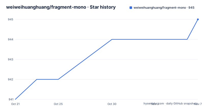
- weiweihuanghuang/fragment-mono945 ★ · +4
| Repository | 2026-10-21 | 2026-11-07 |
|---|---|---|
| weiweihuanghuang/fragment-mono | 941 | 945 |
4 Stars in the last 17 days, measured from the daily GitHub snapshot. Compare with other projects
Editorial analysis
Helvetica as the starting point, not as the final shape
Fragment Mono is a monospaced coding version of Helvetica, and the interesting part of that sentence is the version. The font was created by modifying and extending Nimbus Sans, the URW Design Studio release that serves as a metrically compatible stand in for Helvetica, and the README credits that lineage directly with a link to the urw-core35-fonts repository.
That means the letterforms are not a redrawing of Helvetica from scratch. They are a Helvetica-alike, edited until it could hold a fixed advance width. The work described in the changelog for version 1.00 is exactly that: Nimbus Sans was modified into monospaced, drawings were corrected and improved, the character set was updated, small caps were added, coding ligatures were added based on JetBrains Mono and Fira Code, and some icons and currency glyphs came along for the ride.
Two design decisions in the About section explain what the result feels like in an editor. Cap height has been reduced to 96 percent, for slightly better line fitting, which is a small number that buys real vertical space in a dense code view. Spacing has been matched to SF Mono, so the metrics sit close to what a Mac user already has in the terminal.
The design was directed by Studio Lin and commissioned by Fragment, a commercial design studio, which explains both the care and the scope. This is a typeface with a designer and a client behind it, not a hobby project that happened to be monospaced.
Ligatures from JetBrains Mono and Fira Code, and what that means
The coding ligatures are the feature most people will notice first, and their provenance is documented rather than hidden. The README states that coding ligatures have been added based on JetBrains Mono and Fira Code, and the changelog for version 1.00 repeats it. Both projects are linked in the README, and the two of them between them are the reference points most modern coding fonts are measured against.
The mechanism is the familiar one. A sequence of characters such as an arrow, a not-equal sign or a less-than followed by a greater-than is replaced by a single drawn glyph, so that a chain of operators reads as one shape rather than a run of separate symbols. The README ships rendered samples for JavaScript, Python, Ruby and PHP, which is a reasonable spread because those are the languages where such sequences are most common.
Borrowing the designs rather than inventing them has an obvious benefit and an obvious cost. The benefit is that the ligature set is already familiar to anyone who has used either source project, so muscle memory transfers. The cost is that Fragment Mono is not the origin of those drawings, and anyone who wants to change how an operator combination reads has to work within a shape that was designed elsewhere.
There is a related detail in the alternate stylistic sets. The changelog for version 1.20 records alternate i and l options in ss03 to ss06, for improved legibility, and an alternate digit one with a serif in ss07. The README shows the alternate set characters in an image. For a font with two letters that are easy to confuse in a code editor, that is a more practically useful addition than another weight.
GF Latin Plus, small caps, box drawing and Powerline
Character coverage is where a coding font either holds up or does not, and here the answer is unusually good. The README states that the character set has been extended to include up to GF Latin Plus, the glyph set Google Fonts maintains for Latin script coverage, and the version 1.00 changelog records the same update.
A specimen PDF and PNG character set image are published in the documentation directory, along with images for the alternate stylistic sets, the ligatures and the language samples. A specimen in the repository is a sign of a mature font project, because it is how a reviewer checks coverage without installing anything.
The other additions are small but specific. Box drawing characters were added in version 1.20, which is what a terminal or a TUI needs to draw frames, and Powerline glyphs were added in the same release. Small caps came in earlier, in version 1.00, along with some icons and additional currency glyphs. Circled numerals and letters arrived with 1.20 as well.
Taken together these are the pieces that separate a font that merely looks like a coding font from one that works in a terminal. Box drawing and Powerline glyphs matter for anyone who runs a tmux status bar or a dashboard in the terminal, and the alternates for i and l matter for anyone reading a diff at the end of the day.
The distribution side is straightforward. The README links the latest fonts on the releases page of the repository, and Fragment Mono is also available through Google Fonts, which means the same face is reachable by name from a large number of tools and from a web font request.
The build is gftools, a virtualenv and a stamp file
Fonts are built automatically by GitHub Actions, and the Actions tab holds the artifacts of the latest build. For anyone who wants to reproduce it, the Makefile offers three targets, and the README lists them in the same order.
make build
make test
make proof
The build target is the interesting one. The Makefile resolves its inputs by calling small Python helpers, with SOURCES and FAMILY read through scripts/read-config.py, and the build itself is a loop over every configuration file in sources/, running the gftools builder against each:
build.stamp: venv sources/config.yaml $(SOURCES)
	rm -rf fonts
	(for config in sources/config*.yaml; do . venv/bin/activate; gftools builder $$config; done)  && touch build.stamp
The stamp file pattern is doing the work of a dependency graph. The fonts directory is deleted, the builders run, and a marker file is touched. A make target that depends on build.stamp will rebuild only when the sources, the configuration or the requirements change, which is the difference between a two minute rebuild and a two second one.
The environment is a virtualenv created on demand and populated from requirements.txt, which is itself generated. The header of that file records that it is autogenerated by pip-compile with Python 3.14, and the pinned packages underneath it read like a font pipeline manifest: gftools, fontbakery, afdko, ufo2ft, fonttools, defcon, diffenator2, bumpfontversion and bump2version, among many others.
There is also a customize target that runs scripts/customize.py, which is where a per-family customisation step would live, and the repository layout keeps sources, fonts, out and documentation as separate directories, matching the Unified Font Repository structure the README says it follows, modified for the Google Fonts workflow.
make test runs fontspector, not the FontBakery suite the README names
Here the documentation and the Makefile disagree, and the Makefile is what runs.
The README says that make test will run FontBakery's quality assurance tests. The Makefile's test target does something different. It first checks that fontspector is on the path, and if it is not, it stops with an instruction to install it, then it runs the tool with the googlefonts profile, a warn level, full lists, and a set of output switches that write an HTML report, a markdown report and badges.
which fontspector || (echo "fontspector not found. Please install it with 'cargo install fontspector'." && exit 1)The tool is a Rust program, which is why the Dockerfile in the repository installs a Rust toolchain through rustup. The test target also hunts for the built fonts in fonts/variable first and falls back to fonts/ttf, so it works with either output shape.
FontBakery is not absent from the project, though. It is a pinned dependency in the requirements file, and the README carries four badges that point at a hosted report on the project pages, covering the Fontbakery report, the Universal profile, the Google Fonts profile and Shaping checks, with an Outline Correctness badge linked in the badge definitions. The proof files and QA results are published at the project's GitHub Pages site as well.
So the picture is that the automated pipeline runs one tool on a pull request and publishes reports for several, and that a contributor following the README will install FontBakery expectations and then discover fontspector instead. The cost of that confusion is one failed command, not a wrong result, but it is the kind of thing worth knowing before you start.
The make proof target generates HTML proof documents in the proof directory, and the Makefile help text also lists a make images target for PNG specimen images in the documentation directory.
The container for a font build is a node, cairo and rust image
The Dockerfile in the repository is short, and it is the clearest statement of what a font build needs in 2024 terms.
It starts from python:3.12-bookworm and installs the usual font toolchain dependencies: make, git and curl, then the development headers for cairo, gobject introspection, freetype, libffi, libxml2 and libxslt, and finally nodejs and npm. It then installs Rust through the standard rustup shell script and puts the cargo bin directory on the PATH.
FROM python:3.12-bookworm

RUN apt-get update && apt-get install -y \
    make \
    git \
    curl \
    pkg-config \
    libcairo2-dev \
    libgirepository1.0-dev \
    libfreetype-dev \
    libffi-dev \
    libxml2-dev \
    libxslt1-dev \
    nodejs \
    npm \
    && rm -rf /var/lib/apt/lists/*
The node install is not decorative. The gftools family draws proof images and specimens with a browser engine, which is what drawbot and blackrenderer are for, and blackrenderer in the requirements file carries a skia extra to do exactly that. The cairo and freetype headers serve the same purpose from the other direction, for the raster work.
The container ends with a plain bash entry point rather than a build command, which makes it a developer sandbox rather than a one shot image. The work is copied into /app, so the intended flow is to enter the container and run the Makefile targets yourself.
Two smaller details are visible in the repository root. There is an AUTHORS.txt and a CONTRIBUTRIBUTORS.txt, which is the convention in the Google Fonts family of repositories, and a renovate.json, so the pinned Python dependencies are kept current automatically by a bot rather than by hand.
OFL-1.1 licensing and a release history that stopped in 2024
The licence field on the repository says OFL-1.1, and the README states it in full: this font software is licensed under the SIL Open Font License, Version 1.1, with the text in OFL.txt at the repository root. The Open Font License is the standard for fonts intended for broad reuse. It permits embedding in documents and applications, including commercial ones, and it requires that the font not be sold on its own and that any derivative keep the same licence. For an editor user this is a non-issue, and for a team shipping a product with a UI font it is the licence most font choices are made under.
The maintenance picture needs stating precisely, because the two signals point in different directions. The repository is not archived and the last push was on 2026-04-03, so the working tree is not frozen. The release history, though, stops earlier. The listed versions are 1.21 on 2024-06-28, 1.20 on the same day, and 1.012 from 2024-03-04, and the changelog's most recent entry is the 28 June 2024 release of version 1.20.
That two-releases-on-one-day pattern is common in font projects, where a version bump and a re-release land together, and it also means the 1.21 and 1.20 tags are close together in content. What is harder to explain is the gap between a 2024 release line and a 2026 push, and the README does not explain it. There is no statement about a planned release, no roadmap and no changelog entry after June 2024.
The practical read is that the font is finished and stable rather than abandoned, with the build pipeline still being maintained in the repository. The homepage of the project pages, at weiweihuanghuang.github.io/fragment-mono, publishes the proof files and QA reports, and that is where a current build can be checked.
Fragment Mono against the fonts it borrows from
The honest comparison here is with JetBrains Mono and Fira Code, because Fragment Mono takes its ligature designs from both of them while offering a different underlying typeface.
The difference in approach is the letterforms. JetBrains Mono and Fira Code are original designs with wide script coverage, built as complete font families with many weights and a maintained release cadence. Fragment Mono is a Helvetica derivative. If you want the specific shapes of Helvetica in a fixed width face, with the alternates for i and l that a Helvetica-alike needs, and with spacing that matches SF Mono, then the sources of its ligatures cannot give you that, because they are not Helvetica.
The trade is direct. Fragment Mono gives you a particular aesthetic and a compact, deliberate glyph set. The other two give you a broader language coverage, more weights to choose from, and a font that is still being released. Both JetBrains Mono and Fira Code also support ligatures you can configure per editor, and both are distributed on Google Fonts as well, so a team standardising on one face for everyone is easier with a project that has a maintained release line.
A third option is to not use a coding ligature font at all. An editor with a well tuned font stack and no ligatures can be more readable for some people, and the alternate stylistic set characters that Fragment Mono added for i and l point at the same conclusion from the other direction: legibility in a code editor is won and lost on individual glyph shapes, not on the number of ligatures.
The choice is about which face you want to read all day.
Editorial conclusion
Fragment Mono suits an editor user who likes Helvetica's letterforms but wants a fixed width face with coding ligatures, small caps and the usual box drawing and Powerline glyphs, and it is a poor fit for anyone who needs a wide script coverage or an actively released font, since the last push was on 2026-04-03 and the newest tagged build is 1.21 from 2024-06-28. Verify two things before adopting it: that the ligature set does not collide with the ones your editor or theme already enables, and that the build pipeline in this repository is something you want to run yourself, because the Dockerfile installs Node, cairo development headers and a Rust toolchain to produce the binaries. If your priority is a font with an upstream that ships regular releases, JetBrains Mono or Fira Code are the safer bet, since Fragment Mono's ligatures come from both of them anyway.
Frequently asked questions
What is Fragment Mono and what is it based on?
Fragment Mono is a monospaced coding version of Helvetica, created by modifying and extending Nimbus Sans by URW Design Studio. It was designed with direction by Studio Lin and commissioned by Fragment, and its coding ligatures are based on JetBrains Mono and Fira Code.
How do I install Fragment Mono in my editor?
The README links the latest fonts on the repository releases page, and Fragment Mono is also published on Google Fonts, so it can be installed from the system font catalogue or requested as a web font. The release files are the ones to take, since the listed versions 1.21 and 1.20 both date from 2024-06-28.
How do I build Fragment Mono from source?
The Makefile provides make build to produce the font files, make test to run the QA checks and make proof to generate the HTML proof files, and the README notes that fonts are built automatically by GitHub Actions. The build uses gftools inside a virtualenv populated from requirements.txt.
Which tool does make test actually run?
The Makefile test target runs fontspector with the googlefonts profile and requires it to be installed, telling you to use cargo install fontspector if it is missing. The README describes make test as running FontBakery tests, and FontBakery is a pinned dependency, so the two documents describe different tools.
What licence is Fragment Mono released under?
The licence field says OFL-1.1, and the README states that the font software is licensed under the SIL Open Font License, Version 1.1, with the text in the OFL.txt file at the repository root.
Is Fragment Mono still being updated?
The repository is not archived and the last push was on 2026-04-03. The newest tagged versions are 1.21 and 1.20, both from 2024-06-28, and the most recent changelog entry is dated 28 June 2024, so the release line has not moved since then.
Official sources
Add this badge to your README
If you maintain this project, the badge below links readers to this analysis and shows its maintenance status from the daily GitHub snapshot. Paste the markdown into your README; add ?metric=license or ?metric=stars to the image URL for a different field.

[](https://hysenlabs.com/projects/weiweihuanghuang-fragment-mono)Star history chart for your README
[](https://hysenlabs.com/projects/weiweihuanghuang-fragment-mono)Was this useful?