Better Auth UI ships auth screens for React and Solid, three ways
Beautiful UI components built for Better Auth.
At a glance
- What is it?
- Better Auth UI provides sign-in, sign-up and account settings components built on Better Auth, delivered either as source you copy through the shadcn/ui registry or as installed packages. The choice between the copy route and the package route is the real decision.
- Who is it for?
- Better Auth UI fits a team that already runs Better Auth and wants authentication screens this week rather than a bespoke sign-in flow built from primitives, and the shadcn/ui route is the one to try first because the copied source stays under your control. It does not fit a project not yet on Better Auth, since every flow assumes that backend, or a team that wants a dependency-light bundle, since the package route pulls in a query layer alongside the components.
- Can I use it commercially?
- Yes. MIT is a permissive licence: you can use, modify and sell software built on it, as long as you keep its copyright and licence notices.
- Is it still maintained?
- Yes. The repository last received commits 1 day ago.
- What is it written in?
- Mainly TypeScript, according to GitHub's language statistics.
Answers come from the project's GitHub data, last synced on November 7, 2026, and from our analysis. They are not legal advice.
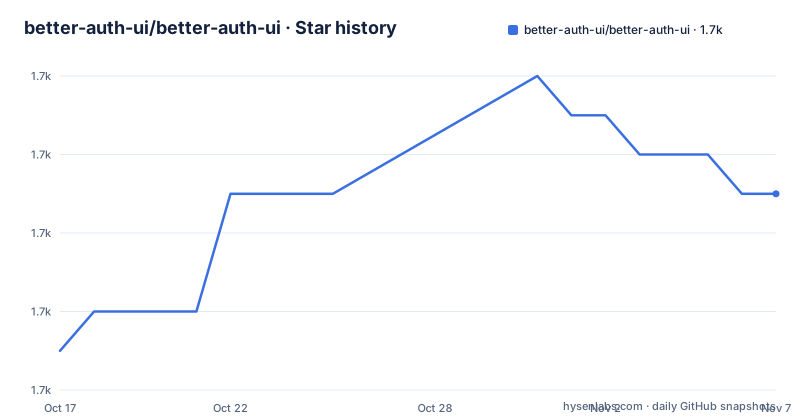
Star history
- better-auth-ui/better-auth-ui1,729 ★ · +4
| Repository | 2026-10-17 | 2026-11-07 |
|---|---|---|
| better-auth-ui/better-auth-ui | 1.7k | 1.7k |
4 Stars in the last 21 days, measured from the daily GitHub snapshot. Compare with other projects
Editorial analysis
Copy the source or install the package, and the choice propagates
Better Auth UI offers four delivery routes, and the README frames the difference as a choice of UI rather than a choice of packaging. In practice packaging is the difference.
The shadcn/ui route gives you React components that you copy into your project. The command is a registry add through the shadcn CLI:
bunx --bun shadcn@latest add @better-auth-ui/authWhat lands in your repository is source. From that point the form is yours: you edit the JSX, restyle it, and no runtime dependency on the component library remains for those files.
The HeroUI route is the opposite. It installs a package, and the README is explicit that this gives packaged React components built with HeroUI v3:
bun add @better-auth-ui/heroui@latest @better-auth-ui/react@latest @better-auth-ui/core@latestThe styles then have to be imported into your global CSS file:
@import "@better-auth-ui/heroui/styles";Zaidan Solid is a third shape, and it mixes both. The data layer is installed as a package while the components come from a registry:
bun add @better-auth-ui/solid @tanstack/solid-query better-auth solid-js
bunx --bun shadcn@latest add https://better-auth-ui.com/r/solid/auth.json
That hybrid is not an accident. The data layer is where the churn is, and the components are where the styling is. Better Auth UI keeps them separable so a team can upgrade the logic without rewriting its markup.
The package split follows the framework, not the feature
The package reference in the README divides the library along framework and layer, which tells you something about how it is meant to be consumed.
`@better-auth-ui/core` holds shared query options, server helpers, types and framework-independent utilities. `@better-auth-ui/react` adds React providers, hooks, queries, mutations and plugin APIs. `@better-auth-ui/solid` is the same shape for Solid. `@better-auth-ui/heroui` is the ready-made component set. `@better-auth-ui/locales` carries locale bundles, language matching helpers and the localization skill.
The architecture implied by that split is a data layer and a view layer, and it is why the components can be copied out. The hooks and queries do not depend on how a button looks. If you take the shadcn/ui source, you still need `@better-auth-ui/react` or the core package underneath, because the copied components call into those hooks.
The feature list is where the coverage becomes clear. The README lists sign-in, sign-up, email verification and password recovery flows, plus user profiles, account settings, session management and security controls. On top of that sit integrations for Better Auth plugins: organizations, passkeys, two-factor authentication, magic links and API keys.
That plugin list is the reason to look at this project at all rather than hand-rolling a form. Each of those flows has more state than a sign-in form: a passkey prompt, a TOTP enrolment, a magic link round trip. Writing them once per project is the cost this library removes.
Ordering matters: configure Better Auth before adding any UI
The quick start section leads with an instruction rather than a command: install Better Auth, then configure it for your application, then add a UI package. That sequence is not pedantry. The components call Better Auth endpoints, so without a configured server the rendered form has nothing to talk to.
After that, each route points at its own setup document. The shadcn quick start covers framework setup and optional components. The HeroUI quick start covers provider and framework setup. The Zaidan Solid quick start covers TanStack Start setup, which matters because the Solid data layer depends on `@tanstack/solid-query` and that dependency is installed alongside the package rather than assumed.
A detail worth noting about the Solid route: the registry URL is a full HTTPS address rather than a registry identifier. The shadcn route uses the short form `add @better-auth-ui/auth`, while the Solid route fetches `https://better-auth-ui.com/r/solid/auth.json` over the network. If you are working offline or in an environment that blocks outbound requests to that host, that second command fails where the first would not.
The repository ships seven example projects, which is the fastest way to see which route matches your stack: `examples/expo-example`, `examples/next-heroui-example`, `examples/next-shadcn-example`, `examples/start-heroui-example`, `examples/start-shadcn-baseui-example`, `examples/start-shadcn-example` and `examples/start-solid-zaidan-example`. Note that TanStack Start, Next, Expo and a BaseUI variant all appear, so the surface is wider than the three README routes alone suggest.
Copied source and packaged components carry different upgrade costs
This is the trade-off the README does not spell out, and it is the one that decides adoption.
Copied source has no upgrade path. Once `bunx --bun shadcn@latest add @better-auth-ui/auth` writes the files into your repository, they are yours. When Better Auth changes a plugin's API and the project updates its components, your copies do not move. You get the fix by diffing their current output against your version and deciding what to take. For an auth flow that rarely changes shape, that is an acceptable deal. For a project that turns on two-factor and passkeys in the same quarter, it becomes a recurring merge.
Packaged components have the opposite profile. A version bump arrives through your package manager, and you get the fixes without touching your own files. The cost is a runtime dependency you do not control, plus a stylesheet import that has to sit in your global CSS, plus a provider setup described only in the online quick start.
Neither side is free. The README gives no version compatibility matrix between a given `@better-auth-ui/react` release and a given Better Auth release, nor a documented policy for how long a copied component is expected to stay current.
For what it is worth on maintenance, the repository is not archived and the last push was on 2026-10-11, matching release v1.7.30. The two releases before it, v1.7.29 and v1.7.28, landed on 2026-10-11 and 2026-10-10. Work is frequent, and frequent means copied source drifts.
Server helpers and email templates sit behind the same library
The feature list includes server-rendering helpers and customizable email templates, which is the part that is less obvious from the component framing.
Email verification and password recovery are the two flows that fail without server work. A recovery email has to be rendered, sent and its token consumed. If each project writes that itself, every project ends up with a slightly different token handling, a slightly different expiry, and a slightly different page. Customizable templates mean the layout is yours while the plumbing is shared.
`@better-auth-ui/core` is where that lives, together with the shared query options and the framework-independent utilities. That is the package to reach for if you are building a custom interface rather than copying the provided screens: the React and Solid references are documented for the lower-level APIs.
Localization is handled by `@better-auth-ui/locales`, which bundles locales and provides language matching helpers. The README frames these as skills as well, covering React with shadcn, Solid with Zaidan, HeroUI, the core data APIs and localization.
One caution. The README gives no list of which Better Auth plugins are covered by which components, so treat the plugin list as a direction to check rather than a confirmed inventory. Whether two-factor and API key screens exist for the Solid route in the version you install is something you verify in the docs, not something this repository states.
Agent skills, the monorepo, and who maintains what
Better Auth UI publishes agent skills through TanStack Intent and skills.sh, and installs them the same way as any other package:
bunx skills@latest add better-auth-ui/better-auth-ui --full-depth --skill better-auth-ui-reactThe skill name selects the application. TanStack Intent loads the same skills from installed npm packages, so an agent working in a project that depends on the packages finds the guidance without a separate install step.
The repository itself is a Bun and Nx monorepo with workspaces covering apps, packages and examples. The workspace scripts are Nx fan-out commands, so `bun run build` runs a build target across projects and `bun run test` does the same for tests. Storybook is scoped to three example projects rather than the whole workspace, and `registry:build` is scoped to the shadcn and Zaidan examples because those are the ones that publish registry output.
Development tooling in the root package.json is worth a glance for anyone tracking how the library keeps pace: Nx 23.1.2, oxfmt for formatting, oxlint for linting, Playwright for browser tests, lefthook for git hooks and renovate for dependency updates. Renovate in particular suggests dependency bumps arrive without a human filing a pull request, which is consistent with the release cadence.
Licensing is MIT for the whole library, which permits use inside proprietary applications and modification. It says nothing about the auth flows themselves, and
Editorial conclusion
Better Auth UI fits a team that already runs Better Auth and wants authentication screens this week rather than a bespoke sign-in flow built from primitives, and the shadcn/ui route is the one to try first because the copied source stays under your control. It does not fit a project not yet on Better Auth, since every flow assumes that backend, or a team that wants a dependency-light bundle, since the package route pulls in a query layer alongside the components. Verify first by adding @better-auth-ui/auth to a throwaway project and reading the copied sign-in and password-recovery files, because MIT licensing covers the code and not the maintenance schedule of a repository that shipped v1.7.28, v1.7.29 and v1.7.30 on consecutive days.
Frequently asked questions
How do I install Better Auth UI with shadcn/ui?
Install and configure Better Auth first, then run bunx --bun shadcn@latest add @better-auth-ui/auth in an existing shadcn/ui project. The components are copied into your repository as source rather than installed as a dependency.
What is the difference between the shadcn/ui and HeroUI options in Better Auth UI?
The shadcn/ui route gives you React components that you copy into your project, while the HeroUI route installs packaged components built with HeroUI v3 together with its styles, which you import into your global CSS file.
Which Better Auth plugins does Better Auth UI cover?
The README lists integrations for organizations, passkeys, two-factor authentication, magic links and API keys, alongside sign-in, sign-up, email verification, password recovery, user profiles, account settings, session management and security controls.
What packages does Better Auth UI publish?
Five: @better-auth-ui/core for shared query options, server helpers and types, @better-auth-ui/react and @better-auth-ui/solid for providers, hooks, queries and mutations, @better-auth-ui/heroui for HeroUI components, and @better-auth-ui/locales for locale bundles and language matching.
What license is Better Auth UI released under?
The README and the root package.json both state MIT, with the LICENSE file in the repository root. The same licence applies to the components whether you copy them or install them as packages.
Official sources
Add this badge to your README
If you maintain this project, the badge below links readers to this analysis and shows its maintenance status from the daily GitHub snapshot. Paste the markdown into your README; add ?metric=license or ?metric=stars to the image URL for a different field.

[](https://hysenlabs.com/projects/better-auth-ui-better-auth-ui)Star history chart for your README
[](https://hysenlabs.com/projects/better-auth-ui-better-auth-ui)Was this useful?