Solid Glass: one stylesheet that restyles shadcn/ui through data-slot, plus components for agent interfaces
A design system for AI applications. Material, physical, tactile, technical.
At a glance
- What is it?
- Solid Glass is a design system for AI applications, delivered as a single CSS file for shadcn/ui projects and a handful of agent-oriented components. This piece covers how the stylesheet attaches, what the install steps change, the components it adds and where its scope stops.
- Who is it for?
- Adopt Solid Glass if you already run shadcn/ui on React 19, Tailwind CSS 4 and the Base UI components, and you are building an agent or chat interface where status, steps and diffs need their own components. Pass if your project uses another component library or an older Tailwind, since the stylesheet depends on shadcn/ui's data-slot attributes.
- Can I use it commercially?
- Yes. MIT is a permissive licence: you can use, modify and sell software built on it, as long as you keep its copyright and licence notices.
- Is it still maintained?
- Yes. The repository last received commits 7 days ago.
- What is it written in?
- Mainly TypeScript, according to GitHub's language statistics.
Answers come from the project's GitHub data, last synced on November 7, 2026, and from our analysis. They are not legal advice.
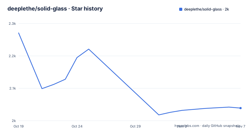
Star history
- deeplethe/solid-glass2,039 ★ · -232
| Repository | 2026-10-19 | 2026-11-07 |
|---|---|---|
| deeplethe/solid-glass | 2.3k | 2k |
-232 Stars in the last 19 days, measured from the daily GitHub snapshot. Compare with other projects
Editorial analysis
The stylesheet finds shadcn/ui parts by data-slot, so your components stay untouched
Solid Glass is one stylesheet. It locates each part of a shadcn/ui component by the data-slot attribute and the classes the component already carries, so the components you have need no changes. There is no wrapper component, no provider and no fork of shadcn/ui to maintain.
The design target is a glass look that stays legible. The README places it between flat design and liquid glass. Flat is an opaque block with no finish. Liquid glass is nearly clear, which on a text-heavy page means the reader is fighting the background for the words. Solid Glass lets only an outline through, enough to read as glass without getting in the way. Depth comes from edge highlights, fine borders and soft shadows.
The cost of attaching by selector is coupling. If shadcn/ui changes the data-slot names or class structure in a future component revision, the stylesheet has to follow. It also means the system is for shadcn/ui users only.
Installing means deleting the colour variables shadcn init just wrote
The starting point is a shadcn/ui project with React 19, Tailwind CSS 4 and the Base UI components:
npx shadcn@latest initThe stylesheet is added straight from the repository:
npx shadcn@latest add deeplethe/solid-glass/solid-glassThen the order of imports matters. Solid Glass goes after Tailwind and shadcn's own stylesheet:
@import "tailwindcss";
@import "tw-animate-css";
@import "shadcn/tailwind.css";
@import "./solid-glass.css";
You must also delete the :root and .dark colour variables that shadcn init wrote, because Solid Glass defines the same names. Leave them in and you have two definitions of one variable, with the result decided by cascade order. The README says dark is the theme as designed and light is available too. The installation page on the project site covers the remaining steps.
status-glyph and the agent components target streaming, tool-using interfaces
The stated reason for the system is that AI applications are built around changing information: responses streaming in, agents performing tasks and decisions waiting for human input. The visual answer is neutral surfaces, depth for hierarchy, and colour and motion reserved for meaningful feedback.
Solid Glass's own components install the same way as the stylesheet, for example:
npx shadcn@latest add deeplethe/solid-glass/status-glyphstatus-glyph is three points of light that say a turn is going, and what it is doing. panel, tag and dot-loader are the thinnest pane, a small label and a row of waiting dots. The larger group is turn-status, composer, tool-steps, diff-view, ask-card, context-ring, task-notice and reasoning. In the README's words, these are a status line for an agent, the box you write to it in, the steps it took, a diff, a question it asks, how full its context is, a notice from a task, and its thinking.
None of these ship a model client. They are presentation components, so wiring them to a streaming API is your work.
Three thicknesses of glass and one state make up the theme
The theme lives in src/solid-glass.css, described as the whole theme in one file: colours, the three thicknesses of glass, the one state, and motion. It defines shadcn/ui's own variable names, which is why the earlier deletion step exists.
The Create page lets you turn the dials. The options are thickness, tint, chart colour, type, radius, rim and blur, with a live preview and the few lines of CSS that result. The file options.ts says what each choice does to the stylesheet variables. That means the control surface is a set of CSS custom properties, not a JavaScript theme object, and customising means editing variables.
The README's style table names four qualities: Tactility, Precision, Physicality and Materiality. Those are design intents, and the checkable pieces are the three thicknesses, the single state and the dials listed above.
The package.json lists many @fontsource-variable packages, among them Inter, Geist, DM Sans, Lora and Playfair Display, which is what the type dial draws from.
The repository is the documentation site, registry and component source at once
The README's path table shows the layout. registry.json is what shadcn add installs from, written by scripts/build-registry.mjs, which also builds public/r/ for the site. src/components/ui/ holds both shadcn/ui's components (Base UI, base-nova) and Solid Glass's own. A few shadcn/ui components differ from stock in small ways: button, input, tabs, dialog, dropdown-menu, sheet, sidebar and some form controls. The README says the stylesheet does not depend on those differences.
Blocks are whole screens made of the components. Single files at the top of src/blocks/, such as agent-workspace, are Solid Glass's own and are in its registry. The folders are shadcn/ui's blocks restyled in the theme. scripts/build-docs.mjs turns content/ into src/docs/generated.json for the site.
To run it locally you use npm install, then npm run dev on http://localhost:5191. The dev script runs the docs and registry builds before vite, so a docs error stops the dev server.
Nothing is versioned: no releases, a private package at 0.1.0
The repository has no GitHub releases. package.json says version 0.1.0 and "private": true, so there is no npm package either. You install through the shadcn registry from the main branch, and a later add can pull different CSS than the one you installed first.
That suits a design system you copy into your own project, since shadcn's model is that the files become yours. It is a poor fit if you need to know exactly which version of the material you are running. Copy the stylesheet and record the commit.
The last push was on 2026-10-22 and the repository is not archived. The license is MIT, with a NOTICE.md in the root. Contributing, security and code-of-conduct documents exist in English and Chinese (the zh-CN files), which is useful if your team reads Chinese. The scope is also bounded: components cover agent interfaces, but the README lists no tables, forms for data entry beyond shadcn's own, or charts beyond a chart-colour dial.
Editorial conclusion
Adopt Solid Glass if you already run shadcn/ui on React 19, Tailwind CSS 4 and the Base UI components, and you are building an agent or chat interface where status, steps and diffs need their own components. Pass if your project uses another component library or an older Tailwind, since the stylesheet depends on shadcn/ui's data-slot attributes. Before installing, remember that it asks you to delete the :root and .dark colour variables shadcn init wrote, so commit first.
Frequently asked questions
What is Solid Glass?
Solid Glass is a design system for AI applications with a glass-inspired look that favours solidity and readability over transparency. It ships as one CSS file for shadcn/ui plus components like status-glyph and composer.
How to install Solid Glass?
In a shadcn/ui project, run npx shadcn@latest add deeplethe/solid-glass/solid-glass. Import the stylesheet after Tailwind and shadcn's CSS, and delete the :root and .dark colour variables that shadcn init wrote.
What are the three types of glass in Solid Glass?
The README mentions the three thicknesses of glass defined in solid-glass.css. It names the thinnest pane as the panel component but does not list the other two by name.
Official sources
Add this badge to your README
If you maintain this project, the badge below links readers to this analysis and shows its maintenance status from the daily GitHub snapshot. Paste the markdown into your README; add ?metric=license or ?metric=stars to the image URL for a different field.

[](https://hysenlabs.com/projects/deeplethe-solid-glass)Star history chart for your README
[](https://hysenlabs.com/projects/deeplethe-solid-glass)Was this useful?