google-type is a gallery of typographic exercises built from Aesop's Fables
Collaborative typography project using select passages from Aesop's Fables set to Google Fonts
At a glance
- What is it?
- google-type is a collaborative typography project where each page sets a passage from Aesop's Fables in at least two Google Fonts. It is a portfolio of composition exercises and a reference for learning typography, and the rules for contributing are stricter than the file listing suggests.
- Who is it for?
- Adopt google-type as a learning reference if you are trying to understand how typefaces are combined and scaled on a page, since every example is constrained to well known text and a restricted font set, which removes most of the variables that make typography hard to study. Do not adopt it as a production asset library, because it is a gallery of exercises with no documented build or deployment process beyond a static page.
- Can I use it commercially?
- Yes. MIT is a permissive licence: you can use, modify and sell software built on it, as long as you keep its copyright and licence notices.
- Is it still maintained?
- Yes. The repository last received commits 158 days ago.
- What is it written in?
- Mainly CSS, according to GitHub's language statistics.
Answers come from the project's GitHub data, last synced on November 7, 2026, and from our analysis. They are not legal advice.
Star history
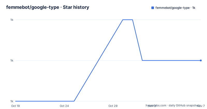
- femmebot/google-type1,023 ★ · +1
| Repository | 2026-10-19 | 2026-11-07 |
|---|---|---|
| femmebot/google-type | 1k | 1k |
1 Stars in the last 19 days, measured from the daily GitHub snapshot. Compare with other projects
Editorial analysis
A gallery of composition exercises, not a font project
google-type is a collaborative typography project, and the subtitle in the repository header describes it exactly. Hand-picked tales from Aesop's Fables with hand-picked type from Google Fonts.
The pairing is the idea. A fable is short, public domain, and old enough that nobody associates it with a particular typeface, so the only variable in the page is the typography. The font is the subject, and the text is a neutral carrier that every reader can read easily and nobody has an opinion about.
The project describes itself as being used by many people as an ongoing reference tool to learn about typography, and it says thousands have visited. The stated standard for submissions is the one that matters: a good foundation in typography, with the primary goal to communicate, not decorate.
That sentence is the design brief for the whole repository, and it is worth reading as a constraint rather than as a slogan. It rules out the page that would look impressive in a screenshot and read badly, which is the failure mode of most type specimens on the web.
The three rules a pull request is judged against
The contribution section lists the requirements, and there are exactly three of them plus a quality bar.
The first rule is that a submission must use at least two typefaces from Google Fonts. Not one, and not three to show off, but two, which is the minimum that makes the exercise about combining type rather than about setting a single font well.
The second rule is that a submission must use at least one of the tales from Aesop's Fables, with the link pointing at the Project Gutenberg edition, ebook number 11339. The Gutenberg constraint also settles the licensing question for the text itself, which is a practical detail that many similar projects forget and then have to unpick in a licensing audit.
The third rule covers artwork. When including third-party images and similar artwork, the requirement is that they must be public domain, and the readme points at a resource for stock images that do not suck. This is the rule most likely to be missed, because adding an image to a typography page feels like decoration, and decoration is exactly what the project is trying to avoid.
The fourth requirement is not a rule so much as a standard. A submission must demonstrate a good foundation in typography, and the readme points at Ellen Lupton's Skillshare class for a quick lesson, at practicaltypography.com for a deeper dig, and at the typography.com techniques pages for advice on combining typefaces. Naming the references is the project telling you where the bar is, since composition quality is not something a reviewer can check mechanically.
What the repository actually contains
The top level listing is short, and it describes a static site rather than an application.
There is an index.html at the root, a css/ directory, an images/ directory, a scripts/ directory, a .vscode/ directory and a .github/ directory. There is no package.json, no build configuration and no dependency manifest, which tells you the page is hand-written HTML with a stylesheet beside it rather than something assembled by a toolchain.
The primary language recorded for the repository is CSS, with HTML and JavaScript alongside, and the topic tags list css, font, google-fonts, html, responsive, typeface and typography. The responsive tag is a hint about the intent, since a typography gallery that only works at one width cannot be used as a reference on a phone or a projector.
The images directory holds the animated gifs you see in the readme, a cover image and a sample, which are screen recordings of the pages rather than static screenshots. That choice is a small design decision with a meaning: it shows the pages as they behave, including any motion, and motion is part of what a typography example can demonstrate.
The .vscode/ directory suggests the repository is edited in a specific editor configuration, and the .github/ directory holds the workflow and contribution files. The scripts/ directory is the part that the README does not document, and its contents are worth asking about before you change anything.
Why the text is fixed and the fonts are not
It is worth spelling out why the project restricts the text, because the reasoning generalises to any typography study.
A typography page demonstrates hierarchy, rhythm, measure, contrast and spacing. To demonstrate those, you need text that is long enough to wrap over several lines, short enough to read quickly, and free of any association that would bias the reader. A fable gives all three. It is also public domain, which removes a licensing dependency from a project whose real subject is typography.
Fixing the text also makes the collection comparable. Every page in the gallery sets essentially the same material, so a reader can move between them and judge the typeface pairing rather than the writing. That is the same reason type specimen books used familiar passages, and the same reason a design studio shows a logo against the same photograph.
The restriction on the font side is the opposite in spirit but similar in effect. Google Fonts is a bounded, curated catalogue, which means a reader can open the page and install the same families, and a contributor cannot introduce a typeface that most readers will not have. The trade is that the ceiling on the collection is the catalogue, and the best pairing available in a family you would never have chosen is a legitimate outcome.
A learning tool with a submission culture
The readme describes the project as one that people use as an ongoing reference tool to learn about typography, and the contribution rules are written to make the repository a place where you can practise rather than a place where you display.
That distinction shows in the rules themselves. There is no rule about originality of the design, no rule about visual impact, and no mention of metrics. There is a rule that the page must communicate, a rule that it must combine at least two typefaces, and a rule that the text must come from one specific book. A page that is a beautiful but illegible experiment fails the third requirement, and one that is a single dramatic font fails the first.
The review model is implied rather than stated. Pull requests are welcome, the questions go to the author on Bluesky, and the standard is expressed through external references rather than through a checklist in the repository. In practice that means a contributor reads Lupton's class before submitting, which is a slow way to build a collection and a fast way to improve the people building it.
For a designer who wants a structured exercise rather than an open canvas, that is the appeal. The rules remove the need to decide what a good typographic page looks like, and replace it with a checklist you can verify yourself.
What the documentation leaves open
The readme is short, and the gaps are worth naming rather than filling in with assumptions.
It does not document a local development setup. There is no mention of a server, a build command, a package manager or a deployment script, so how the index.html, the stylesheet and the scripts are assembled and served is not described in the README. Anyone wanting to run it locally would be reading the scripts/ directory and the.github/ workflows to find out.
It also does not describe how the pages are indexed. Whether the gallery is one long page with anchors, a set of linked pages, or something generated from a list is not stated, and that is a visible question for a first-time visitor.
On licensing, the repository carries a LICENSE file and the licence is recorded as MIT, which covers the project's own files. The rules handle the third party content explicitly, requiring public domain artwork and pointing at the Gutenberg edition for the text, but the readme does not spell out the attribution convention used for the fonts themselves.
None of these gaps is unusual for a portfolio project with a single maintainer, and the contact route is a Bluesky handle, so the practical answer for anything specific is to ask.
A maintained but quiet repository
The repository is not archived, and the last push was on 2026-06-02, so the project is still being touched. The recent release list is empty, because the repository has no GitHub releases, and the reason is structural rather than accidental. There is nothing to release. A gallery of static pages with no package to distribute does not need a version tag, and the versioning lives in the commits.
The topic tags give a sense of the intended scope, css, font, google-fonts, html, responsive, typeface and typography. There is no framework tag and no build tool tag, which is consistent with a repository whose largest top level directory is a stylesheet.
The live site is at femmebot.github.io/google-type, which is the standard GitHub Pages path for a repository of that name, so the publishing path is a GitHub Pages deployment of a static page rather than an application server.
The project is a good example of a category that sits outside the usual open source shapes. It is not a library, there is no API to depend on, and there is no bug to fix. It is a shared body of work with a stated standard, and its value to a reader is that it is curated rather than random, which is the whole difference between a gallery and a scroll.
Editorial conclusion
Adopt google-type as a learning reference if you are trying to understand how typefaces are combined and scaled on a page, since every example is constrained to well known text and a restricted font set, which removes most of the variables that make typography hard to study. Do not adopt it as a production asset library, because it is a gallery of exercises with no documented build or deployment process beyond a static page. Verify first that the two typefaces you plan to use are on Google Fonts, that the passage is from the Gutenberg edition of Aesop's Fables, and that any artwork you add is public domain, because those three rules are what a pull request will be reviewed against.
Frequently asked questions
What is google-type?
It is a collaborative typography project that sets hand-picked tales from Aesop's Fables in hand-picked type from Google Fonts. Each page pairs a passage from the fables with at least two typefaces from the Google Fonts catalogue.
What are the rules for contributing to google-type?
A submission must use at least two typefaces from Google Fonts, must use at least one of the tales from Aesop's Fables as published by Project Gutenberg, must use only public domain third party artwork, and must demonstrate a good foundation in typography.
Where does google-type get its text from?
From Aesop's Fables, using the Project Gutenberg edition, ebook number 11339, which the readme links directly. The fables are short, old and free of any association with a particular typeface, which keeps the focus on the typography.
Can I use images in a google-type submission?
Yes, but they have to be public domain. The contribution rules say that when including third-party images and similar artwork you should make sure they are public domain, and the readme links to a resource for stock images.
What is in the google-type repository?
An index.html, a css directory, an images directory with the animated samples, a scripts directory, a .vscode directory, a .github directory, the README and the LICENSE file. There is no package manifest or build configuration in the top level listing, so the site is hand-written HTML and CSS.
How is google-type licensed?
The repository carries a LICENSE file and the project is recorded as MIT licensed, which covers the project's own files. Third party artwork has to be public domain, and the text comes from the public domain Gutenberg edition of Aesop's Fables.
Official sources
Add this badge to your README
If you maintain this project, the badge below links readers to this analysis and shows its maintenance status from the daily GitHub snapshot. Paste the markdown into your README; add ?metric=license or ?metric=stars to the image URL for a different field.

[](https://hysenlabs.com/projects/femmebot-google-type)Star history chart for your README
[](https://hysenlabs.com/projects/femmebot-google-type)Was this useful?