The Chinese copywriting guideline that tells you not to trust the browser
Chinese copywriting guidelines for better written communication.
At a glance
- What is it?
- This repository is a style guide for Chinese copywriting and typesetting, written to reduce the arguments a team has about spacing and punctuation, and it is maintained as three parallel documents with a translation service and automated dependency updates behind them. Its most useful section is the one admitting that a CSS property was supposed to solve the spacing problem and never shipped.
- Who is it for?
- This guideline fits a team writing Chinese product copy, especially one with more than one person touching the same interface, because it turns taste into a shared reference and it ships tooling that can check the mechanical rules automatically. It does not fit a team that wants a complete Chinese style manual, since it explicitly leaves capitalisation conventions to English writing and marks two of its own rules as personal preference.
- Can I use it commercially?
- Yes. MIT is a permissive licence: you can use, modify and sell software built on it, as long as you keep its copyright and licence notices.
- Is it still maintained?
- Yes. The repository last received commits 33 days ago.
- What is it written in?
- GitHub does not report a main language for this repository.
Answers come from the project's GitHub data, last synced on November 14, 2026, and from our analysis. They are not legal advice.
Star history
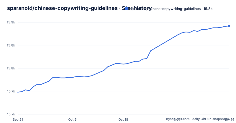
- sparanoid/chinese-copywriting-guidelines15,842 ★ · +144
| Repository | 2026-09-21 | 2026-11-14 |
|---|---|---|
| sparanoid/chinese-copywriting-guidelines | 15.7k | 15.8k |
144 Stars in the last 54 days, measured from the daily GitHub snapshot. Compare with other projects
Editorial analysis
Three parallel documents, a translation service and automated updates
The repository holds the same guide in three forms: an English version, a traditional Chinese version which is the default file, and a simplified Chinese version. Underneath them sit two pieces of automation that explain how a document project stays consistent across three languages. A translation service configuration sits at the root, which is how the translated files are kept in step when the source changes, and a dependency update configuration sits beside it so the tooling the guide uses for its own linting is refreshed automatically. The stated purpose is worth translating carefully, because it is narrower than a style manual: unify the usage of Chinese copywriting and typesetting in order to reduce the communication cost between team members and strengthen the presence of the website. That is a document about consistency between people, not about aesthetics alone.
Spacing has four cases and two documented exceptions
The spacing section opens with a joke, credited to the author of a spacing tool, about how people who dislike typing a space between Chinese and English characters fare in love. Then it gets precise. A space belongs between Chinese and English words, and the examples show two wrong variants, including a half-fixed one where the space appears on only one side. A space belongs between Chinese and numbers. A space belongs between numbers and their units, with a bandwidth and a disk capacity as examples. And a space does not belong between full-width punctuation and the characters around it. Two exceptions are stated rather than implied. Product names keep whatever format their owner defines, so a music application name is written as officially specified rather than as this guide would space it. And degrees and percentages take no space at all.
A CSS property was supposed to do this, and it never arrived
This is the most useful paragraph in the guide and it is a small lesson in how platform features fail to land. A property in the fourth level of the CSS text module, spelled text-spacing, and an older Microsoft-prefixed equivalent, can insert the space between Chinese and English automatically. The guide then explains why you still have to type them: neither is widely supported, and, more decisively, the feature does not exist in the user interfaces of the major desktop and mobile operating systems, which is where the text is actually rendered. So the recommendation is to keep the habit of adding spaces by hand. For a team this means the guideline is not optional polish but the only mechanism available, and it also means anyone planning an automated formatting pass has to assume the platform will not help them.
Punctuation is never doubled, and English sentences keep English punctuation
The punctuation section makes one rule about repetition and it is a rule against local custom. Mainland practice permits repeated marks to convey emphasis, and the guide rejects that on aesthetic grounds, showing examples where two or many exclamation marks collapse into one and where a mix of question and exclamation marks becomes a single combined mark. The width section then separates two scripts. Chinese punctuation should be full width, so an exclamation mark and a question mark and quotation marks stay in the Chinese form, not their half-width lookalikes. Digits should be half width, with one exception: in a design mockup or a poster, where a very small number of full-width digits is allowed to make text align. The last case is the one people forget: a complete English sentence or a special foreign term keeps half-width punctuation inside it, including its own commas, and an English book title is set in italics rather than forced into Chinese book-title marks.
Capitalisation is borrowed from English, and one rule is a CSS instruction
The noun section is candid about its own scope. Case conventions belong to English writing and are not this guide's subject; it only summarises the easy-to-get-wrong cases. The core rule is that a proper noun keeps the capitalisation its owner uses, illustrated with a brand name shown written correctly and then in five wrong forms, including an all-caps form and a shouted form using a different script's letters. The genuinely practical instruction comes next, and it is a web one: when a page needs everything in capitals or everything in lower case for visual style, write the correct case in the markup and define the presentation with the text-transform property instead. The section closes by banning unidiomatic abbreviations, with a job advert written properly and the same advert full of shortened jargon.
Two families of tooling, and two rules the author calls personal
The tools table is the practical payload, with two named families. The first has implementations for JavaScript, Go, Java, Python, Ruby, PHP and Vim script, plus a web converter for a component framework and a plugin for a commercial IDE. The second family is a single cross-platform tool written in Rust and compiled to WebAssembly, shipped as a command line program, with bindings for Node.js, Python, Ruby, Java, Go and PHP, an editor extension and another IDE plugin. A handful of other projects follow, including a WordPress plugin, a build-task plugin and several one-off scripts, one of which does exactly the spacing job this guide describes. Then comes the section the author labels as containing personal colour: whether to put spaces around hyperlinks, and whether simplified Chinese should use corner brackets rather than curly quotes. He notes that both forms are grammatically correct, which is the honest way to present a preference.
The document is the package, and its test command lints Markdown
The package manifest treats the guide as a product, which is unusual and useful. The main entry point is the readme itself, so anything that reads a package can read the guideline. The test script runs a Markdown processor over the repository, and the configuration section enables a consistency preset and a recommended preset plus one specific rule that requires list items to be indented with a space, which is a hint about the house style the document follows. The release script delegates to a release automation tool. The manifest also carries the licence and three keywords. Finally there is an adoption table listing sites that apply these conventions to their own copy, several of them regional pages of two large Western companies, with two community sites also marked as applying them to user-generated content, and a short references list drawn from English-language punctuation and capitalisation sources.
Editorial conclusion
This guideline fits a team writing Chinese product copy, especially one with more than one person touching the same interface, because it turns taste into a shared reference and it ships tooling that can check the mechanical rules automatically. It does not fit a team that wants a complete Chinese style manual, since it explicitly leaves capitalisation conventions to English writing and marks two of its own rules as personal preference. Before you adopt it, decide how strict you want to be, because the document separates rules that are wrong from the outside from two that are merely arguable, and mixing them in your own style guide will produce the arguments the guide was written to remove. The licence is MIT, the newest release is 1.0.1 from 2022-04-27, and the default branch was pushed on 2026-10-12.
Frequently asked questions
What is chinese-copywriting-guidelines?
It is a style guide for Chinese copywriting and typesetting, published in English, traditional Chinese and simplified Chinese. Its stated goal is to unify usage so that communication cost between team members drops and the presentation of a website improves, covering spacing between Chinese, Latin text, numbers and units, punctuation width and repetition, proper-noun capitalisation, and the tooling that can apply these rules automatically.
Why do Chinese and English words need spaces between them?
Because the guideline requires a space at every boundary between Chinese and an English word, between Chinese and a number, and between a number and its unit, while forbidding a space next to full-width punctuation. The author also explains that a CSS text property and an older vendor-prefixed equivalent were supposed to insert these spaces automatically, but neither is widely supported and neither exists in the user interfaces of the major operating systems, so the spaces must still be typed by hand.
How can I check a Chinese document against these rules?
The guide links a family of spacing tools with implementations for JavaScript, Go, Java, Python, Ruby, PHP and Vim, a framework web converter, an IDE plugin, and a cross-platform command line tool written in Rust and compiled to WebAssembly with bindings for several languages plus editor and IDE plugins. The repository itself uses a Markdown linter as its test command, so its own prose is checked on every run.
Which of these Chinese typesetting rules are optional?
The guide separates a small set of rules explicitly, marking a section as carrying personal colour: whether to put a space around hyperlink text, and whether simplified Chinese should use corner brackets instead of curly quotes. It notes that both forms are grammatically correct in those cases, so they are preferences rather than errors. Everything in the spacing and punctuation sections is presented as a rule with examples.
Official sources
Add this badge to your README
If you maintain this project, the badge below links readers to this analysis and shows its maintenance status from the daily GitHub snapshot. Paste the markdown into your README; add ?metric=license or ?metric=stars to the image URL for a different field.

[](https://hysenlabs.com/projects/sparanoid-chinese-copywriting-guidelines)Star history chart for your README
[](https://hysenlabs.com/projects/sparanoid-chinese-copywriting-guidelines)Was this useful?