Primer CSS is in KTLO mode: utility classes stay, complete patterns live in primer/react
Primer is GitHub's design system. This is the CSS implementation
At a glance
- What is it?
- Primer CSS is the SCSS implementation of GitHub's Primer design system, shipped as the npm package @primer/css. Its own README puts it in KTLO mode and sends anyone who needs styling plus markup to primer/react, which is the single most important fact about adopting it.
- Who is it for?
- Adopt Primer CSS if your team writes its own markup in a server-rendered or plain HTML app and wants GitHub's utility classes without a framework runtime. Do not adopt it expecting dropdowns, dialogs or any pattern that carries its own styling and markup, because the README hands those to primer/react and primer/view_components.
- Can I use it commercially?
- Yes. MIT is a permissive licence: you can use, modify and sell software built on it, as long as you keep its copyright and licence notices.
- Is it still maintained?
- Yes. The repository last received commits 4 days ago.
- What is it written in?
- Mainly SCSS, according to GitHub's language statistics.
Answers come from the project's GitHub data, last synced on November 14, 2026, and from our analysis. They are not legal advice.
Star history
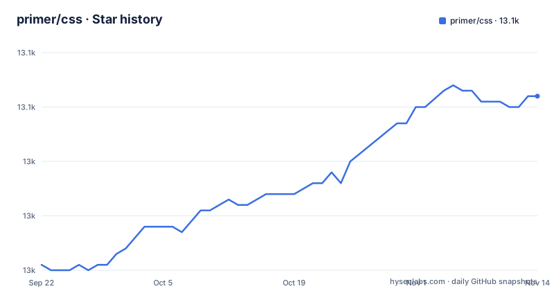
- primer/css13,052 ★ · +31
| Repository | 2026-09-22 | 2026-11-14 |
|---|---|---|
| primer/css | 13k | 13.1k |
31 Stars in the last 53 days, measured from the daily GitHub snapshot. Compare with other projects
Editorial analysis
KTLO mode is the package's own warning label
The first thing the README says, before anything about installation, is that the project is in KTLO mode and that you should use existing utility classes from it where needed. For patterns that combine styling and markup, the same paragraph sends you to primer/react, or, in its words, primer/view_components if that is necessary. That sentence decides who this package is for. More complete patterns that combine styling with markup are pointed to those other packages rather than to this one. If your design spec is a component inventory rather than a utility vocabulary, this is the wrong package, and no amount of reading the docs site changes that. What remains is the layer underneath those components, which is exactly what the maintainers intend people to keep consuming.
The import only resolves once node_modules is a Sass load path
Installation is one npm command, published under the @primer scope:
npm install --save @primer/csspackage.json asks for Node 16.0.0 or newer through its engines field, and marks the package as type module with main pointing at dist/primer.js. The source files are written in Sass using SCSS syntax, so consuming them means configuring your compiler before writing any rule. The README's instruction is to add your project's node_modules directory to your Sass include paths, which it notes are called load paths in Ruby, and then import by package name:
@import "@primer/css/index.scss";The consequence of skipping that compiler setup is a failed build rather than a missing style. The string "@primer/css/index.scss" is a package specifier, and the resolver needs the node_modules directory on its search path to turn it into a file. Sass load path configuration is per project, so it does not survive a change of build tool, and the README does not document a configuration for Vite, webpack or any specific bundler.
Three named entry points, none with a documented contents list
Beyond the top-level index.scss, the README shows that individual modules can be imported straight out of the package:
@import "@primer/css/core/index.scss";
@import "@primer/css/product/index.scss";
@import "@primer/css/marketing/index.scss";
The three names are the whole of what the README says about them. Core, product and marketing read as a sensible split, and a reader will assume product is the layer application interfaces need and marketing is for landing pages, but the file does not say which components or utilities sit behind each entry point, and neither does the install section. Anyone choosing between them is guessing at payload size rather than reading a manifest. Two things make the guessing easier to survive. The package.json exports map ends with a wildcard entry, "./*": "./*", so deep paths into the package resolve rather than being blocked by the exports field, and the style field already points at a prebuilt dist/primer.css for anyone who would rather not run Sass at all. Decide which entry you need by measuring your own bundle, since the project does not publish the per-entry contents.
A Sass entry, a JS entry and a classnames entry, three consumers
package.json is explicit about which file serves which consumer, and the three answers do not point at the same artifact. The sass field is index.scss, the raw source entry. The style field is dist/primer.css, a compiled stylesheet for a plain link tag or a tool that wants CSS rather than Sass. The main and the root export both resolve to dist/primer.js, and the second export entry is ./classnames, which ships a type declaration alongside separate import and require files so a bundler can pick ESM or CommonJS. Read together, that means the JS side of this package is not a runtime library of Primer components, it is an entry point that exists alongside the stylesheets, and the only named JavaScript surface the manifest offers is classnames. A team expecting a JavaScript API for tabs, menus or tooltips will not find one here, because the components that would need it are in the packages KTLO mode points away from.
deprecations.js and migrations/ carry the removal paperwork
Two paths at the top of the repository explain how this package takes things away. There is a deprecations.js file at the root, and a migrations/ directory beside it, alongside a CHANGELOG.md and a .changeset/ directory. The scripts make the intent visible: eslint runs across deprecations.js, __tests__ and script, prepublishOnly runs script/prepublish, and release runs changeset publish. So a class that is on its way out has a recorded entry in code and a migration note, and the published version bump comes from changesets rather than from a hand-edited version field. That is a better story than most stylesheet packages can tell, and it has a practical consequence. Before taking a minor or major version, read migrations/ and deprecations.js for the version you are moving to, because the gap between your installed version and the next one is exactly where a removed utility class shows up as a styling hole with no error message.
Checking the components visually means a second install inside docs/
The test and preview scripts say what it costs to verify work on this package. The test path runs npm run dist and script/pretest first, then executes jest under NODE_OPTIONS=--experimental-vm-modules, and the __tests__/ directory at the root is where those tests live. The stylelint scripts enforce rules over the SCSS in src/, and there are separate scripts for adding and removing stylelint disables, which tells you the codebase expects exceptions to be tracked rather than sprinkled in. The documentation preview is the expensive part. The storybook script is written as cd docs && npm i && npx storybook build, so building the component documentation performs a fresh dependency install inside the docs/ directory instead of reusing the root tree. Practical effect: npm test is cheap and runs in the tree you already have, while seeing the components rendered is a separate install that resolves its own versions.
Tagged releases stop in June while commits continue
The repository is not archived and the last push to main was 2026-11-02, so work is landing. The release record behind it is slower and does not line up cleanly with the manifest. The three most recent releases are v22.3.0 from 2026-06-17, v22.2.1 from 2026-06-12 and v22.2.0 from 2026-05-18, while package.json in the repository reads version 22.3.3. Three patch numbers in the manifest sit above the newest tag in that record, which is what changesets look like between publishing runs, but it also means the number you see in the repository and the number in your lockfile are not guaranteed to be the same thing on any given day. For a stylesheet consumed by many teams at once, the safe move is to pin the exact version you validated rather than track a range, and to treat the CHANGELOG.md and migrations/ entries as the place to read what a version bump actually removed.
Editorial conclusion
Adopt Primer CSS if your team writes its own markup in a server-rendered or plain HTML app and wants GitHub's utility classes without a framework runtime. Do not adopt it expecting dropdowns, dialogs or any pattern that carries its own styling and markup, because the README hands those to primer/react and primer/view_components. Verify two things before you start: that your build has node_modules on the Sass include paths, since the documented import fails without it, and what your Sass compiler does with the index.scss entry given the package is published as type module with a dist/primer.js main. The last push was 2026-11-02 and the repository is not archived, so the package is alive while its newest tagged release in the record is v22.3.0 from 2026-06-17.
Frequently asked questions
What is Primer CSS and who is it for?
Primer CSS is the CSS implementation of GitHub's Primer Design System, written in Sass with SCSS syntax and published to npm as @primer/css. It is aimed at teams that want GitHub's utility classes and write their own markup.
How do you install Primer CSS?
The package is distributed through npm, so npm install --save @primer/css adds it to a project. package.json declares Node 16.0.0 or newer as the minimum through its engines field.
Does Primer CSS ship components with markup?
Not the complete ones. The README puts the project in KTLO mode and directs you to primer/react, or primer/view_components if necessary, for patterns that include both styling and markup. What stays in this package are the existing utility classes.
How do you import Primer CSS in Sass?
Add your project's node_modules directory to your Sass include paths, called load paths in Ruby, then import the package entry with @import "@primer/css/index.scss". The core, product and marketing modules can also be imported individually.
Does Primer CSS work without a Sass build step?
There is a compiled stylesheet to point at, since the style field in package.json is dist/primer.css. The JavaScript side of the package is a separate entry, dist/primer.js, with ./classnames as the only named export map for it.
Official sources
Add this badge to your README
If you maintain this project, the badge below links readers to this analysis and shows its maintenance status from the daily GitHub snapshot. Paste the markdown into your README; add ?metric=license or ?metric=stars to the image URL for a different field.

[](https://hysenlabs.com/projects/primer-css)Star history chart for your README
[](https://hysenlabs.com/projects/primer-css)Was this useful?