dotUI Studio: Export a Custom React Design System as Code
Build your design system.
At a glance
- What is it?
- dotUI is a browser-based studio for defining visual decisions and exporting them as editable React components through the shadcn CLI or v0. It suits teams that want source-level ownership rather than a permanent component runtime, but its beta status creates API migration risk.
- Who is it for?
- Adopt dotUI when a team values a visual editor, accessible component foundations, and source-code ownership more than stable pre-1.0 APIs. Do not choose it when frozen exports are mandatory or when an undocumented v0 integration would create unacceptable migration work.
- Can I use it commercially?
- Yes. MIT is a permissive licence: you can use, modify and sell software built on it, as long as you keep its copyright and licence notices.
- Is it still maintained?
- Yes. The repository last received commits 3 days ago.
- What is it written in?
- Mainly TypeScript, according to GitHub's language statistics.
Answers come from the project's GitHub data, last synced on November 6, 2026, and from our analysis. They are not legal advice.
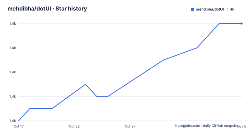
Star history
- mehdibha/dotUI1,374 ★ · +8
| Repository | 2026-10-17 | 2026-11-06 |
|---|---|---|
| mehdibha/dotUI | 1.4k | 1.4k |
8 Stars in the last 20 days, measured from the daily GitHub snapshot. Compare with other projects
Editorial analysis
Why dotUI moves design decisions into exportable React code
dotUI addresses a specific handoff problem: designers and developers often begin with visual tokens but still have to rebuild the same components in application code. Its studio treats colors, typography, icons, density, radius, and per-component styles as a design system rather than limiting customization to a palette replacement. The live preview uses components built on React Aria and Tailwind CSS, so the editor presents the system through components that can be inspected rather than static mockups alone.
The target user is a developer or product team working with React and Tailwind CSS that wants to define a system visually and retain direct control of the resulting implementation. The export path is designed for shadcn users, while the README also describes opening the generated system in v0. This is closer to a source generator than a hosted component service. According to the README, exported components arrive as plain React files with no dotUI package dependency, which lets consumers restyle or rewrite them after installation.
That ownership has an operational boundary. dotUI helps create the first implementation and establish its appearance, but it does not become a runtime abstraction that governs every later change. The README does not describe synchronization from repository edits back into the studio. A team expecting a central editor to remain authoritative after export would therefore need to confirm a workflow that is not currently documented.
How the dotUI studio becomes application-owned files
The workflow has three visible stages. First, a user defines visual choices in dotUI Studio at `dotui.org/studio`. The studio offers live previews built with React Aria and Tailwind CSS. Second, the completed system receives an export endpoint containing a user-specific identifier. Third, the shadcn CLI retrieves that configuration and writes component source into the consumer's codebase.
The generated route has the form `https://dotui.org/r/s/<your-id>/init.json`. The `<your-id>` segment is a placeholder in the README example, not a literal value to paste unchanged. Initialization through shadcn establishes the project integration. Components are then added by registry identifier, such as `@dotui/button`. The repository itself is a TypeScript monorepo with `packages/`, `www/`, `docs/`, and `examples/`. Its root `package.json` uses Turbo, pnpm workspaces, Vitest, Oxlint, and Oxfmt.
The key architectural decision is source ownership. The README says that components land as plain React files and consumers do not depend on a dotUI package. This differs from a conventional library where every application imports styled components from the vendor. The trade-off is equally direct: exported teams accept and own later source maintenance instead of waiting for an upstream package update to repair every application.
Installing a dotUI design system and adding its first component
Create the design system in `dotui.org/studio`, choosing the colors, typography, icons, density, radius, and component styles that the project requires. Preview those decisions in the studio before exporting. The resulting system-specific initialization endpoint is used by the shadcn CLI.
In an existing React project, run the documented initialization command. Replace the README's `<your-id>` placeholder with the identifier assigned to the exported design system.
npx shadcn@latest init "https://dotui.org/r/s/<your-id>/init.json"The CLI should complete the shadcn setup against the exported registry response. The README does not enumerate the files this command creates, so the exact repository changes should be reviewed before proceeding.
Add the first component, Button, with the documented registry name:
npx shadcn@latest add @dotui/buttonAfter this command, the expected result is an editable React Button in the project rather than a permanent dotUI runtime dependency. Render it through the application's existing component path and check its states against the product's intended use. The README gives no Button markup example, so it does not establish which props or variants the generated file exposes.
For work inside the repository itself, `package.json` specifies Node `^24.11.1`, pnpm `^11.5.3`, and `packageManager` value `[email protected]+sha512.66c1ac4c7d4762d6d7dde44c7f3e5a73591ed0a0806e751d4ed32d4f004f25b2285a906b1fd8a9e3e621df3b4e2858`. It defines `pnpm dev` and `pnpm build` as repository-level scripts. Those details concern contributor and monorepo setup, not installation of an exported design system.
What plain React exports gain and who inherits their upkeep
Exporting component files gives an application team direct control over implementation details. A developer can modify class names, composition, markup, or behavior in the generated React source without waiting for a vendor package release. That is useful when a product needs local divergence, code review requirements, or components compatible with an existing application architecture.
The initial foundation is not entirely manual. The README states that the live components are built on React Aria and Tailwind CSS. It does not enumerate the accessibility features implemented by each dotUI component, so keyboard interaction, focus behavior, screen-reader announcements, and disabled-state semantics should be checked in the generated files rather than inferred from the phrase "accessible components."
Code ownership also creates an upgrade cost. dotUI has no GitHub releases, and the README labels the project as beta while warning that APIs may change before 1.0. A consumer cannot use GitHub releases to identify a normal sequence of downstream migrations. Exported plain React files can diverge from later studio output, making repeated imports harder to compare unless the team records the system identifier and tracks local changes.
The repository is not archived, and its last push was on 2026-10-15. This indicates recent repository activity, but it does not establish API stability. The beta warning remains the more relevant adoption constraint for exported files and configuration APIs. Contributors also have repository scripts such as `pnpm check`, `pnpm typecheck`, `pnpm test`, and `pnpm smoke:examples`; these validate the monorepo and examples, not a downstream consumer's edited exports.
dotUI versus hand-authored and v0-centered component workflows
A hand-authored workflow starts with an existing React application and creates Tailwind CSS components directly in the repository. It avoids a separate visual editor and makes every design decision explicit in source, but it also places component construction, consistency checks, and documentation on the product team. dotUI instead begins with a studio where visual choices can be configured and previewed, then exports that structure through a shadcn-oriented installation path.
The second alternative is v0-centered authoring. dotUI states that a design system can be opened directly in v0 with its brand settings already included, allowing work to continue through prompting. That path may suit teams that want generative interface work after establishing a theme. The direct shadcn path is different: it initializes a project and adds named components as React source. Neither the README nor the repository documentation proves that v0 output preserves an exact production design specification, so file-level review remains necessary.
dotUI is not a runtime replacement for React Aria, Tailwind CSS, shadcn, or v0. It composes or targets those tools at the design-system creation and export stages. Its distinguishing choice is the combination of a visual editor and source delivery, not a new component dependency that remains after export.
Where dotUI Studio creates operational risk
The largest risk comes from the gap between a centrally edited design system and independently edited exported files. The README promises that developers can restyle or rewrite generated components, which is useful after export, but it does not document synchronization, selective upgrades, conflict detection, or rollback for source that has diverged. A team needs a clear policy for comparing local edits with newer generated output before refreshing components.
Beta status adds another constraint. APIs may change before 1.0, yet the repository has no GitHub releases. Teams that need a stable, dated distribution channel cannot derive one from repository pushes or the absence of releases. They should inspect generated output whenever the upstream configuration changes rather than assuming that rerunning an initialization or component-add command will merge cleanly.
dotUI is also a poor fit for projects that do not use React, Tailwind CSS, or a shadcn-compatible source workflow. A plain HTML or CSS project will not benefit from React exports. It may also be the wrong choice for organizations that require a vendor-managed component package and centralized runtime upgrades, because dotUI deliberately removes the permanent dotUI package dependency after export.
The MIT License permits reuse and modification under its terms, but each consumer remains responsible for complying with the license. The README does not promise warranty coverage, support response times, or migration assistance beyond the contribution process described in `CONTRIBUTING.md`.
Editorial conclusion
Adopt dotUI when a team values a visual editor, accessible component foundations, and source-code ownership more than stable pre-1.0 APIs. Do not choose it when frozen exports are mandatory or when an undocumented v0 integration would create unacceptable migration work. Verify the exported Button files, generated theme configuration, React Aria and Tailwind integration, and the effect of planned API changes before committing production screens.
Frequently asked questions
Does dotUI export React components that consumers can edit?
Yes. The README says exported components land as plain React files with no dotUI package dependency, and it explicitly allows consumers to restyle or rewrite them.
How do I install a design system exported from dotUI?
Create the system in dotUI Studio, then pass its `init.json` URL to `npx shadcn@latest init`. Individual components can be added with `npx shadcn@latest add @dotui/button` or another documented component identifier.
Is dotUI stable enough for production APIs?
The README labels dotUI as beta and says to expect API changes before 1.0. The repository also has no GitHub releases, so consumers should not treat it as having a stable release contract.
Official sources
Add this badge to your README
If you maintain this project, the badge below links readers to this analysis and shows its maintenance status from the daily GitHub snapshot. Paste the markdown into your README; add ?metric=license or ?metric=stars to the image URL for a different field.

[](https://hysenlabs.com/projects/mehdibha-dotui)Star history chart for your README
[](https://hysenlabs.com/projects/mehdibha-dotui)Was this useful?