UI TripleD for TypeScript UI Blocks and Visual Builders
Production-ready UI blocks, components, and full pages available in shadcn/ui and Base UI, powered by Framer Motion, with a Landing Page Builder, Background Builder, and Grid Generator.
At a glance
- What is it?
- UI TripleD is a TypeScript monorepo for browsing shadcn/ui and Base UI components, composing landing pages, and generating animated backgrounds and Tailwind CSS grids. It fits developers who want local visual tools, although the README does not document consumer installation or rollback.
- Who is it for?
- Adopt UI TripleD when your team works in TypeScript, Next.js, Tailwind CSS, and the shadcn/ui ecosystem and wants a local environment for its component catalog and visual builders. Do not treat it as a documented consumer package with an established upgrade path, because the README provides repository setup rather than package installation and does not explain rollback.
- Can I use it commercially?
- Yes. MIT is a permissive licence: you can use, modify and sell software built on it, as long as you keep its copyright and licence notices.
- Is it still maintained?
- Yes. The repository last received commits 72 days ago.
- What is it written in?
- Mainly TypeScript, according to GitHub's language statistics.
Answers come from the project's GitHub data, last synced on November 6, 2026, and from our analysis. They are not legal advice.
Star history
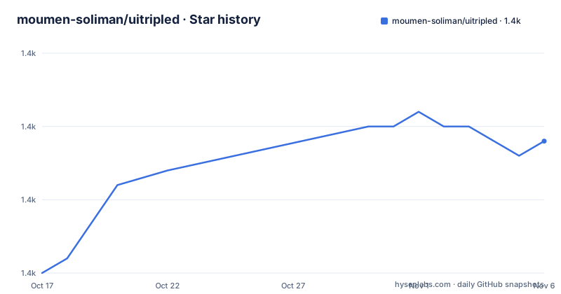
- moumen-soliman/uitripled1,364 ★ · +9
| Repository | 2026-10-17 | 2026-11-06 |
|---|---|---|
| moumen-soliman/uitripled | 1.4k | 1.4k |
9 Stars in the last 20 days, measured from the daily GitHub snapshot. Compare with other projects
Editorial analysis
What problem UI TripleD solves
UI TripleD is aimed at frontend developers who need interface building blocks rather than a finished application. Its stated scope includes UI blocks, components, and full pages available through shadcn/ui and Base UI. The repository also provides a Landing Builder for assembling shadcn/ui landing pages, a Background Builder for shader-powered and animated Aurora backgrounds, and a Grid Generator for Tailwind CSS layouts.
The intended users are developers working in TypeScript and the React ecosystem. The README lists Next.js 16, React 19, Tailwind CSS, Framer Motion, shadcn/ui, Base UI, and Radix UI as part of the technology stack. This combination fits projects that already use component-oriented React development and CSS utility conventions. It is less directly aligned with teams governed by a different component framework or teams whose primary requirement is a finished backend product.
The project addresses the gap between static code examples and visual composition. According to the README, developers can browse components, preview them, and copy code into their own project. They can also use visual builders to customize components and inspect live previews. The emphasis is on source-level reuse and configurable examples, not on installing UI TripleD as a conventional runtime dependency. The README does not specify accessibility test results, supported browsers, or the update policy for individual blocks, so those details require verification.
How the UI TripleD monorepo is organized
Based on the repository layout, UI TripleD is organized as a Turborepo with pnpm workspaces. The root `package.json` is a private package named `uitripled-monorepo`, and the repository contains `apps/` and `packages/` directories. Root scripts delegate work through Turbo, including `build`, `dev`, `lint`, and `type-check`. This structure separates the documentation application from shared packages while retaining one workspace-level dependency and task system.
The root package.json also exposes registry commands. `registry:generate` runs a TypeScript script through `pnpm dlx tsx` to synchronize and generate registry files. `registry:sync` runs a JavaScript script under `apps/docs/scripts/`, while `registry:validate` validates the registry with another `pnpm dlx tsx` script. These commands indicate a data path in which component or block metadata is synchronized into registry files and then validated. The README does not describe the registry schema or explain whether generated files are committed.
The documented application is named `uitripled-docs`. Its development command runs that app through the root development script, while the build command filters Turbo to the same app. The package also declares Changesets commands and a release script for `@uitripled/*`. This indicates a package-oriented release path inside the monorepo, although the available repository record lists no GitHub releases.
Installing UI TripleD and starting the docs app
The README provides local repository setup rather than installation instructions for an existing application. It requires Node.js 18 or later, and the root `package.json` specifies supported Node.js ranges of `^18.18.0`, `^20.0.0`, or `^22.0.0`. The package manager is pinned as `[email protected]`.
Install the workspace dependencies from the repository root with the documented command:
pnpm installThe command should install dependencies according to the workspace configuration and `pnpm-lock.yaml`. The README does not provide commands for installing UI TripleD into a separate application.
Start the documentation application with the documented filter:
pnpm dev --filter=uitripled-docsAfter the development server starts, open the documented local address:
http://localhost:3000The repository metadata declares `[email protected]`, so using the pinned package manager version avoids differences caused by an unrelated global pnpm release.
Using component previews and specialized builders
The README describes three visual workflows. Landing Builder is intended for shadcn/ui landing pages. Background Builder is intended for shader and animated Aurora backgrounds. Grid Generator is intended for Tailwind CSS grids. Each builder is presented as a way to customize or compose an interface while viewing a live preview, then copy code into a project.
That design separates exploration from integration. The browser application is the place to inspect examples and adjust settings, while the destination repository receives copied code. The README does not say whether builder settings are saved between sessions, whether generated code is deterministic, or whether an existing page can be imported into the visual editor. Those omissions matter for teams that need repeatable design workflows rather than one-off customization.
The named libraries also create a choice rather than a single implementation path. shadcn/ui and Base UI are both listed as sources for available UI material, while Framer Motion supplies animation capabilities. The README does not map every component to one library or explain whether a copied block includes all imports and dependencies. Developers should inspect generated code before placing it into an application.
The repository's `registry:generate`, `registry:sync`, and `registry:validate` scripts suggest that the catalog can be synchronized and checked as source material changes. The README does not explain the registry format or a routine for updating copied blocks after a dependency changes. Teams should treat the catalog as source code that requires review rather than as an automatically maintained application dependency.
Limitations and alternatives to UI TripleD
The clearest limitation is the difference between a development repository and a documented consumer package. The README tells developers to install dependencies and run the docs application. It does not provide a command for adding UI TripleD to an existing application, nor does it document a versioned package endpoint. The root release script includes Changesets and `@uitripled/*`, but no GitHub release is listed, so a stable release line cannot be assumed from the available documentation.
The README is also silent on rollback, compatibility guarantees, and migration procedures for generated blocks. It does not state how to update copied components when a dependency or design token changes. This does not make the repository unsuitable, but it means the adopting team owns maintenance of the copied material.
Plain shadcn/ui code is the closest alternative because UI TripleD explicitly builds on that ecosystem. The README explicitly includes shadcn/ui in UI TripleD's component ecosystem and Landing Builder. UI TripleD adds a documentation catalog, visual previews, and specialized builders for landing pages, backgrounds, and grids. Plain code is simpler when a team already knows which components it needs. UI TripleD is more relevant when the team wants to compare examples and configure visual elements before copying them. The tradeoff is the additional local monorepo and the absence of documented migration or rollback behavior.
UI TripleD is not presented as a hosted page builder or content-management system. It is better understood as a source catalog plus local composition tools.
Maintenance, releases, and MIT licensing
The repository is not archived, and its last push was on 2026-08-28. That is a recent maintenance signal based on the repository record, but it is not evidence that every block or builder has a stable compatibility promise. The repository has no GitHub releases, so consumers should not infer a release cadence or a supported upgrade path from source activity alone.
The project is licensed under MIT according to the repository metadata and the README's license reference. That permits use and modification under the terms of the MIT license, but adopting teams still need to review the license file and the licenses of imported dependencies. MIT for UI TripleD does not remove the need to account for Next.js, React, Tailwind CSS, Framer Motion, shadcn/ui, Base UI, Radix UI, or other packages under their respective terms.
Changesets support is visible in `package.json`, including commands for versioning and publishing. Since the README does not provide release documentation and the repository record lists no GitHub releases, the safest operational interpretation is that UI TripleD is primarily a development source for the current checkout, not a dependency with a documented upgrade contract.
Editorial conclusion
Adopt UI TripleD when your team works in TypeScript, Next.js, Tailwind CSS, and the shadcn/ui ecosystem and wants a local environment for its component catalog and visual builders. Do not treat it as a documented consumer package with an established upgrade path, because the README provides repository setup rather than package installation and does not explain rollback. Before adoption, verify the specific blocks and builders your product needs, inspect the copied code and dependencies, and confirm that the MIT-licensed source fits the application.
Frequently asked questions
How do I install and run UI TripleD?
Install dependencies with `pnpm install`, then run `pnpm dev --filter=uitripled-docs` from the repository root. The README says to open `http://localhost:3000` in a browser.
What does the UI TripleD Landing Builder do?
The README describes it as a drag-and-drop builder for assembling shadcn/ui landing pages. It provides visual customization and live previews before code is copied into another project.
Does UI TripleD document consumer package installation?
No. The README documents local dependency installation and running the docs app, but it does not provide a command for adding UI TripleD to an existing application.
Which technologies does UI TripleD use?
The README lists TypeScript, Next.js, React, Tailwind CSS, Framer Motion, shadcn/ui, Base UI, Radix UI, Turborepo, and pnpm workspaces. The repository also uses Turbo scripts to coordinate workspace tasks.
Official sources
Add this badge to your README
If you maintain this project, the badge below links readers to this analysis and shows its maintenance status from the daily GitHub snapshot. Paste the markdown into your README; add ?metric=license or ?metric=stars to the image URL for a different field.

[](https://hysenlabs.com/projects/moumen-soliman-uitripled)Star history chart for your README
[](https://hysenlabs.com/projects/moumen-soliman-uitripled)Was this useful?