react-modal requires Modal.setAppElement so screen readers ignore the page behind the dialog
Accessible modal dialog component for React
At a glance
- What is it?
- An MIT-licensed accessible modal dialog component for React. The repository's last push was 2026-03-02, its newest tagged release is 3.16.1 from 2022-10-18, and package.json already says 3.16.3.
- Who is it for?
- Use react-modal if you want a small, accessibility-focused modal for React that you style yourself with inline styles or CSS classes, and you accept that its last push was on 2026-03-02 and its newest release tag is from 2022. Choose another library if you want built-in animations or a design system around the dialog.
- Can I use it commercially?
- Yes. MIT is a permissive licence: you can use, modify and sell software built on it, as long as you keep its copyright and licence notices.
- Is it still maintained?
- Activity is slowing. The repository last received commits 8 months ago.
- What is it written in?
- Mainly JavaScript, according to GitHub's language statistics.
Answers come from the project's GitHub data, last synced on November 7, 2026, and from our analysis. They are not legal advice.
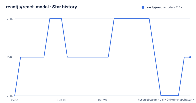
Star history
- reactjs/react-modal7,404 ★ · +1
| Repository | 2026-10-08 | 2026-11-07 |
|---|---|---|
| reactjs/react-modal | 7.4k | 7.4k |
1 Stars in the last 30 days, measured from the daily GitHub snapshot. Compare with other projects
Editorial analysis
Modal.setAppElement tells assistive technology what to hide while the dialog is open
The README's example carries a comment that matters more than any option: make sure to bind the modal to your appElement. The call is:
Modal.setAppElement('#yourAppElement');The selector names the root element of your app. The point of the call is accessibility, and the project links an accessibility page at reactcommunity.org/react-modal/accessibility for the explanation. Leaving it out means the component has no declared app root to treat as background content. One of the hosted demos is dedicated to this call, titled Using setAppElement, so it is clearly the step people trip over.
npm, yarn and a CDN script tag are the three ways in
Installation uses npm or yarn:
npm install --save react-modal
yarn add react-modal
For an app that loads React from a CDN, the README says to add a script tag after the React CDN scripts and before your own JavaScript, for example from cdnjs:
<script src="https://cdnjs.cloudflare.com/ajax/libs/react-modal/3.14.3/react-modal.min.js"
integrity="sha512-MY2jfK3DBnVzdS2V8MXo5lRtr0mNRroUI9hoLVv2/yL3vrJTam3VzASuKQ96fLEpyYIT4a8o7YgtUs5lPjiLVQ=="
crossorigin="anonymous"
referrerpolicy="no-referrer"></script>
Then use the ReactModal tag inside that app. The CDN path pins version 3.14.3, older than the 3.16.3 in package.json, so a CDN user does not get later fixes unless they change the URL and the integrity hash.
The centered dialog in the example is pure inline styles
The README example defines a customStyles object with a content key. It sets top and left to 50%, right and bottom to auto, marginRight to -50%, and a transform of translate(-50%, -50%). That centers the box over the overlay with no stylesheet.
The example imports React, ReactDOM and Modal from react-modal, keeps a modalIsOpen flag in React.useState, and defines openModal and afterOpenModal functions. The demos on CodePen split the topics: a minimal example, setAppElement, onRequestClose, shouldCloseOnOverlayClick, inline styles, CSS classes and customizing the default styles. Those option names are the closing and styling hooks the library exposes.
Styling is yours: inline objects, CSS classes or edits to the defaults
The library ships a default look, and three demos show how to change it. Inline styles pass an object like customStyles above. CSS classes let you style through your own stylesheet. A third demo customizes the default styles. The repository's examples directory has base.css plus basic, bootstrap and wc folders, with an index.html that ties them together.
The cost is that nothing looks finished out of the box in your design system. A team that wants a prebuilt animated sheet or a themed dialog will do the styling work, or pick a different component.
Run the examples locally with npm start or yarn run start
The examples directory runs in a local development server using npm start or yarn run start. In package.json, start launches webpack-dev-server with the config in scripts/webpack.config.js on host 127.0.0.1 with examples/ as the content base. The test script sets NODE_ENV=test and runs karma, and lint runs eslint on src/.
The test setup uses karma with Chrome and Firefox launchers, mocha and coverage tooling, and the build chain is Babel 6 with the env, react and stage-2 presets. A Makefile adds commands such as make deps, make serve, make tests, make lint, make docs and make build. Docs are built with mkdocs and mkdocs-material, installed through pip. Contributors need Python for docs on top of Node.
The newest tag is 3.16.1 from 2022 while package.json reads 3.16.3
The release list holds two entries: 3.16.1 on 2022-10-18 and 3.14.4 on 2021-11-10. The package.json in the repository declares version 3.16.3, so the manifest is ahead of the tagged releases. The last push to the master branch was on 2026-03-02, and the repository is not archived.
Because the last push is more than seven months old and the last GitHub release is from 2022, do not read this as an actively developed project. Pin the npm version you tested. The repository also holds CHANGELOG.md and an UPGRADE_GUIDE.md, which is where to look before moving between major versions.
Browser support and React version limits are left to the docs
The README is short: installation, a link to the reference book at reactjs.github.io/react-modal, one example and the demo list. It does not state which React versions the current code supports or which browsers it targets. The devDependencies include an eslint-plugin-jsx-a11y for accessibility linting and a custom-elements polyfill, which fits the wc example folder.
Before adopting, read the reference book for the full prop list and check your React version against package.json peer ranges. The license is MIT, and the listed author in package.json is Ryan Florence. Support questions have a Gitter room linked from the README badge row.
Editorial conclusion
Use react-modal if you want a small, accessibility-focused modal for React that you style yourself with inline styles or CSS classes, and you accept that its last push was on 2026-03-02 and its newest release tag is from 2022. Choose another library if you want built-in animations or a design system around the dialog. Before shipping, make sure Modal.setAppElement points at your root element, and test with a screen reader.
Frequently asked questions
What is react-modal?
react-modal is an accessible modal dialog component for React.JS. It is MIT licensed and installs with npm or yarn.
How do I use react-modal?
Install it with npm install --save react-modal, import Modal, call Modal.setAppElement with your app root selector, and render the Modal component with an open flag kept in React state.
What is a modal in frontend?
A modal is a dialog shown over the page content. react-modal provides one for React, with options such as onRequestClose and shouldCloseOnOverlayClick demonstrated in its CodePen demos.
Official sources
Add this badge to your README
If you maintain this project, the badge below links readers to this analysis and shows its maintenance status from the daily GitHub snapshot. Paste the markdown into your README; add ?metric=license or ?metric=stars to the image URL for a different field.

[](https://hysenlabs.com/projects/reactjs-react-modal)Star history chart for your README
[](https://hysenlabs.com/projects/reactjs-react-modal)Was this useful?