Ten theme packages, three validators, and one Nx command for all of them
A React component for building Web forms from JSON Schema.
At a glance
- What is it?
- react-jsonschema-form renders a form from a JSON Schema, and the repository is a monorepo where the interesting decisions live in the package layout rather than in the docs: one package per user interface library, a separate package for each validation implementation, and a task runner that applies the same script to every package. The root manifest is where the workflow is actually documented.
- Who is it for?
- This library fits a team that already owns JSON Schema documents and wants the form to follow the schema instead of the other way round, and it fits a team that has standardised on one of the ten supported interface libraries. It does not fit a project that wants a dependency-free renderer or a single package, because you install a theme package and pick a validator, and the repository itself runs on Node 20 with pnpm and a task runner.
- Can I use it commercially?
- Yes. Apache-2.0 is a permissive licence: you can use, modify and sell software built on it, as long as you keep its copyright and licence notices.
- Is it still maintained?
- Yes. The repository last received commits 1 day ago.
- What is it written in?
- Mainly TypeScript, according to GitHub's language statistics.
Answers come from the project's GitHub data, last synced on November 14, 2026, and from our analysis. They are not legal advice.
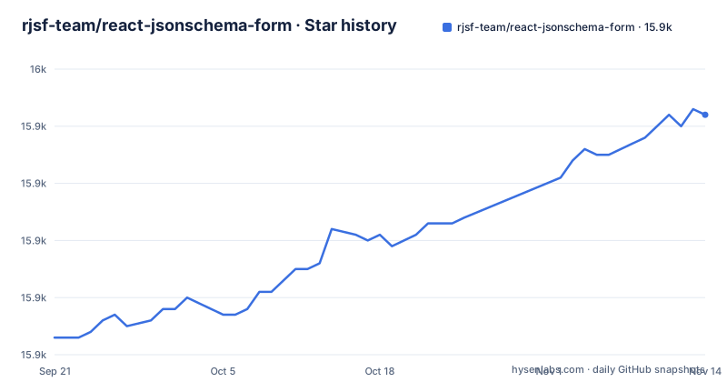
Star history
- rjsf-team/react-jsonschema-form15,942 ★ · +39
| Repository | 2026-09-21 | 2026-11-14 |
|---|---|---|
| rjsf-team/react-jsonschema-form | 15.9k | 15.9k |
39 Stars in the last 54 days, measured from the daily GitHub snapshot. Compare with other projects
Editorial analysis
Ten theme packages, and one of the links is not a theme
The theme list is the fastest way to understand what this library is made of, because there is one package per user interface library, each in its own directory, and each carries the version of the library it targets. Ant Design at version 5, Bootstrap at 3, Chakra UI at 3, Daisy UI at 5, Fluent UI at 9, Mantine, Material UI at 7, React-Bootstrap for Bootstrap 5, Semantic UI at 2, and Shad CN. Read one detail carefully, though: the core package is linked in that same list under the label for Bootstrap version 3. In other words, the Bootstrap 3 theme is the core package itself rather than a separate theme package. The practical consequence is that you choose two things at install time, the component library and the theme package that matches its major version, and the core is what both of them build on.
Validation is a separate package, and three implementations ship
The API section lists a shared utilities package and then three validator packages, and that is a design decision rather than a packaging detail. It means the form component is not welded to one validation library. One validator is built around a widely used JavaScript schema validator at its current major version, one is an alternative implementation (validator-ata), and one is built for a worker runtime. If your data is untrusted and large, or your app already has a validator in the graph, the choice is yours to make. The corollary is that the version of the validator in your lockfile is part of your form behaviour, because different implementations differ on how strictly they enforce a schema and on which keywords they support. Nothing in the readme ranks them, so treat that as a decision to test rather than a default to accept.
One runner applies the same target to every package
The root manifest is where the engineering workflow is written down, and it is a task runner executing the same target across the workspace rather than a list of per-package commands. Tests and their snapshot-update counterpart run across packages with a parallelism of two, linting runs across all of them, and there is a serial build variant for the cases where parallel builds race. Formatting and its check counterpart are separate targets, as is a pre-commit target that also runs serially, and type checking is not delegated to the runner at all but is a project-reference build of the compiler, which is what lets it follow the dependency graph between packages. An unused-code detector is wired up as its own script, and a sanity-check script chains lint, unused-code detection, build and tests in one go, which is the single command to run before opening a pull request.
The bump script tells you to check the playground yourself
Four scripts exist purely for maintenance, and each tells you something about the project's habits. The dependency bump script begins by printing a note reminding you to sanity check the playground locally before committing, and only then updates every dependency to the latest version, reinstalls, and runs lint, build and tests in sequence. A second script deletes the installed modules in every package and reinstalls from scratch, and a third is named bluntly enough that nobody has to guess what it removes: it deletes the task runner cache and the lockfile, which is the nuclear option for a workspace whose state has gone strange. A fourth retags and force-pushes the version tag, computed from a script, which is worth knowing about before you run anything that pushes tags.
Two documentation toolchains and two files pinning the Node version
The repository root is where the duplication shows. Documentation is described as powered by one static site generator, and the readme's own links point at a documentation site built with it, yet a documentation configuration for a different generator and a Python requirements file for documentation dependencies both sit at the root, along with a Netlify configuration and a shell script that tells the deploy what to ignore. Node is pinned twice as well, once in a version file and once in the file the version manager reads, and the manifest states a floor of version 20 for the engine. None of this is broken, and a monorepo of this size often ends up with two documentation pipelines because the two grew at different times. The cost lands on whoever changes documentation: you may need to know which stack owns the page you are editing.
The playground has to be built before it starts
There is a hosted playground on the project's own pages, and the local one is described by a start script that does nothing but print an instruction: build from the main directory first, then run the start command inside the playground package. That is a small design choice with a real effect, since a developer who clones the repository and runs the obvious command gets a sentence rather than an application, and the build of the playground therefore depends on the rest of the monorepo being compiled. Browser-level testing is described as powered by a hosted testing service, which is worth noting when you are deciding whether the themes will actually hold up in browsers you care about, since the coverage depends on that service's configuration rather than on anything visible in the repository.
Three releases in three weeks, and every package moves together
The release record shows a steady minor line rather than occasional big jumps: a 6.10.0 in early September, a 6.10.1 patch the following week, and 6.11.0 at the end of the month. The default branch was pushed on 2026-11-02, more than a month after that release. The root also carries a CHANGELOG.md and a pull request template.
Editorial conclusion
This library fits a team that already owns JSON Schema documents and wants the form to follow the schema instead of the other way round, and it fits a team that has standardised on one of the ten supported interface libraries. It does not fit a project that wants a dependency-free renderer or a single package, because you install a theme package and pick a validator, and the repository itself runs on Node 20 with pnpm and a task runner. Before you commit, decide which validator you want, since three ship and they differ in where validation runs, and check that your interface library's major version is the one in the list, because each theme targets a specific major version of its library. The newest release is 6.11.0 from 2026-09-28 and the default branch was pushed on 2026-11-02.
Frequently asked questions
What is a JSON Schema?
In this project's terms it is the document you hand to the React component, which uses it to declaratively build and customise a web form. You describe the shape of the data and the component renders the inputs, and the same schema drives validation through a validator package you choose separately.
react jsonschema form vs jsonforms
The readme makes no comparison with other libraries. What it does state is its own shape: one package per supported interface library, a shared utilities package, and three validator implementations, which is the axis on which such libraries usually differ. Any ranking beyond that would be the reader's judgement rather than something the project documents.
How do I add a theme to react-jsonschema-form?
Install the package for your interface library rather than the core, and check the major version in the list, since the packages are versioned per library: Ant Design 5, Bootstrap 3, Chakra UI 3, Daisy UI 5, Fluent UI 9, Mantine, Material UI 7, React-Bootstrap for Bootstrap 5, Semantic UI 2 and Shad CN are listed as supported.
How does react-jsonschema-form validate form data?
Through a validator package that you install alongside the theme. Three ship: one built around a widely used JavaScript schema validator, an alternative implementation (validator-ata), and one built for a worker runtime, plus a shared utilities package they build on. Because the implementations differ in strictness and keyword support, the validator you choose is part of your form behaviour and worth testing rather than defaulting to.
Official sources
Where developers are discussing it
Posts on Hacker News, dev.to and Lobsters that link to this repository, found by our scan of those communities. 1 in the last 30 days; newest first.
- A React component for building Web forms from JSON SchemaHacker News · Oct 26, 2026 · 2 points · 0 comments
Add this badge to your README
If you maintain this project, the badge below links readers to this analysis and shows its maintenance status from the daily GitHub snapshot. Paste the markdown into your README; add ?metric=license or ?metric=stars to the image URL for a different field.

[](https://hysenlabs.com/projects/rjsf-team-react-jsonschema-form)Star history chart for your README
[](https://hysenlabs.com/projects/rjsf-team-react-jsonschema-form)Was this useful?