Adobe's React Spectrum: A Three-Layer Answer to Accessible UI Components
A collection of libraries and tools that help you build adaptive, accessible, and reliable user experiences.
At a glance
- What is it?
- React Spectrum is not one library but three: a styled design system, an unstyled component layer, and a state management layer. This review covers what each layer does, how they fit together, and where the trade-offs live.
- Who is it for?
- Adopt React Spectrum if you need a complete, accessible component library with Adobe's design language, or if you want unstyled behavior hooks to build your own design system without reinventing keyboard and screen reader support. Skip it if you need a lightweight, single-purpose component set with minimal dependencies, or if your team cannot commit to the React-centric, hook-based architecture.
- Can I use it commercially?
- Yes. Apache-2.0 is a permissive licence: you can use, modify and sell software built on it, as long as you keep its copyright and licence notices.
- Is it still maintained?
- Yes. The repository last received commits 1 day ago.
- What is it written in?
- Mainly TypeScript, according to GitHub's language statistics.
Answers come from the project's GitHub data, last synced on November 14, 2026, and from our analysis. They are not legal advice.
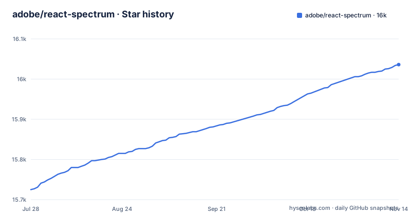
Star history
- adobe/react-spectrum16,036 ★ · +311
| Repository | 2026-07-28 | 2026-11-14 |
|---|---|---|
| adobe/react-spectrum | 15.7k | 16k |
311 Stars in the last 109 days, measured from the daily GitHub snapshot. Compare with other projects
Editorial analysis
What Problem Does React Spectrum Actually Solve?
Building accessible UI components from scratch is tedious and error prone. Keyboard navigation, focus management, ARIA attributes, and screen reader announcements are easy to get wrong, and the details differ across browsers and devices. React Spectrum addresses this by packaging Adobe's own design system and accessibility work into reusable libraries. The target audience is twofold: teams building applications that need to match Adobe's Spectrum design language, and teams building their own design systems who do not want to reimplement interaction behavior. The README states that all components are tested across a wide variety of screen readers and devices, which is a promise many open source component libraries do not make. For an engineering team, the value is not just the components themselves but the accumulated knowledge of what accessible behavior looks like in practice.
The Three-Layer Architecture: Spectrum, Aria, and Stately
The repository is not a monolith. It contains three distinct libraries that can be used independently or together. React Spectrum is the styled implementation of Adobe's design system. It gives you ready-made components with the Spectrum look and feel. React Aria is the unstyled layer: hooks and components that provide behavior, accessibility, and interactions without any visual styling. React Stately is the state management layer, handling things like selection, focus, and drag and drop in a platform-agnostic way. The README explains that React Stately can be used on its own, for example in React Native. This separation is useful because it lets you consume only what you need. If you want a complete design system, you take React Spectrum. If you want to build your own styled components but keep the accessibility behavior, you take React Aria. If you only need state management, you take React Stately. The architecture RFC linked in the README goes into more detail, but the key point is that the layers are designed to be composed, not to force you into a single framework.
How the Mechanism Works: Hooks, State, and Internationalization
The core mechanism is React hooks. React Aria provides hooks like useButton, useSlider, or useDatePicker that return props to spread onto your own DOM elements. You control the markup and the styling; the hook handles the behavior. React Stately provides state management hooks that manage the underlying state, so your component can focus on rendering. The internationalization layer is separate and framework-agnostic, covering date formatting, number formatting, and messages for over 30 languages, including right-to-left support. The adaptive behavior is built in: the README says components are designed for mouse, touch, and keyboard interactions. This is not just a styling concern. It means the hooks detect input modality and adjust focus and interaction accordingly. For example, a button might show a focus ring only when using a keyboard, not when clicking with a mouse. That kind of behavior is hard to get right on your own, and it is the core value proposition of the library.
Getting Started: Installation and First Steps
The README points to separate getting started guides for each library, but the general pattern is clear from the repository structure. You install the package that matches your use case. For React Aria, you would install react-aria-components or the individual hooks packages. For React Spectrum, you install @react-spectrum/s2 or the older @adobe/react-spectrum package. The recent releases show react-aria-components at version 1.22.0 and @react-spectrum/s2 at 1.8.0, both actively maintained. A typical installation command would be npm install react-aria-components or npm install @react-spectrum/s2. The exact command depends on the package, but the README directs you to the official guides for specifics. The key takeaway is that you do not install the whole monorepo. You pick the layer you need. The documentation also emphasizes that React Aria works with your own styling, so you do not need to adopt a CSS framework or design tokens unless you want to.
A Genuine Limitation: The Styling Overhead and Learning Curve
The biggest limitation is the learning curve. If you come from a conventional component library like Material UI or Ant Design, you are used to importing a styled component and being done. With React Aria, you get behavior but no styles. You have to write your own CSS, handle theme tokens, and manage responsive design yourself. That is a significant upfront cost. Even with React Spectrum, the styled layer, you are tied to Adobe's design language. If your product needs a different visual identity, you either override a lot of styles or fall back to React Aria. The README acknowledges this by positioning React Aria for teams building their own design systems. Another limitation is that the library is React-only. It does not work with Vue, Svelte, or Angular. The state management layer can be used in React Native, but the components themselves are web-focused. If your team is not on React, this is the wrong tool.
A Real Alternative: Radix UI or Headless UI
A direct alternative to React Aria is Radix UI, which also provides unstyled, accessible React components. The difference in approach is subtle but important. Radix UI provides a set of primitive components with a consistent API, and it handles accessibility and behavior out of the box, but it does not give you state management hooks that are as deeply separated from the components. React Aria separates state into React Stately, which you can use independently. React Aria also has a broader coverage of complex components like date pickers and sliders, which Radix UI does not fully match. Another alternative is Headless UI, which is lighter and simpler, but it does not offer the same level of internationalization support or the same depth of focus management. If you need a full design system with a specific look, React Spectrum has no direct open source equivalent outside of Adobe. The choice between React Aria and Radix UI often comes down to whether you want the extra layer of state management and the broader component coverage.
Maintenance, Upgrades, and License Considerations
The repository is actively maintained, with recent releases in September and October 2026. The version numbers are high, which suggests a mature API, but the 1.x releases for react-aria-components and @react-spectrum/s2 indicate that breaking changes are possible. The README does not detail a migration path, so you should check the changelog before upgrading. The license is Apache-2.0, which is permissive for commercial use. You can use the libraries in proprietary projects, but you must preserve the license notice. There is no mention of a contributor license agreement or any Adobe-specific restrictions beyond the Apache license. The maintenance cost for you as a user is mostly in keeping up with new releases and adapting to any API changes. The project has a large community, but the README does not provide a formal support channel or SLA. For an engineering team, the main cost is not the license but the learning curve and the potential need to override styles if you do not want the default Spectrum look.
Who Should Adopt This and What to Verify First
Adopt React Spectrum if you are building an Adobe-integrated product or if you want a complete, accessible component library without assembling behavior hooks yourself. Adopt React Aria if you are building a custom design system and want the accessibility behavior without the styling. Do not adopt it if you need a lightweight, drop-in component set with minimal dependencies, or if you are not on React. Before you commit, verify that the component coverage matches your needs. Check the specific component APIs against your requirements. Also verify browser and screen reader support for your targets; the README says components were tested across a wide variety of screen readers and devices but does not list them. Finally, look at the recent release notes for any breaking changes, especially in the 1.x versions. The architecture is sound, but it is not a small dependency, and you should be prepared for the learning curve.
Editorial conclusion
Adopt React Spectrum if you need a complete, accessible component library with Adobe's design language, or if you want unstyled behavior hooks to build your own design system without reinventing keyboard and screen reader support. Skip it if you need a lightweight, single-purpose component set with minimal dependencies, or if your team cannot commit to the React-centric, hook-based architecture. Before adopting, verify that your target browsers and screen readers are covered by the project's testing, and check the current release notes for any breaking changes in the 1.x versions of react-aria-components or @react-spectrum/s2.
Frequently asked questions
what is react spectrum
react-spectrum is Adobe's collection of libraries and tools for building adaptive, accessible and reliable user experiences. It contains React Spectrum, a React implementation of the Spectrum design system, React Aria for unstyled components and hooks, React Stately for state hooks, and Internationalized for internationalization.
is react spectrum open source
Yes. The repository is licensed under Apache-2.0 and is not archived, with the default branch last pushed on 2026-11-02. The README invites contributions of any size and points to a contributing guide and an architecture document for how the development process works.
is react spectrum free
The code is Apache-2.0, which permits use without a licence fee.
react spectrum vs aria
They are two packages in the same repository aimed at different outcomes. React Spectrum is a complete, styled component library following Adobe's Spectrum design system; React Aria is unstyled components and hooks for building a component library with your own DOM structure and styling.
react spectrum vs material ui
The comparison turns on who owns the design system. React Spectrum ships Adobe's Spectrum look with theming and automatic dark mode, while React Aria and React Stately provide behavior, accessibility and interactions without imposing a visual design. Neither project states a comparison with Material UI in its own documentation.
Official sources
Add this badge to your README
If you maintain this project, the badge below links readers to this analysis and shows its maintenance status from the daily GitHub snapshot. Paste the markdown into your README; add ?metric=license or ?metric=stars to the image URL for a different field.

[](https://hysenlabs.com/projects/adobe-react-spectrum)Star history chart for your README
[](https://hysenlabs.com/projects/adobe-react-spectrum)Was this useful?