react-design-editor: a Fabric.js canvas component and workflow editor for React
React Design Editor has started to developed direct manipulation of editable design tools like Powerpoint, We've developed it with reactjs, ant.design, fabricjs
At a glance
- What is it?
- react-design-editor is a React module that ships a Canvas component with a Fabric.js handler for adding, selecting, transforming and exporting canvas objects, plus a separate BPM workflow editor built on labelled ports and node types. The published package is the canvas core, and the toolbars and panels in the demo are yours to build.
- Who is it for?
- Adopt react-design-editor if you are building a diagramming, annotation or process-modelling surface inside a React application and you want a canvas object model with transform, selection, clipboard and JSON persistence already handled. Do not adopt it as a design tool, since the package deliberately publishes only the canvas component and leaves the chrome to you, and check the version because the 0.x line is still changing shape.
- Can I use it commercially?
- Yes. MIT is a permissive licence: you can use, modify and sell software built on it, as long as you keep its copyright and licence notices.
- Is it still maintained?
- Yes. The repository last received commits 12 days ago.
- What is it written in?
- Mainly TypeScript, according to GitHub's language statistics.
Answers come from the project's GitHub data, last synced on November 7, 2026, and from our analysis. They are not legal advice.
Star history
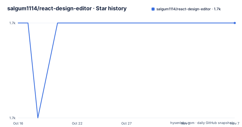
- salgum1114/react-design-editor1,710 ★ · +0
| Repository | 2026-10-16 | 2026-11-07 |
|---|---|---|
| salgum1114/react-design-editor | 1.7k | 1.7k |
0 Stars in the last 22 days, measured from the daily GitHub snapshot. Compare with other projects
Editorial analysis
Two features that are really two products
The README describes react-design-editor as a module for React, written in Javascript/Typescript, providing two primary features.
The first is an Image Editor: create images in React, draw diagrams and arrange compositions using the image editor and save the result to one of several export formats, providing functionality similar to Powerpoint. The second is Business Process Modelling: design flowcharts and process workflows in React and export the model to JSON, which can be imported back into the tool, a load and save round trip.
Those two features share almost nothing except a React codebase and an Ant Design theme, and that is worth noticing because it explains the shape of the package. The canvas half is a general-purpose Fabric.js editor. The workflow half is a graph editor with node types, ports and edges. The two live in the same repository and the same demo, and the module description says it provides two primary features, but they are separate applications that happen to share a style.
The primary language is TypeScript, the licence is MIT, and the homepage is a GitHub Pages site that doubles as the demo. The description in the repository's own metadata is the older, blunter version of the story: React Design Editor has started to developed direct manipulation of editable design tools like Powerpoint, we've developed it with reactjs, ant.design, fabricjs. Started to developed is doing real work in that sentence, and it is the most honest description of the project's state anywhere in the documentation.
The audience is a React developer who needs an editable canvas or a node graph inside their own application. The demo is at salgum1114.github.io/react-design-editor/, and the README says the project is being continually developed to support a variety of different functions.
The release history is short and recent: v0.1.3 on 2026-07-31, v0.1.4 on 2026-08-01 and v0.2.0 on 2026-08-25, with the package.json at 0.2.1. The last push was on 2026-10-11 and the repository is not archived.
The Canvas component and the handler object
The published package provides the Canvas component and its canvas handlers, and the README is explicit that toolbars, palettes and property panels shown in the demo can be built around this component as needed. That sentence is the most important one in the whole document for an adopter, because it means the npm package is the engine and the demo is a reference application.
The usage example shows the shape of it:
import { useRef } from 'react';
import { Canvas, type CanvasInstance } from 'react-design-editor';
import 'react-design-editor/react-design-editor.css';

export default function DesignCanvas() {
	const canvasRef = useRef<CanvasInstance | null>(null);

	const addRectangle = () => {
		canvasRef.current?.handler.add({
			type: 'rect',
			name: 'Rectangle',
			width: 160,
			height: 90,
			fill: '#5ee0bd',
			rx: 8,
			ry: 8,
		});
	};
The handler is reached through canvasRef.current.handler, and the README says you use it to add or remove objects, change the selection, control zoom, run undo/redo operations and import or export canvas data. The add call takes a Fabric.js-shaped object with type, name, width, height, fill and the corner radii rx and ry, which tells you the object model is Fabric.js's own rather than a bespoke one, and that is a significant piece of information for anyone planning to migrate a canvas elsewhere later.
The persistence path is the same model:
const saveCanvas = () => {
	const objects = canvasRef.current?.handler.exportJSON() ?? [];
	localStorage.setItem('design', JSON.stringify(objects));
};

const loadCanvas = async () => {
	const saved = localStorage.getItem('design');
	if (saved) {
		await canvasRef.current?.handler.importJSON(JSON.parse(saved));
	}
};
So a saved design is the Fabric.js JSON array, stored in whatever you like. There is no document format of its own, no schema, no migration path described, and the round trip depends entirely on Fabric.js's serialisation staying compatible. That is a feature if you want to interoperate with other Fabric.js code, and a liability if you want a stable file format.
One practical requirement is stated plainly: the parent element or the style prop must provide a visible height when responsive sizing is enabled. That is the kind of detail that costs an afternoon if you hit it without being told, and it appears in the README because the author has hit it.
The workflow editor, and labelled ports as its core idea
The BPM half is the more distinctive part of the package, and its feature list describes a graph editor rather than a diagram tool.
Build workflows with configurable trigger, logic, data and action nodes. Connect workflow nodes with labeled ports, multiple routes and automatic layout. Copy, paste and Ctrl-drag workflow nodes while preserving selected internal links and ports. Review workflow validation, canvas status and undo/redo history.
The node taxonomy is the interesting design decision. Trigger, logic, data and action is a description of what a node does in a process, not what it looks like, and it is a more useful decomposition than the usual shape-based categories. A trigger starts something, logic branches on it, data carries or transforms values, and an action does the thing. A process model built on those four kinds of node can be validated, because a logic node with no incoming trigger is an error the editor can point at.
Labelled ports are the other structural idea. A port carries a label, so an edge is not just a connection but a named channel, and a node can have several routes. That is what lets a workflow express a choice rather than a sequence, and it is also what makes the automatic layout possible, because a layout engine needs to know which ports are on which side and how many there are before it can route the edges.
The copy and paste behaviour is the detail that shows the level of care. Copying, pasting and Ctrl-dragging a node while preserving selected internal links and ports means the editor has to decide which of a node's connections travel with it, and doing that by default would break a workflow whose node is shared between two branches. Preserving only the selected links is a deliberate, opinionated choice.
The workflow side exports to JSON and imports back, the same round trip as the canvas. And the screenshot section shows the workflow editor separately from the four image map modes, which confirms the two are separate features sharing a project rather than one integrated tool.
The feature list, and what is still unchecked
The README's feature list is a checklist with boxes, and reading the boxes tells you what the project has actually finished.
Done: add, remove, resize, reorder, clone, copy/paste and drag/drop elements. Drawing capability with polygon, line, arrows and link support. Preview mode, tooltips, group/ungroup and zoom. Upload with drag/drop, import and export to JSON or image. Image cropping, image filters, alignment and zoom-aware alignment guides. Distance measurement guides and equal-spacing snap assistance. Snap to grid, rulers, context menu, animation and video elements. Icons in an icon picker and fonts from Google Fonts, twenty of them. HTML/CSS/JS elements and an iFrame element. Animation support with Fade, Bounce, Shake, Scaling, Rotation and Flash effects. A Monaco code editor with HTML, CSS and JavaScript preview. PowerPoint-style interactions, including selection, grab, Shift axis lock and Ctrl-drag duplication. Multiple layouts, with fixed, responsive, fullscreen and grid modes. SVG, Chart and GIF elements. Undo/Redo support. Light and dark editor themes.
Unchecked: wireframes, in development. Multiple Map, in development.
Two of those finished items deserve comment. Zoom-aware alignment guides and equal-spacing snap assistance are the kind of detail that separates a canvas people tolerate from a canvas people use, and they are the hardest to add later because they interact with every other transform. The PowerPoint-style interactions, grab, Shift axis lock and Ctrl-drag duplication, are an explicit statement of intent: the goal is to feel like the tool people already know, not like a canvas library demo.
The HTML/CSS/JS element and the iFrame element are the other notable entries, and they come with a security dimension that the README does not address. An editor that lets a user drop in arbitrary HTML, CSS and JavaScript and renders it in an iframe is a document editor that can execute code. If you build a product on this, the iframe sandboxing and the origin of the rendered content are decisions you have to make, and the README does not say how the module makes them.
The Monaco code editor with a live preview is a serious feature rather than a gadget, and it explains part of the dependency list. The topic tags include animejs for the animation effects, mediaelementjs for video elements, react-ace and fontawesome5 for the icon picker, and imagemap for the image map work that the original image editor was built around.
Installing it, and the packaging details that matter
Installation is a normal package install, either `npm install react-design-editor` or `yarn add react-design-editor`, and then the bundled stylesheet has to be imported from the app entry:
import 'react-design-editor/react-design-editor.css';That import is not optional decoration. The package.json declares style as dist/react-design-editor.css and the exports map has an explicit entry for ./react-design-editor.css, so the CSS is a separate export path rather than something injected by a side effect. A consumer who forgets the import gets an unstyled editor, and the exports map means there is no implicit fallback.
The distribution is a full multi-format package. main is dist/react-design-editor.cjs.js, module is dist/react-design-editor.es.js, unpkg is dist/react-design-editor.umd.js, typings is dist/types/index.d.ts, and the exports map routes types, import, require and default separately. So the library is consumable from ESM, from CommonJS, and from a script tag through the UMD build, and it ships declarations.
The build scripts show how it is put together. build runs clean, then build:demo, then build:lib, then typedoc, so a full build produces the demo site, the library bundle and the API documentation. build:demo is a plain vite build, and build:lib is vite build --mode lib followed by tsc --project tsconfig.build.json to emit the declarations. The README notes that library builds run with Vite only.
Running the demo locally is a four-step sequence:
git clone https://github.com/salgum1114/react-design-editor.git
npm install
npm start
and then the browser at http://localhost:4000, since start:dev is vite --host localhost --port 4000. There is a separate serve script previewing the demo build on port 4001, a ghpages script that builds and pushes the demo to GitHub Pages, and a deploy script that builds the library and publishes it to npm. There is also a release:notes script that runs node scripts/release-notes.js, and the repository has a MIGRATION.md, which is the file to read before upgrading across a version boundary.
The engines field requires Node >= 20.0, and the test setup is worth a small note. The plain test script is the npm placeholder that echoes an error and exits, so npm test does nothing useful, but test:unit runs vitest run. So the unit tests exist and are not wired to the default script, which is a small trap worth knowing about before you conclude there is no test suite.
Where react-design-editor is the wrong tool
There are three limits, and the first is the one that catches teams out.
The first is that the published package is only the canvas core, and everything you see in the demo around it is not in the package. The README says the published package provides the Canvas component and its canvas handlers, and that toolbars, palettes and property panels shown in the demo can be built around this component as needed. So the feature list in the README, which reads like a product description, mostly describes the demo application. The thing you install is a canvas with a handler.
That is a coherent choice and it is the right one for a library, but it means the work you are comparing against a product is yours. Building a usable editor is not a toolbar and a properties panel; it is a properties panel that knows which properties apply to the selected object type, an icon picker with categories, a layer list, a zoom control, a keyboard shortcut scheme, and all of it themed. The demo shows that the author did that work, and the README's screenshot of the fixed, responsive, fullscreen and preview modes is evidence that a lot of it exists, in the demo, in a repository you are not installing.
The second is the 0.x version line with a recent MIGRATION.md. The releases are 0.1.3, 0.1.4 and 0.2.0 within a few weeks in 2026, which means the public API is moving and you should expect to read the migration document when you upgrade. The package.json version is 0.2.1 while the last release tag listed is v0.2.0, so the tree is ahead of the tags, which is normal for an actively developed package but is a reminder that the API in the repository is not necessarily the API you get from npm.
The third is the rendering model, and it comes from Fabric.js. The object model is Fabric.js's, the serialisation is Fabric.js's JSON, and the whole editor is therefore coupled to a canvas library that works on a 2D context. That means the output is a raster canvas, not vector content, and anything you export is an image rather than an editable document. The README does mention SVG elements among the supported ones, but the fundamental point stands: if you need a design tool that produces a document other applications can open and edit, this is not it.
And a fourth point about the interactive elements. The HTML/CSS/JS element and the iFrame element, combined with the Monaco code editor and its live preview, mean the editor can run arbitrary code that the user wrote. For a tool intended for internal use that is a feature. For anything hosted and reachable by other users, the sandboxing policy is the question you have to answer before shipping, and the README does not answer it.
Editorial conclusion
Adopt react-design-editor if you are building a diagramming, annotation or process-modelling surface inside a React application and you want a canvas object model with transform, selection, clipboard and JSON persistence already handled. Do not adopt it as a design tool, since the package deliberately publishes only the canvas component and leaves the chrome to you, and check the version because the 0.x line is still changing shape. Verify first that the release you install exposes the handler methods you need, since the API is described in prose rather than in a versioned reference, and that the Fabric.js and Ant Design versions in your application are compatible with the ones the module expects.
Frequently asked questions
What does the react-design-editor package actually provide?
The published package provides the Canvas component and its canvas handlers, with toolbars, palettes and property panels left to the consumer. The README says these can be built around the component as needed, and the handler is reached through canvasRef.current.handler to add or remove objects, change selection, control zoom, run undo and redo, and import or export canvas data.
How do I install and import react-design-editor?
Run `npm install react-design-editor` or `yarn add react-design-editor`, then import the stylesheet from your app entry with `import 'react-design-editor/react-design-editor.css'`. The package exports the CSS at its own subpath, so the import is not optional if you want a styled editor.
What is the Business Process Modelling feature in react-design-editor?
It is a workflow editor with configurable trigger, logic, data and action nodes, connected through labelled ports with multiple routes and automatic layout. Nodes can be copied, pasted and Ctrl-dragged while preserving selected internal links and ports, and the model can be exported to JSON and imported back.
How is a design saved and reloaded in react-design-editor?
Through the handler's exportJSON and importJSON, so the persisted value is the Fabric.js JSON array of canvas objects. The README's example writes that array to localStorage as a string and reads it back, passing the parsed value to importJSON.
Official sources
Add this badge to your README
If you maintain this project, the badge below links readers to this analysis and shows its maintenance status from the daily GitHub snapshot. Paste the markdown into your README; add ?metric=license or ?metric=stars to the image URL for a different field.

[](https://hysenlabs.com/projects/salgum1114-react-design-editor)Star history chart for your README
[](https://hysenlabs.com/projects/salgum1114-react-design-editor)Was this useful?