SyntaxUI: Tailwind components you copy instead of install
Get free access to pre-built, Tailwind CSS-powered components, animations and effects - brought to life using Framer Motion. Just copy, paste and you're ready to go!
At a glance
- What is it?
- SyntaxUI is a gallery of pre-built Tailwind CSS components with Framer Motion interactions, and the way it is distributed is the interesting part: there is no package to add, the code is copied into your project and then customised, with the site itself being a Next.js and MDX application that renders, searches and highlights the snippets. It is a fast way to a working interface, and it comes with the usual trade of a snippet you now own.
- Who is it for?
- Adopt SyntaxUI when you need a polished interface quickly and the components are close enough to what you want that a copy and a restyle is cheaper than building, particularly for landing pages, dashboards and marketing surfaces that need motion. It is the wrong tool for a design system that has to stay consistent over time, because copied code diverges by definition, and the wrong tool if you need accessibility guarantees you did not implement.
- Can I use it commercially?
- Yes. MIT is a permissive licence: you can use, modify and sell software built on it, as long as you keep its copyright and licence notices.
- Is it still maintained?
- Yes. The repository last received commits 174 days ago.
- What is it written in?
- Mainly TypeScript, according to GitHub's language statistics.
Answers come from the project's GitHub data, last synced on November 7, 2026, and from our analysis. They are not legal advice.
Star history
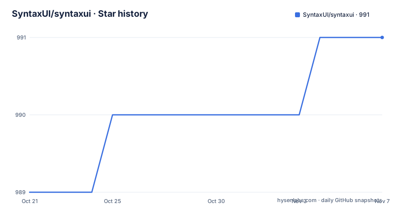
- SyntaxUI/syntaxui991 ★ · +2
| Repository | 2026-10-21 | 2026-11-07 |
|---|---|---|
| SyntaxUI/syntaxui | 989 | 991 |
2 Stars in the last 17 days, measured from the daily GitHub snapshot. Compare with other projects
Editorial analysis
The distribution model is the product
The repository description states the model in one sentence: get free access to pre-built, Tailwind CSS-powered components, animations and effects, brought to life using Framer Motion, and then just copy, paste and you are ready to go.
That last clause is the whole design. There is no npm package to install, no peer dependency to keep in step, no version to upgrade. What you take is a snippet of JSX and Tailwind classes, and it becomes part of your codebase, subject to your codebase's rules from that moment on.
This is the same approach that shadcn made popular, and the repository carries the tell for it, a components.json file at the root, which is the configuration file that marks a Tailwind project as set up for that workflow. The components.json, the Tailwind config, the typography plugin and the class composition utilities in the dependency list all point at the same conventions.
The benefits of copying are real. The component is in your repository, so your team can change it, your code review tools can see it, and there is no dependency to audit or to break. The costs are equally real and equally well known. Every copy is a fork, so twenty projects that copy the same button will have twenty slightly different buttons, and the library cannot ship a fix to any of them. The upgrade path is manual and per project, and the version drift is invisible until something breaks.
The README's own feature list is a fair summary of the trade: pre-built, customizable components for rapid development, powered by Tailwind CSS for easy styling, Framer Motion-enhanced interactions, and easy to use, just copy, paste and customize. The word customize appears twice, which is the honest framing.
The site is the catalogue, and its dependencies describe it
The repository is the site, and the dependency list in package.json is the most detailed description of how the product works.
The framework is Next.js at 15.5.18 with React 18.2, and the content is MDX, with the loader and the react packages from @mdx-js, the Next integration through @next/mdx, and remark and rehype plugins including remark-gfm and remark-mdx. The site is TypeScript, with an mdx-components.tsx file at the root that maps MDX elements to React components, which is the standard Next.js pattern for a content site.
The search is built on two libraries that do different jobs. @algolia/autocomplete-core provides the autocomplete shell for the search box, and flexsearch does the actual indexing, which is why the site can offer instant filtering without a hosted search service.
The component primitives come from Radix UI, with the popover, select, slot and tooltip packages, and from Headless UI, with the react package and the tailwindcss integration. Radix is the accessibility layer, which is the part that makes the components usable rather than merely pretty, and it is a good sign that the snippets depend on Radix rather than on hand-rolled divs.
Around those, the rest of the stack is the standard modern React set: class-variance-authority for variant definitions, clsx and tailwind-merge for class composition, next-themes for light and dark mode, sonner for toasts, lucide-react for icons, react-colorful for colour pickers, and the Geist typeface. On the site side there is @vercel/analytics and @vercel/speed-insights for traffic and performance measurement, and posthog-js for product analytics, with the public keys exposed through a .env.example that contains NEXT_PUBLIC_POSTHOG_KEY, NEXT_PUBLIC_POSTHOG_HOST and GITHUB_OAUTH_TOKEN.
That last file is worth a note, because it shows how the project is built and distributed. The package is private and versioned 0.1.0, and there is no publish step in the scripts, so the site is not a library, it is a catalogue.
The workflow, four steps, and the tooling that produces the snippets
The Getting Started section is four steps, and the numbering in the README skips a three, which is a small sign of a document that was edited over time rather than written in one pass.
The steps are: browse the components, choose the component you need and copy the code, paste the code into your project, and customise as needed to fit your project's style.
What the reader does not see in the README is how the snippets are produced, and the dependencies give it away. There is acorn, the JavaScript parser, alongside remark and rehype, the unified ecosystem processors, and mdx-annotations, a package for annotating MDX content. There is also a simple-functional-loader and a raw-loader, and a types.d.ts and a react-syntax-highlighter.d.ts at the root alongside a types directory, plus a fast-glob dependency that suggests the build walks the tree to find component files.
The reasonable reading of that set is that the site parses the component source at build time, annotates it, and renders it as MDX with syntax highlighting and type information, rather than storing the snippets as pre-rendered text. That is a build-time pipeline, and it is why the site can offer copy buttons, highlighted code and searchable component names without maintaining a parallel set of markdown files by hand. This is an inference from the dependency list rather than something the README states, so it is worth confirming in the source before relying on it.
The four scripts in the manifest are the whole build:
"scripts": {
    "dev": "next dev",
    "build": "next build",
    "start": "next start",
    "lint": "eslint ."
}
A standard Next.js project with a lint script, and no test script, no typecheck script and no build for a published package.
Credits, licence and the honesty about borrowed work
Two details in the README are worth more attention than they first appear.
The first is the credits file, linked from the README as a list of people who helped build the components or from whom I have taken the components. For a copy and paste component library, that is the load-bearing licence question, and the wording is admirably blunt: some of these components came from other people. A snippet built on someone else's work carries that person's terms, and a project that says so in the README is doing something most component galleries do not.
The second is the licence statement, which is MIT, and the link points at the LICENSE file in the repository under the name of the original author, ansub, which is the same name that appears in the star badge and in the Twitter badge in the header. The organisation in the repository path is SyntaxUI, and the individual behind it is the author whose handle appears throughout the badges. For a project of this kind that is normal, and it is worth knowing who you are dealing with when you are copying their code into a product.
The project also lists its sponsors, with Vercel in the header, which is a hosting relationship, and it has a Discord server and a Twitter account, plus the Repobeats activity graphic in the README, which is a generated image of recent commit activity.
The contributing guide is the one that carries a real instruction, and it is short: contributions are welcome, and if you would like to add new components or features, read the contributing guide. The repository also has a code of conduct, an .editorconfig and .vscode directory, a tailwind.config.ts, a typescript config, a prettier config and an eslint flat config in eslint.config.mjs. The lack of a test script in the manifest is the notable absence, and for a site that renders a catalogue rather than a library, that is defensible.
Maintenance, and what a copied component costs you
The repository is not archived and the last push was on 2026-05-18, and there are no GitHub releases, which is consistent with a project whose deliverable is a website rather than a versioned artefact. The package version in the manifest is 0.1.0 and the package is marked private, so there is no published version to pin and no changelog to read.
For a site that publishes components, the maintenance question is about the components rather than the site, and it is not answerable from the repository. If a component depends on a Radix primitive, then a Radix major version can change the API underneath the snippet, and you will find out when the component stops working rather than when the gallery updates. That is the concrete version of the copy and paste risk, and it is worth knowing which Radix packages and which major versions the components you use assume.
The other ongoing cost is accessibility, and here the news is better than the general case. Because the snippets are built on Radix and Headless UI rather than on plain elements, the keyboard behaviour, focus management and roles are largely handled by libraries that take that seriously. That does not transfer automatically. Radix gives you the behaviour, and the visual styling, the labelling and the contrast are in the snippet, and it is the labelling and the contrast that a copied component gets wrong most often, because they depend on your content rather than on the component.
The Framer Motion layer has a similar shape. An animation that reads well in the gallery may not read well in your product, and the motion preferences of your users are not the ones the snippet was tuned for.
So the honest summary is that SyntaxUI gets you a good-looking starting point in minutes, and the work moves rather than disappears. What you take on is keeping the copied code current, keeping the accessible behaviour correct for your content, and accepting that you now own a fork of every snippet you use.
Editorial conclusion
Adopt SyntaxUI when you need a polished interface quickly and the components are close enough to what you want that a copy and a restyle is cheaper than building, particularly for landing pages, dashboards and marketing surfaces that need motion. It is the wrong tool for a design system that has to stay consistent over time, because copied code diverges by definition, and the wrong tool if you need accessibility guarantees you did not implement. Before copying anything, read the credits file, check the accessibility behaviour of the component in a real screen reader, and confirm that the dependencies the snippet assumes, Tailwind, Framer Motion and the Radix primitive it uses, match the versions in your project.
Frequently asked questions
How does SyntaxUI distribute its components?
As code you copy into your project. The README describes copying and pasting a component into your project and then customising it, rather than installing a package, and the repository carries a components.json file, which is the marker of that workflow.
What is SyntaxUI built on?
The site is a Next.js 15 and React 18 application with MDX content processed by remark and rehype, Tailwind CSS for styling, Radix UI and Headless UI for the component primitives, Framer Motion for the animations, and Algolia autocomplete with flexsearch for search.
Is there a package to install from SyntaxUI?
No. The package.json is marked private with version 0.1.0, and there is no publish step in the scripts, so the deliverable is the site and the snippets rather than a library.
Who owns the components that SyntaxUI publishes?
The README links a credits file listing the people who helped build the components or from whom the author took the components, which matters because a copied snippet carries the terms of whoever wrote it. The project itself is MIT licensed.
What should I check before using a SyntaxUI component in a product?
The credit for that component, the accessibility behaviour of the specific component in a screen reader with your own labels and content, and the versions of Tailwind, Framer Motion and the Radix primitive that the snippet assumes against the versions in your project, since copied code does not receive upstream fixes.
Official sources
Add this badge to your README
If you maintain this project, the badge below links readers to this analysis and shows its maintenance status from the daily GitHub snapshot. Paste the markdown into your README; add ?metric=license or ?metric=stars to the image URL for a different field.

[](https://hysenlabs.com/projects/syntaxui-syntaxui)Star history chart for your README
[](https://hysenlabs.com/projects/syntaxui-syntaxui)Was this useful?