Tokenami: atomic CSS variables for a type-safe design system, with no runtime injection
The utility-first CSS lib for type-safe design systems. No runtime injection, no class soup, no specificity wars—just predictable styling with atomic CSS variables.
At a glance
- What is it?
- Tokenami is an MIT licensed utility-first CSS library for TypeScript projects that generates static styles at build time, so there is no runtime injection, no class soup and no specificity wars, with a roughly 2.6 kb runtime helper and a TypeScript plugin. It suits a typed component library that needs one theme to travel across React, Preact, Vue, Solid and Qwik, and it is the wrong choice if you want a component library shipped as ready-made React components.
- Who is it for?
- Tokenami fits a team building a typed design system where the design tokens live in TypeScript and the compiled output has to be plain CSS, because the atomic variable approach removes both the specificity problem and the runtime cost, and the type layer means a mistyped utility is a compile error.
- Can I use it commercially?
- Yes. MIT is a permissive licence: you can use, modify and sell software built on it, as long as you keep its copyright and licence notices.
- Is it still maintained?
- Yes. The repository last received commits 57 days ago.
- What is it written in?
- Mainly TypeScript, according to GitHub's language statistics.
Answers come from the project's GitHub data, last synced on November 7, 2026, and from our analysis. They are not legal advice.
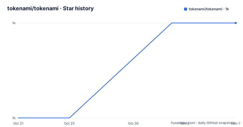
Star history
- tokenami/tokenami1,023 ★ · +1
| Repository | 2026-10-21 | 2026-11-07 |
|---|---|---|
| tokenami/tokenami | 1k | 1k |
1 Stars in the last 17 days, measured from the daily GitHub snapshot. Compare with other projects
Editorial analysis
The pitch is just-in-time CSS without a runtime
Tokenami describes itself as a modern approach to just-in-time CSS using atomic CSS variables, with no bundler required, and the repository description frames it as the utility-first CSS lib for type-safe design systems with no runtime injection, no class soup and no specificity wars. The distinction from a conventional utility framework is worth spelling out. In a typical utility library the class names carry the values, so the generated stylesheet grows with the number of distinct class combinations. Tokenami instead turns the values into CSS custom properties, and the classes are stable, so the same set of variables can be reused across a design system and the output is a static stylesheet you can inspect. The homepage is tokenami.com, the project is MIT licensed, and the last push was on 2026-09-11.
Installation is a package, an init and a config file
There are two supported setups, a Vite plugin and a CLI, and the first steps of both are the same. The packages install as a dev dependency for the tooling plus a runtime dependency for the css helper.
npm install -D tokenami @tokenami/unplugin && npm install @tokenami/cssThen you initialise the project, which writes the configuration and the environment type definitions.
npx tokenami initThe TypeScript side is configured in tsconfig.json or jsconfig.json, with the generated type file included and the plugin registered.
{
  "include": [".tokenami/tokenami.env.d.ts", "src"],
  "compilerOptions": {
    "plugins": [{ "name": "tokenami" }]
  }
}
The Vite path then registers the plugin and points it at an output file.
import * as tokenami from '@tokenami/unplugin';
import { defineConfig } from 'vite';

export default defineConfig({
  plugins: [tokenami.vite({ output: './src/styles.css' })],
});
The CLI path skips the bundler entirely and watches the source instead.
npx tokenami --output ./public/styles.css --watchThe README is explicit that only Vite is supported for the plugin route for now, and that other bundlers and frameworks should use the CLI setup.
The runtime helper is small but not optional
The installation section describes what Tokenami generates: static styles, a lightweight utility of roughly 2.6 kb for specificity-safe style composition, and a TypeScript plugin for the developer experience. That 2.6 kb figure is a bundlephobia measurement of the @tokenami/css package, and the repository enforces a budget on it, with a size-limit configuration in the root package.json setting a 3.5 kB limit gzipped for packages/@tokenami-css/dist/index.js. There is also a size:why script that runs size-limit with the why flag, so when a change pushes the runtime over budget the tool explains which import caused it. The helper is what composes class names and style objects, and the README shows how to configure it so it does not double-escape characters that Vite has already escaped.
import { createCss } from '@tokenami/css';
import config from '../.tokenami/tokenami.config';

export const css = createCss(config, { escapeSpecialChars: false });
Styles are declared as CSS variables with a dashed prefix
The getting started example shows the style authoring format, and it explains a lot about the design. A composed style is an object whose keys are CSS property names prefixed with two dashes, so the values become custom properties rather than utility class names.
const button = css.compose({
  '--display': 'flex',
  '--align-items': 'center',
  '--justify-content': 'center',
  '--background-color': 'var(--color_gray5)',
  '--color': 'var(--color_gray12)',
  '--gap': 0.5,

  '--hover_background-color': 'var(--color_gray6)',
  '--hover_color': 'var(--color_gray12)',

  variants: {
    size: {
      default: { '--padding-block': 1, '--padding-inline': 3 },
The double-dash prefix is what makes the specificity predictable, since every rule targets a custom property rather than the element, and a pseudo-state such as --hover_background-color becomes a rule scoped to the hover state. The values themselves reference other variables, here the gray scale of a theme, which is how the theming works without regenerating the stylesheet.
Variants and TypeScript types come from the same object
The example also shows the type story, and it is the part that distinguishes Tokenami from a utility library with a types package bolted on. The Variants and TokenamiStyle types are imported from @tokenami/css, and the variant configuration is inferred from the composed style object.
import { css, type Variants, type TokenamiStyle } from '@tokenami/css';

type ButtonVariants = Variants<typeof button>;
type ButtonElementProps = TokenamiStyle<React.ComponentProps<'button'>>;
interface ButtonProps extends ButtonElementProps, ButtonVariants {}

function Button({ size = 'default', ...props }: ButtonProps) {
  const [cn, sx] = button({ size });
  return <button {...props} className={cn(props.className)} style={sx(props.style)} />;
}
The variant keys become the props of the component, so a size prop is typed from the variant object rather than declared separately, and the returned pair gives you a class name merger and a style merger, which is what keeps overrides working without specificity games. The README also covers one-off styles, extending styles, and a createCss entry point for building your own higher-level helpers.
Theming is a set of variables, and a design system is a config file
The core concepts section covers theming, grid values, arbitrary selectors and arbitrary values, and the design systems section splits into using the official system and building your own. Theming works through properties, and the README has a dedicated section on theming properties and on custom properties, so a theme is a set of variables that a component reads rather than a set of hard-coded values. Grid values are the units that make spacing consistent, and arbitrary selectors and arbitrary values are the escape hatches for the cases the grid does not cover. Global styles, breakpoints and animation are also first-class, which is the part that separates a design system from a bag of utilities.
A monorepo with five framework examples and a size budget
The repository root shows a pnpm workspace with turbo driving the build, a lerna.json, packages/ holding the published libraries, examples/ with a design-system example and a nextjs example, and a visual-tests/ directory. The root package.json is the monorepo package, @tokenami/monorepo, with a postinstall that builds the packages, a release script that runs auto shipit, and separate dev scripts for the design system and the Next.js example, the latter running both the app and the CSS watcher. The supported frameworks are shown as logos in the README header, React, Preact, Vue, SolidJS and Qwik, and the TypeScript integration section covers utility types and CI setup, with a troubleshooting section for enabling string completions, supported libraries, supported browsers and supported editors, plus a Browserslist note.
Editorial conclusion
Tokenami fits a team building a typed design system where the design tokens live in TypeScript and the compiled output has to be plain CSS, because the atomic variable approach removes both the specificity problem and the runtime cost, and the type layer means a mistyped utility is a compile error. It is a poor fit if you want a component library, since the repository ships the styling primitives rather than finished components, and a poor fit if you are on a framework without a Tokenami integration. Verify first which frameworks are supported, since the README notes that only Vite is supported for the plugin path for now and other bundlers need the CLI route, and check whether the ~2.6 kb runtime helper fits your budget, since that is on top of the generated CSS rather than instead of it.
Frequently asked questions
How do I install Tokenami?
With npm install -D tokenami @tokenami/unplugin and npm install @tokenami/css for the Vite path, or npm install -D tokenami with the same runtime package for the CLI path, then npx tokenami init to create the project configuration. The README also offers a Vite starter repository to jump from.
Does Tokenami inject styles at runtime?
No. The repository description states there is no runtime injection, and the approach is just-in-time CSS using atomic CSS variables that generate static styles. A small runtime helper of about 2.6 kb remains for specificity-safe style composition, with a size budget of 3.5 kB gzipped enforced by size-limit.
Which frameworks does Tokenami support?
The README header shows support for React, Preact, Vue, SolidJS and Qwik. For the plugin route only Vite is supported for now, and the README says other bundlers and frameworks should use the CLI setup instead.
How are variants typed in Tokenami?
Variants are declared inside the composed style object, and the Variants and TokenamiStyle types are inferred from it, so a component props interface extends the inferred element props and the inferred variants. The component then calls the composed style with the chosen variant to get a class name merger and a style merger.
Official sources
Add this badge to your README
If you maintain this project, the badge below links readers to this analysis and shows its maintenance status from the daily GitHub snapshot. Paste the markdown into your README; add ?metric=license or ?metric=stars to the image URL for a different field.

[](https://hysenlabs.com/projects/tokenami-tokenami)Star history chart for your README
[](https://hysenlabs.com/projects/tokenami-tokenami)Was this useful?