Storefront UI installs its own icons, fetches browserslist, and asks you to trust two bold claims
A frontend library for React and Vue that helps developers quickly build fast, accessible, and beautiful storefronts. Made with 💚 by Vue Storefront team and contributors.
At a glance
- What is it?
- Storefront UI is a Tailwind based component library for Vue and React aimed at eCommerce, published as three scoped packages. Its monorepo root is private, its postinstall rewrites source files, and its two headline claims about Lighthouse scores and WCAG compliance arrive with no audit attached.
- Who is it for?
- Storefront UI is worth evaluating if your team already runs Tailwind and wants eCommerce specific pieces such as ProductCard, QuantitySelector and checkout blocks in both Vue and React from one design source. Before you commit, run the postinstall and read what it rewrote, because yarn install generates icon sets and then lints them unless NOT_GENERATE_ICON is set, and remember that the Lighthouse and WCAG AA lines in the README carry no report, no page list, and no date.
- Can I use it commercially?
- Yes. MIT is a permissive licence: you can use, modify and sell software built on it, as long as you keep its copyright and licence notices.
- Is it still maintained?
- Yes. The repository last received commits 7 days ago.
- What is it written in?
- Mainly TypeScript, according to GitHub's language statistics.
Answers come from the project's GitHub data, last synced on November 15, 2026, and from our analysis. They are not legal advice.
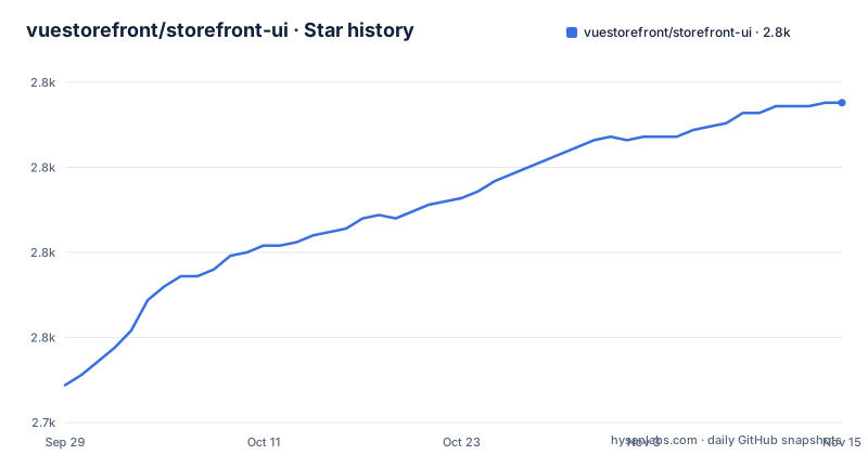
Star history
- vuestorefront/storefront-ui2,819 ★ · +83
| Repository | 2026-09-29 | 2026-11-15 |
|---|---|---|
| vuestorefront/storefront-ui | 2.7k | 2.8k |
83 Stars in the last 47 days, measured from the daily GitHub snapshot. Compare with other projects
Editorial analysis
The default branch is v2-develop, the docs say v2, the packages say 3 and 4
Three versioning systems are running at once in this repository. The default branch is named v2-develop. The documentation links in the README point at paths that begin with a v2 segment, for example docs.storefrontui.io/v2/vue/getting-started.html and the matching React page, and the Figma link names the file SFUI 2 Design Kit v2.7. Meanwhile the three packages that actually ship carry unrelated numbers: @storefront-ui/vue at 3.1.4, @storefront-ui/tailwind-config at 3.1.2, and @storefront-ui/react at 4.0.3. All three were published at the same instant on 2026-09-01, which tells you the release is coordinated even though the majors are not aligned. The React package being a full major ahead of the Vue one is the detail to check before you assume the two framework implementations are feature-equivalent. The last push is dated 2026-09-29.
A postinstall generates icon sets and then runs the linter over them
Installing this repository changes files in it. The postinstall script reads as node hasEnv NOT_GENERATE_ICON || yarn generate-icons, a short circuit through a root level helper called hasEnv.js, so on any machine that has not set NOT_GENERATE_ICON the install proceeds to generate-icons, which runs createVueIcons, then createReactIcons, then lint:fix:sfui. That last step is the surprising part. A plain yarn install generates two icon sets from createIcons.js and then runs the task runner's lint:fix:sfui across the SFUI packages, rewriting whatever the generator produced. The main build does the same thing, chaining update-browserlist-db, generate-icons, build:peer-next, and then turbo run build. There is an escape hatch, and it is a single environment variable, but nothing in the local development instructions mentions it. The prepare script adds a second post install effect by initialising husky, so a fresh clone ends up with git hooks wired up before you have edited anything.
yarn dev downloads the browserslist database before it builds anything
The dev script is not a dev server. It is yarn update-browserlist-db, then yarn build:peer-next, then yarn build:nuxt-module, then yarn build:react, then turbo run dev --parallel. The first of those runs yarn dlx browserslist@latest, which fetches the current caniuse data from the registry every time you start. So the documented way to work on this project assumes a working network connection and a registry round trip before any preview boots, and it assumes three packages get built first. Only after all of that does the parallel task run bring up both previews, the Nuxt one for Vue and the Next one for React. The tree also carries a .browserslistrc and a .nvmrc, so the target browsers and the Node version are pinned as configuration while the browserslist data behind them is refreshed on every single start. There are two other entry points, dev:docs, which repeats the browserslist refresh and then runs the docs, and dev:shared, which runs only the shared package watch, so the three ways of starting work do not build the same set of packages first.
Even yarn lint needs three packages built first
Read the lint script as yarn build:typography, then yarn build:peer-next, then yarn build:vue, then turbo run lint. Linting is gated behind three builds, and the build script in turn triggers generate-icons and another browserslist fetch. The dependency order comes from turbo.json and the nine workspace globs in the root package.json, and those globs overlap. apps/* already covers apps/shared and apps/preview, yet apps/shared is listed again on its own line, and apps/preview/* sits alongside the apps/* entry that reaches the same packages. The root package is private at version 0.0.0, so nothing here is published from the root; the publishable units are the scoped packages under packages/sfui and its frameworks subdirectory. Alongside the task runner the repository carries .changeset for version bumps, commitlint.config.js, a .husky directory, and renovate.json. Four top level directories sit outside the workspace globs that matter to a build: _readme, _templates, .cursor for editor agent rules, and .vuestorefrontcloud. The links section points at Alokai alongside the documentation and at two hosted playgrounds, play-vue.vuestorefront.io and play-react.vuestorefront.io, one per framework.
The 95 to 100 Lighthouse number names no report and no page list
The performance section of the README makes a specific numeric claim in bold: all standard eCommerce pages that we have built with Storefront UI hit 95 to 100 on Lighthouse, with mobile performance measured using PSI. Read carefully, three things are missing. There is no link to any Lighthouse or PSI report. There is no list of which pages count as standard eCommerce pages, and no date for the measurement. And the subject is pages the team built, not the library measured in isolation, so the number covers their pages rather than a controlled sample. None of that makes the claim false, and the reasoning behind it is sound, since a component library can be a bottleneck and the Lighthouse score is a reasonable thing to watch. It is still a number a buyer cannot check, which is a different thing from a number they can.
WCAG AA compliance is asserted, and the link backs the law, not the audit
The accessibility section is built the same way and the contrast is instructive. The bold claim is that Storefront UI components are WCAG AA compliant out of the box. The supporting link points to a law firm's page about web accessibility being a legal requirement in the United States, and the surrounding text argues that you risk fines if a regulator determines your site is non-compliant. So the citation substantiates the claim that accessibility carries legal exposure, which is a different claim from the one it is placed next to. Nothing in the file names an audit, an auditor, a date, or a conformance report. That matters more here than it would for an ordinary component library, because the sentence itself tells you the buyer is exposed to fines. A bold conformance claim with a legal citation attached is the combination most likely to be repeated by a marketing team without anyone re-running the check.
build:replace-assets-url-with rewrites preview pages into a public bucket
One script in the manifest publishes assets, and it is worth reading in full. It invokes frs-replace with the literal pattern http://localhost:3100/@assets/ and the replacement https://storage.googleapis.com/sfui_docs_artifacts_bucket_public/$ENV_NAME/, scoped to apps/preview/*/pages/**/* with the preserve-structure option and an output of the current directory. Two things follow. The rewrite is keyed to an environment variable named ENV_NAME with no validation in the script, so an unset or misspelled value produces URLs pointing at the wrong or no prefix. And the operation is in place on your working tree, not in a build artifact, so running it leaves modified page files behind. The name of the script repeats the URL it matches, which is at least an honest signal about what the command does before you run it.
Customization means base components plus copy-pasteable Blocks
The README is direct about where this library expects to beat its peers, and the mechanism is worth understanding before you evaluate it. The argument is that most libraries fail when components need heavy customization, and that you end up working against the library. The answer offered is a split between small, flexible base components such as Button, Checkbox, and Modal, which you assemble into more complex things yourself, and larger examples called Blocks, such as ProductCard or a different set of checkout steps, which are delivered as copy-pasteable code built from SFUI components and Tailwind utilities. On top of those sit composables such as useDropdown that abstract complex UI interactions, a Tailwind preset that maps tailwind config to CSS variables with a few SFUI specific defaults, a Typography package for third party fonts, and a Figma file kept as a pixel-perfect representation of the components. The Blocks approach means you own the code you copy, which is also what makes a library shared across visually different projects workable. The README names that inheritance case directly, a library that one project adopts and customises, where several downstream projects have to look different from each other while sharing the same base. The eCommerce focus is the third argument, and the components named for it are ProductCard, QuantitySelector, and checkout pieces. Nothing in the repository documents a theme object or a single place to change brand colour, so the CSS variable mapping in the preset is the closest thing to a theming surface the project describes.
Editorial conclusion
Storefront UI is worth evaluating if your team already runs Tailwind and wants eCommerce specific pieces such as ProductCard, QuantitySelector and checkout blocks in both Vue and React from one design source. Before you commit, run the postinstall and read what it rewrote, because yarn install generates icon sets and then lints them unless NOT_GENERATE_ICON is set, and remember that the Lighthouse and WCAG AA lines in the README carry no report, no page list, and no date. Check the version you actually install: the repository's default branch is v2-develop, the documentation URLs carry a v2 segment, and the three published packages sit at 3.1.4, 3.1.2, and 4.0.3.
Frequently asked questions
What is Storefront UI?
A Tailwind based component library and design system for eCommerce, published separately for Vue and React. It ships base components such as Button, Checkbox, Input, and Modal, Blocks such as ProductCard and checkout steps, composables like useDropdown, a Tailwind preset mapping config to CSS variables, a Typography package, and a Figma file.
Which packages does Storefront UI publish?
Three scoped packages appear in the release history: @storefront-ui/vue at 3.1.4, @storefront-ui/tailwind-config at 3.1.2, and @storefront-ui/react at 4.0.3, all published at the same moment. The monorepo root package is private and pinned at version 0.0.0, so it is never published itself.
How do I run Storefront UI locally?
Run yarn in the root directory to install, then yarn dev to start both previews, a Nuxt one for Vue and a Next one for React. To run only one, go to /apps/preview/nuxt or /apps/preview/next. Three subdependencies have to be built: @storefront-ui/shared, @storefront-ui/tw-plugin-peer-next, and @storefront-ui/typography.
Does Storefront UI require Tailwind CSS?
Yes. It is described as a framework agnostic UI library and design system for eCommerce based on TailwindCSS. The Tailwind preset maps tailwind config to CSS variables and adds a few SFUI specific defaults, and the Blocks are delivered as copy-pasteable code using SFUI components and Tailwind utilities.
What does Storefront UI claim about performance and accessibility?
That all standard eCommerce pages the team built with it hit 95 to 100 on Lighthouse, mobile performance measured using PSI, and that the components are WCAG AA compliant out of the box. Neither line in that file names an audit report, a list of the pages measured, or a date, and the accessibility link points to a page about legal requirements rather than to an audit.
Official sources
Add this badge to your README
If you maintain this project, the badge below links readers to this analysis and shows its maintenance status from the daily GitHub snapshot. Paste the markdown into your README; add ?metric=license or ?metric=stars to the image URL for a different field.

[](https://hysenlabs.com/projects/vuestorefront-storefront-ui)Star history chart for your README
[](https://hysenlabs.com/projects/vuestorefront-storefront-ui)Was this useful?