Cal Sans v2: one variable file with a GEOM axis and four named families
The home for our Cal Sans font.
At a glance
- What is it?
- Cal Sans is an OFL-1.1 variable typeface shipped from a Python build pipeline, with optical sizing, a primary GEOM axis that slides between accessibility-first and fully geometric letterforms, and a Flex build that morphs between the named families. The interesting engineering is in the axis set and the npm packaging.
- Who is it for?
- Adopt Cal Sans v2 if you want one binary to cover fine-print UI through hero display and you care about small-size legibility, because the per-size drawings and the A11y end of the GEOM axis are work you would otherwise commission yourself. Do not adopt it if you need the intermediate family shapes to morph rather than switch, unless you specifically take Cal Sans Flex, since in the standard build compatible letterforms switch cleanly at the named boundaries instead.
- Can I use it commercially?
- Check first. The repository uses a licence we do not classify automatically, so read its LICENSE file before any commercial use.
- Is it still maintained?
- Yes. The repository last received commits 4 days ago.
- What is it written in?
- Mainly Python, according to GitHub's language statistics.
Answers come from the project's GitHub data, last synced on November 6, 2026, and from our analysis. They are not legal advice.
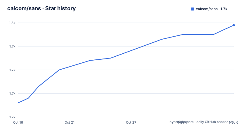
Star history
- calcom/sans1,749 ★ · +33
| Repository | 2026-10-16 | 2026-11-06 |
|---|---|---|
| calcom/sans | 1.7k | 1.7k |
33 Stars in the last 21 days, measured from the daily GitHub snapshot. Compare with other projects
Editorial analysis
One file, and the CSS is two declarations
The headline claim of Cal Sans v2 is stated as "Every size. Every surface. One file." A single variable font covers fine-print UI at 8 pt through hero display at 45, adapting proportions, spacing and geometry continuously in between. That is a real engineering decision rather than marketing, because most families handle small sizes by drawing a separate cut, and you end up with a stack of files and a matching `font-size` rule per step.
Integrating it is two declarations:
font-family: "Cal Sans";
font-optical-sizing: auto;
The second line is the load-bearing one. Optical sizing only does something if the browser applies the `opsz` axis automatically, which is what `font-optical-sizing: auto` requests. Where it is not honoured, you get a font that still works but loses the small-size compensation the design work was spent on. This is the first thing to check in any environment you deploy to.
The repository reflects a typeface project that treats its build as software. There is a `requirements.txt` listing glyphsLib, fontTools, fontmake, tqdm, uharfbuzz and brotli, a `scripts/` directory, `sources/` for design sources, `fonts/` for output, `reference/` for comparison material, and `documentation/`. There is also an `.nvmrc` and a `packages/` directory, so parts of the pipeline run through Node even though the Python font toolchain is the core.
npm ships woff2 and ttf, not the sources
The npm package is named `cal-sans` and its description is "Geometric sans-serif typeface to adorn the headlines and interfaces of Cal.com". The author field credits Mark Davis. What matters is the `files` array, which is the whole story of what consumers actually get:
"files": [
  "fonts/calsans-var-full/*.woff2",
  "fonts/calsans-var-full/*.ttf",
  "index.css",
  "OFL.txt"
]
Only the variable font binaries in woff2 and ttf form, plus a stylesheet and the licence text. The design sources, the build scripts and the reference material are not in the package. The entry point is `index.css`, with `main` pointing at it and `sideEffects` set to false, which lets a bundler drop it safely when the package is imported but unused.
Two small details are worth noting. `prettier` config is embedded in package.json with a print width of 120 and double quotes, which tells you the project formats itself from that manifest. And `publishConfig` pins the public npm registry explicitly.
Version numbers in this repository are worth reading carefully. The package version is 2.1.0, the README is headed Cal Sans v2, and the recent releases are tagged v2.010 on 2026-10-07 and v2.003 on 2026-09-21. A typeface uses typographic versioning where 2.010 means minor 2, build 10, so the npm semver and the font version do not map onto each other one to one. Pin deliberately rather than assuming.
The GEOM axis is the design argument
The README puts the typeface in a lineage explicitly: if Inter is Univers and Geist is Helvetica, Cal Sans is Futura. The justification given is a historical one. The original metal was cut size by size, Bauer cut it in metal down to 6 pt, and digital revivals flattened that discipline into one drawing that was then scaled. Cal Sans attempts to restore it.
Concretely, the 45 pt and the 10 pt styles are separate drawings. Corners blunt as sizes fall, overshoots ease, spacing is cut per size and keeps widening through OpenType below 10 pt, and at 8 pt the letter a grows a tail for the hardest settings.
`GEOM` is the axis everything else orbits, and it is the most interesting thing in the project. Sliding it moves the letterforms from accessibility-first neutrality to full geometry, passing through four named families on the way: A11y at 0, UI at 25, Base at 50 and Geo at 100. Four typefaces in one axis.
The distinction between the standard build and Cal Sans Flex is the practical detail. In the standard build, compatible letterforms switch cleanly at the boundaries, so A11y, UI, Base and Geo are discrete states you land on. In Flex they morph between each other, a humanist shape flowing into a geometric one mid-slide. That is a different file and a different rendering experience, and the README does not say which npm entry point corresponds to each, so you will need to look in `fonts/`.
Weight, YTAS, SHRP and a real italic
Beyond GEOM there are the tuning axes. Weight `wght` runs 400 to 700. `YTAS` raises the ascenders for taller, airier headlines. `SHRP` sharpens the corners for display work. And the italics are described as real italics drawn at 9.5 degrees, powered by Sebastian Carewe's Italify, not slanted by the browser.
That last point is the one with the most practical consequence. A browser-synthesised oblique is a transform applied to the regular glyphs, which changes apparent weight, breaks curves subtly, and looks wrong next to real italic text on the same page. If a design has italics at all, this is the axis that decides whether it will look deliberate.
The README is explicit about the philosophy of the named instances: they cover one optical size and four weights per family, and everything else is a tweak from there, with the line "instances are the starting points, the axes are the range". In practice that means a designer starts from a named instance and moves axes from there, rather than choosing from a list of hundreds of pre-cut styles. Full axis documentation lives in `fonts/README.md` in the repository, which is the file to read before you start tuning anything.
There is also a legibility argument in the README that is worth taking seriously as a design position rather than as a technique to copy. It suggests simulating the inevitable bad conditions, specifically blurring the type, which stands in for quickly-moving eyes, poor light, a far screen, or degenerative optical conditions, and says that this is what separates beautiful type designs from the dryly functional.
Cal Sans UI Text and the proportion that decides a component
The README devotes a section to why this font works in interface components rather than only in headlines. Two measurements are named as decisive: how tall the lowercase runs against the caps, and how far the line box sits off cap-center.
Cal Sans UI Text is stated to hold its x-height at 71.5 percent of cap height, described as the classic UI proportion, rather than the taller lowercase of Inter and SF Pro. That is a specific, checkable number, and it is the sort of decision that either works for your product or does not. A taller lowercase reads well in body copy and eats vertical space in dense lists, tables and buttons.
The comparison image in the documentation is captioned as Cal Sans UI Text cap height and x-height against other UI typefaces at 14px, so 14px is the size the design is being judged at in its own materials.
The family naming maps onto use cases rather than weights: Cal Sans UI, Cal Sans Text, Cal Sans Geo and the base Cal Sans appear together in a line-set image across every weight, described as easy to use like the Cal Sans UI product they are named after. For a team choosing a typeface, this is the practical framing: which of the four named families on the GEOM axis does a given surface want, and does the answer differ between your marketing site and your scheduling UI.
Licence, provenance and where it is going next
Cal Sans is under the SIL Open Font License, Version 1.1, and the README is explicit that it is free for commercial and personal use. That is one of the more permissive and better understood licences in the type world, and the `OFL.txt` file ships in the npm package so the terms travel with the binaries.
Provenance is recorded in the repository rather than implied. The font was commissioned by Peer Richelsen for Cal.com, and drawn, engineered and shipped by WORDMARK. The repository root carries `AUTHORS.txt` and `CONTRIBUTORS.txt` alongside `OFL.txt`, which is the conventional OFL attribution set and means the designers and font engineers are named in the artefact itself.
Distribution is broadening. It is available now via npm, described as coming to Google Fonts, and there is an Adobe Fonts request through UserVoice that the README frames as something that could happen with help. Each of those channels changes who can get the font without npm, which matters for a brand typeface where the practical concern is often that a contractor or a marketing tool cannot install it.
The project is active. The last push was on 2026-10-15, and the previous font release was v2.003 on 2026-09-21. The original v1.0.0 Launch Fonts release is from 2021-11-04. The gap between v1 and the v2 line is the interesting part of the history: the second generation is a reworking with a real axis architecture rather than a re-release of the same drawings.
Editorial conclusion
Adopt Cal Sans v2 if you want one binary to cover fine-print UI through hero display and you care about small-size legibility, because the per-size drawings and the A11y end of the GEOM axis are work you would otherwise commission yourself. Do not adopt it if you need the intermediate family shapes to morph rather than switch, unless you specifically take Cal Sans Flex, since in the standard build compatible letterforms switch cleanly at the named boundaries instead. Verify first that `font-optical-sizing: auto` is actually honoured in your render path, then read fonts/README.md for the full axis documentation and check the named instances, which the README says cover one optical size and four weights per family.
Frequently asked questions
How do I add Cal Sans to a project?
The package is `cal-sans` on npm. Its entry point is index.css and the published files are the variable woff2 and ttf binaries plus index.css and OFL.txt. In CSS you set `font-family: "Cal Sans"` together with `font-optical-sizing: auto`.
What is the GEOM axis in Cal Sans v2?
GEOM is the axis the other axes orbit. Sliding it moves letterforms from accessibility-first neutrality to full geometry, passing four named families: A11y at 0, UI at 25, Base at 50 and Geo at 100. Full axis documentation is in fonts/README.md in the repository.
What is the difference between Cal Sans and Cal Sans Flex?
In the standard build, compatible letterforms switch cleanly at the GEOM family boundaries. In Cal Sans Flex they morph between each other, so a humanist form flows into a geometric one mid-slide rather than jumping at the boundary.
Can I use Cal Sans commercially?
Yes. The font is released under the SIL Open Font License, Version 1.1, and the README states it is free for commercial and personal use. The npm package includes OFL.txt, and the repository records the commission and the design and engineering credits in AUTHORS.txt and CONTRIBUTORS.txt.
Does Cal Sans have real italics?
The README describes real italics drawn at 9.5 degrees, powered by Sebastian Carewe's Italify, rather than being slanted by the browser. The weight axis runs from 400 to 700, with `YTAS` for ascender height and `SHRP` for corner sharpness.
Official sources
Add this badge to your README
If you maintain this project, the badge below links readers to this analysis and shows its maintenance status from the daily GitHub snapshot. Paste the markdown into your README; add ?metric=license or ?metric=stars to the image URL for a different field.

[](https://hysenlabs.com/projects/calcom-sans)Star history chart for your README
[](https://hysenlabs.com/projects/calcom-sans)Was this useful?