Liquid Glass in React Native stops adapting text colour at a height of 65 or more
Liquid Glass in React Native
At a glance
- What is it?
- @callstack/liquid-glass is an MIT-licensed React Native module that renders the iOS 26 liquid glass material with tint colours, two effect modes and merging glass elements. It needs Xcode 26 and React Native 0.80 or later, does not work in Expo Go, and degrades to a plain View below iOS 26.
- Who is it for?
- Use this module when your React Native app is iOS only, built with Xcode 26 on React Native 0.80 or later, and you want the system glass material rather than a hand-rolled blur. Do not adopt it for Android or for Expo Go, both of which the README rules out, and do not rely on automatic text colour adaptation inside a glass view at least 65 points high.
- Can I use it commercially?
- Yes. MIT is a permissive licence: you can use, modify and sell software built on it, as long as you keep its copyright and licence notices.
- Is it still maintained?
- Yes. The repository last received commits 53 days ago.
- What is it written in?
- Mainly Objective-C++, according to GitHub's language statistics.
Answers come from the project's GitHub data, last synced on November 7, 2026, and from our analysis. They are not legal advice.
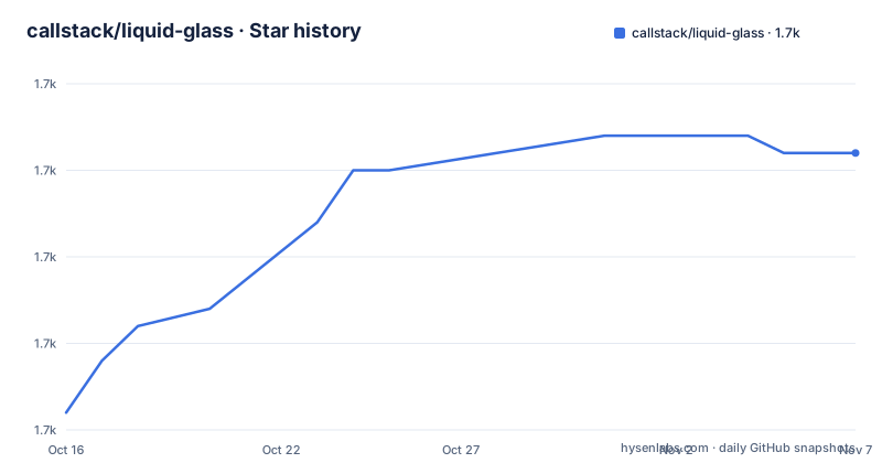
Star history
- callstack/liquid-glass1,726 ★ · +15
| Repository | 2026-10-16 | 2026-11-07 |
|---|---|---|
| callstack/liquid-glass | 1.7k | 1.7k |
15 Stars in the last 22 days, measured from the daily GitHub snapshot. Compare with other projects
Editorial analysis
A thin native wrapper around one iOS material
@callstack/liquid-glass does one job: it puts the iOS 26 liquid glass material into a React Native tree. The README's feature list is short, an iOS 26 liquid glass visual effect, customisable tint colours, and two effect modes called `clear` and `regular`.
Under the hood this is not a JavaScript implementation. The repository's primary language is Objective-C++, and package.json publishes the `ios` and `cpp` directories alongside `src` and `lib`, with a LiquidGlass.podspec at the root. So this is a native component with a thin JavaScript surface, and it needs a real native build step rather than a JavaScript-only bundler.
The interesting design decision is what happens when the material is unavailable. Below iOS 26 the component renders a normal `View` with no effects, so nothing crashes and your layout survives. The consequence is that a design that looks like glass in the simulator on a new OS quietly becomes a flat rectangle on an older one, which is why the exported `isLiquidGlassSupported` boolean exists.
Installing it, and the three requirements that rule projects out
The install is a normal npm or yarn add:
npm install @callstack/liquid-glass
# or
yarn add @callstack/liquid-glass
After that come the constraints, and they are stated as warnings rather than buried. You must compile the app with Xcode >= 26. React Native 0.80 or later is required. And the library is not supported in Expo Go.
That Expo Go exclusion is a structural one rather than a preference. Expo Go ships a fixed set of native modules and cannot load an arbitrary pod, so any module with native code of its own needs a development build or a prebuild. If your workflow is Expo Go and you have no intention of leaving it, this library cannot work for you at any version.
The package also publishes its own TypeScript sources through an exports condition, with `@callstack/liquid-glass-source` pointing at `./src/index.tsx`, so a monorepo consuming the module can step into the source instead of the compiled output.
LiquidGlassView props: interactive, effect, tintColor, colorScheme
The main component takes six props. `interactive` is a boolean defaulting to false and enables the touch press effect. `effect` takes `'clear'`, `'regular'` or `'none'`, defaults to `'regular'`, and picks between a more transparent glass, the standard blur, or a transparent view with no glass at all. Changing it animates the materialization and dematerialization of the material. `animated` defaults to true and controls whether those changes animate, and `animationDuration` sets the duration in milliseconds, falling back to the default UIKit animation duration when omitted.
The remaining two are colour. `tintColor` takes any React Native colour format, hex, rgba or named. `colorScheme` takes `'light'`, `'dark'` or `'system'` and defaults to `'system'`, so it follows the device appearance unless you pin it.
A minimal usage looks like this:
import {
  LiquidGlassView,
  LiquidGlassContainerView,
  isLiquidGlassSupported,
} from '@callstack/liquid-glass';

function MyComponent() {
  return (
    <LiquidGlassView
      style={[
        { width: 200, height: 100, borderRadius: 20 },
        !isLiquidGlassSupported && { backgroundColor: 'rgba(255,255,255,0.5)' },
      ]}
      interactive
      effect="clear"
    >
      <Text>Hello World</Text>
    </LiquidGlassView>
  );
}
That snippet is the pattern to copy. The style array applies a translucent white only when `isLiquidGlassSupported` is false, so older devices get an approximation of the material instead of nothing. Without that conditional, the fallback branch is invisible.
LiquidGlassContainerView merges neighbours past a spacing threshold
Separately placed glass views look like separate pieces of glass. The container view changes that. Its single prop is `spacing`, a number defaulting to 0, documented as the distance between child elements at which they begin to merge their glass effects into one combined effect.
function MergingGlassElements() {
  return (
    <LiquidGlassContainerView spacing={20}>
      <LiquidGlassView style={{ width: 100, height: 100, borderRadius: 50 }} />
      <LiquidGlassView style={{ width: 100, height: 100, borderRadius: 50 }} />
    </LiquidGlassContainerView>
  );
}
With `spacing={20}` the two circles in this example stop reading as two discs and start reading as one shape with a waist between them. Set it to 0 and they stay independent. This is the mechanism behind tab bars and toolbars that read as a single pill rather than a row of buttons, and it is the prop most worth experimenting with before you settle on a layout.
The 65 point height limit on automatic text colour
The README documents a hard edge that is easy to hit by accident. To get text that adapts to whatever is behind the glass, you use `PlatformColor` from react-native rather than a hardcoded colour:
import { PlatformColor } from 'react-native';
import { LiquidGlassView } from '@callstack/liquid-glass';

function MyComponent() {
  return (
    <LiquidGlassView style={{ padding: 20, borderRadius: 20 }}>
      <Text style={{ color: PlatformColor('labelColor') }}>Hello World</Text>
    </LiquidGlassView>
  );
}
The note says there appears to be a size limit for this automatic adaptation, and that if the glass view height is 65 or greater it will not adapt to the material behind it. The README says "appears to be", which is the project's own hedge about a system behaviour it does not fully control.
The practical consequence is concrete. In the earlier example the view is 100 units tall, which is above the threshold, so a `PlatformColor('labelColor')` text inside it will not pick up the background. For tall glass surfaces, set the text colour explicitly. Also note that `PlatformColor` is a react-native API used here to cooperate with the system material, not something this package defines.
Where this is the wrong tool
The wrongness is mostly geographic and tooling related, and the README is explicit about two of the three.
Android is out. The package description and the keywords both say iOS, the material is an iOS 26 system feature, and the fallback is a plain View rather than an equivalent Android treatment. If your app is cross-platform, this module handles only one side and you need a second implementation for the other.
Expo Go is out, as covered above, unless you move to a development build.
There is a subtler case: designs that must look identical everywhere. Because the fallback is a plain View, a product decision that depends on the glass reading correctly on older devices will not hold. If iOS 26 adoption in your user base is partial, verify the design against the fallback rather than the effect.
There is also no documentation in the README about thread safety, memory behaviour, or what happens when the effect is toggled repeatedly on screen. For a decorative surface that is probably fine; for anything load-bearing, the module gives you few guarantees to lean on.
Version 0.8.x, frequent releases, native code in the package
The module is pre 1.0. Releases are v0.8.0 on 2026-05-31, v0.8.1 on 2026-08-18 and v0.8.2 on 2026-09-15, and the last push was on 2026-09-15, the same day as the 0.8.2 tag. The repository is not archived.
The cadence is a plus: three releases in four months on a young native module suggests active work against a new OS version. It is also a warning, because 0.x carries no compatibility promise and a minor bump may change props.
The upgrade path itself has a native component. The published files include `ios`, `cpp` and the podspec, so an upgrade changes native code and therefore requires a rebuild of the app rather than a JavaScript bundle reload. Podfile lockfile churn and possible side effects from CocoaPods updates are the practical cost.
The licence is MIT, declared in package.json and with the LICENSE file in the repository root. That permits use in commercial applications and modification, which is a licensing note rather than legal advice. One detail worth knowing: the README states the project will always remain free to use, and it points to Callstack's own site for contact, so the support path is the maintainer rather than a commercial support contract.
The alternative: SwiftUI's own material, or a blurred overlay
The nearest alternative is to build the effect in native code. This package provides a React Native component styled with props; a native implementation would place the effect outside that component tree.
The other common approach is a plain semi-transparent view with a blur, which you can do with no dependency at all. That gives you a consistent result across iOS versions and platforms, at the cost of not being the system material, so it does not adapt to the content behind it the way the real thing does.
Choose this package when matching the system appearance matters and you accept the iOS 26 and Xcode 26 floor. Choose the blur when consistency matters more than fidelity. Choose the native route when you need material options this component does not expose, since its prop list stops at `effect`, `tintColor`, `colorScheme`, `interactive` and the two animation flags.
Editorial conclusion
Use this module when your React Native app is iOS only, built with Xcode 26 on React Native 0.80 or later, and you want the system glass material rather than a hand-rolled blur. Do not adopt it for Android or for Expo Go, both of which the README rules out, and do not rely on automatic text colour adaptation inside a glass view at least 65 points high. Verify first that your toolchain compiles with Xcode 26, then set an explicit text colour rather than trusting PlatformColor('labelColor') to resolve behind a tall glass view.
Frequently asked questions
How do I install Liquid Glass in React Native?
Run npm install @callstack/liquid-glass or yarn add @callstack/liquid-glass, then rebuild the native app. The README requires compiling with Xcode >= 26 and React Native 0.80 or later.
Does Liquid Glass in React Native work in Expo Go?
No. The README carries an explicit warning that the library is not supported in Expo Go, because the module contains its own native code.
What happens on iOS versions below 26?
The README states that on an unsupported iOS version below iOS 26 the component renders a normal View with no effects. The exported isLiquidGlassSupported boolean lets you detect this and supply your own fallback styling.
What is the difference between the clear and regular effects?
The effect prop defaults to regular, which is the standard glass blur. Passing clear gives a more transparent glass, and none renders a transparent view with no glass effect. Changing the prop animates the materialization and dematerialization of the effect.
How do I make several glass elements merge into one?
Wrap them in LiquidGlassContainerView and set its spacing prop, which is the distance between children at which they begin to merge their glass effects into a combined effect. The default value is 0.
What licence is @callstack/liquid-glass released under?
It is released under the MIT licence, declared in package.json with the LICENSE file in the repository root. This is a licensing note and not legal advice.
Official sources
Add this badge to your README
If you maintain this project, the badge below links readers to this analysis and shows its maintenance status from the daily GitHub snapshot. Paste the markdown into your README; add ?metric=license or ?metric=stars to the image URL for a different field.

[](https://hysenlabs.com/projects/callstack-liquid-glass)Star history chart for your README
[](https://hysenlabs.com/projects/callstack-liquid-glass)Was this useful?