Lion Web Components: Installation, Extension, and Design-System Fit
Fundamental white label web component features for your design system.
At a glance
- What is it?
- Lion is an MIT-licensed JavaScript library for building accessible, white-label Web Components. It suits teams that want reusable component foundations without adopting a fixed visual design, provided they can manage browser components, documentation, and package upgrades.
- Who is it for?
- Adopt Lion when a design system needs an unopinionated Web Components layer that can be extended and restyled. Do not adopt it if a ready-made visual system or a framework-specific component library is required.
- Can I use it commercially?
- Yes. MIT is a permissive licence: you can use, modify and sell software built on it, as long as you keep its copyright and licence notices.
- Is it still maintained?
- Yes. The repository received new commits within the last day.
- What is it written in?
- Mainly JavaScript, according to GitHub's language statistics.
Answers come from the project's GitHub data, last synced on November 7, 2026, and from our analysis. They are not legal advice.
Star history
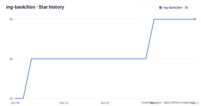
- ing-bank/lion1,973 ★ · +2
| Repository | 2026-10-16 | 2026-11-07 |
|---|---|---|
| ing-bank/lion | 2k | 2k |
2 Stars in the last 22 days, measured from the daily GitHub snapshot. Compare with other projects
Editorial analysis
What Lion Solves for Design-System Teams
Lion addresses the gap between framework-specific UI libraries and a design system that needs to control its own components. It provides Web Components and JavaScript classes that can be adopted, extended, and adapted by a team building its own component layer. The repository describes Lion as an unopinionated, white-label layer rather than a finished visual theme. That distinction matters for banks, product teams, and internal platform groups that need shared behavior without inheriting a particular brand's typography, colors, spacing, or interaction styling.
The target users are engineers responsible for reusable browser UI, design systems, and accessible components. Lion states that its accessibility work targets WCAG 2.2 AA. That is a stated objective, not a substitute for an application-level accessibility review, but it gives adopters a concrete requirement to examine. The library also describes itself as being aimed at relevant browsers with minimal dependencies. Consumers still need to validate that the generated components work with their supported browser matrix and their own assistive-technology testing.
Lion is distributed as pure ES modules. Its component model is therefore closer to a browser-native UI foundation than to a single application framework abstraction. This can be useful when components must work across different JavaScript stacks, but it also means adopters need to understand custom-element registration, shadow DOM behavior, styles, and browser upgrade rules.
Installation with @lion/ui and the First Documentation Workflow
The README gives one direct installation command for the main UI package. Install it in the JavaScript project that owns the design system or application.
npm i @lion/uiAfter installation, the repository links to the Lion Guides, Fundamentals, Components, and Blog sections at `https://lion.js.org`. The README does not provide a complete standalone application example, so a first use should start with the guides rather than inventing an import path, component name, or configuration option. The documentation is also where adopters should verify the specific component API for their use case.
The repository includes documentation development commands. If the goal is to inspect the documentation locally, the README identifies `npm run start` as the Astro development command. This is a repository documentation workflow, not a consumer setup command.
npm run startThe documentation text says that documentation content is copied into Astro-related directories when `npm run start` runs and when content under `/docs` is updated. That detail explains why local documentation changes can appear through a generated path. For production documentation, the README lists a build followed by a preview command.
npm run buildnpm run previewThese commands build and serve the documentation site. They do not install Lion into an unrelated application. Consumers should reserve the package installation for their application and use the repository commands only when working on the Lion documentation itself.
Extending Web Components Without Inheriting a Fixed Theme
Lion's central design choice is extension rather than visual prescription. The README explicitly says that its demos may look bland because they include functional styling only. The stated reason is that the main use case is to extend the components, and an adopter who changes the component layer should not have to spend the first step overriding an existing theme.
That approach gives a design-system team control over appearance, but it also transfers work to the adopter. The library can provide behavior and structural foundations, while the consuming team remains responsible for the visual language, responsive rules, product-specific states, and consistency checks. An extension can therefore be a better fit than importing a finished component suite when branding changes frequently or when several applications need the same interaction model with different visual skins.
Lion exposes functions, classes, and Web Components. The README does not specify one universal composition API or a complete list of extension points. That means a team should inspect the component documentation before choosing between class extension and direct custom-element use. The important architectural fact is that Lion supports multiple forms rather than forcing every behavior into a single abstraction.
The accessibility objective also interacts with visual customization. Restyling a control is not automatically the same as preserving its accessible states, keyboard behavior, labeling, or focus treatment. The repository gives WCAG 2.2 AA as the target, but adopters still need to test the customized result rather than treating the base component as evidence that the final UI meets the requirement.
ES Modules, Browser Components, and Package Boundaries
Lion uses pure ES modules, and the repository includes package-oriented workspaces under `packages/` and `packages-node/`. The main consumer-facing installation documented by the README is `@lion/ui`. The package is part of a broader monorepo that also contains documentation, tests, build configuration, and separate workspace tooling.
This structure is useful when a team wants to contribute to the library or work on its documentation, but it should not be mistaken for a requirement to clone the entire repository in order to consume the package. The direct npm installation is the documented consumer path. The repository's `package.json` identifies the root package as private and `@lion/root`, so the root manifest is a development workspace rather than the package users install for their applications.
The repository's browser-test configuration files are browser-specific, including Chrome, Firefox, WebKit, visual testing, and BrowserStack configurations. Those files show that the project has multiple ways to exercise browser behavior. They do not, by themselves, state which exact browser versions are supported. An adopter should verify compatibility against the browser versions used by its applications and against the browser behavior required by its deployment target.
The recent releases listed for the repository include `@lion/[email protected]` on 2026-10-14. The package version is therefore the relevant upgrade boundary for consumers of the main UI package. Because the documentation does not provide a complete migration guide for every change, consumers should read the release notes and diff the package changes before upgrading a production design system.
Phone-Number Metadata and the @lion/ui Build Constraint
The README documents a temporary phone-number metadata workaround in `@lion/ui`. It says the project temporarily vendors a rebuilt `awesome-phonenumber` package based on Google's libphonenumber data rather than using the registry dependency. The reason is that the previous `[email protected]` rejected the French Guiana premium-rate example `+594890123456`, while the maintained fork includes updated metadata.
This workaround has a larger operational footprint than a normal registry dependency. The private workspace at `packages-node/awesome-phonenumber` contains pinned fork sources and Google JavaScript sources rather than a prebuilt distribution. The README says its build verifies checksums, compiles with Closure ADVANCED, and bundles ESM with Rollup. The root `postinstall` builds these assets before source-analysis tools and browser tests. That means installing from a repository checkout can require additional build work and registry access for Lion's ordinary dependencies.
The README also states that `@lion/ui` has no awesome-phonenumber runtime or bundled dependency, while package-private `#awesome-phonenumber` imports map types, ESM, and CommonJS to shipped assets. Consumers do not need a browser import map for that internal mapping. However, anyone evaluating Lion should determine whether their application actually uses the phone-number functionality and should include this build path in source-control and CI review.
The repository provides a specific verification command for a fresh consumer checkout.
npm run test:node --workspace @lion/uiThe README says this packs Lion, installs it into a fresh consumer, and checks ESM, CommonJS, TypeScript 7 and 4.7.4, licenses, provenance, and French Guiana metadata. The command is evidence of a documented compatibility check, not a claim that this article has executed it.
Maintenance, Licensing, and the Cost of Ownership
Lion is MIT-licensed. The repository also contains separate notices for Google source material associated with the phone-number workaround, including MIT and Google's Apache-2.0 notices. The presence of a permissive project license does not remove the need to preserve applicable notices or to review dependencies separately. This is a repository and compliance observation, not legal advice.
Maintenance is currently supported by repository facts. The repository is not archived, and the last push was on 2026-10-16. Recent releases include `@lion/[email protected]` and `[email protected]`, both dated 2026-10-14. Those dates show recent release activity, but they do not guarantee that every component will receive changes on a schedule or that a particular breaking change will be handled quickly.
The upgrade cost is higher for teams that customize components heavily. A change to a base class, slot, event, attribute, or internal DOM structure can affect an extension even when the consumer's visible styling has not changed. Pure ES module packaging also requires the consuming build and browser strategy to handle the package correctly. The repository's temporary phone-number build adds another review area for teams that reproduce the checkout rather than consuming the published package.
A design-system team should inspect `@lion/ui` release notes, compare the current package version, and review its own overrides before accepting a new release. The repository does not document a general consumer rollback procedure.
Editorial conclusion
Adopt Lion when a design system needs an unopinionated Web Components layer that can be extended and restyled. Do not adopt it if a ready-made visual system or a framework-specific component library is required. Verify first that the current @lion/ui release, browser support, accessibility expectations, and your own styling and extension plan fit the application. The repository was last pushed on 2026-10-16 and is not archived, while the listed releases include @lion/[email protected].
Frequently asked questions
How do I install Lion for a JavaScript design system?
The README documents `npm i @lion/ui` as the installation command. It then directs users to the Lion Guides and documentation website for component-specific usage.
Does Lion impose its own visual design?
No. The README describes Lion as an unopinionated, white-label layer and says its demos use functional styling because the main use case is extending the components.
What should I check before upgrading @lion/ui?
The repository lists `@lion/[email protected]` as a recent release, but it does not provide a general consumer rollback procedure. Check release notes, package changes, browser requirements, and any custom extensions before upgrading.
Official sources
Add this badge to your README
If you maintain this project, the badge below links readers to this analysis and shows its maintenance status from the daily GitHub snapshot. Paste the markdown into your README; add ?metric=license or ?metric=stars to the image URL for a different field.

[](https://hysenlabs.com/projects/ing-bank-lion)Star history chart for your README
[](https://hysenlabs.com/projects/ing-bank-lion)Was this useful?