Zendesk Garden React: a design system shipped as 22 packages
:seedling: garden React components
At a glance
- What is it?
- zendeskgarden/react-components is the React implementation of the Garden design system that Zendesk uses in its own products, published under Apache 2.0 as one package per component so an app installs only what it uses. The repository is a pnpm and lerna monorepo with Storybook demos, vitest tests and a tsdown build. The wrinkle to know about is versioning: published packages sit on the 9.x line while the repository root is already at 10.0.0-next.2.
- Who is it for?
- Adopt Zendesk Garden React if you are building a Zendesk product and want the same components the vendor ships, or you want a design system you can adopt one package at a time. Skip it if you need a general purpose component library with a large community, because Garden optimises for one company's product surface.
- Can I use it commercially?
- Yes. Apache-2.0 is a permissive licence: you can use, modify and sell software built on it, as long as you keep its copyright and licence notices.
- Is it still maintained?
- Yes. The repository last received commits 4 days ago.
- What is it written in?
- Mainly TypeScript, according to GitHub's language statistics.
Answers come from the project's GitHub data, last synced on November 7, 2026, and from our analysis. They are not legal advice.
Star history
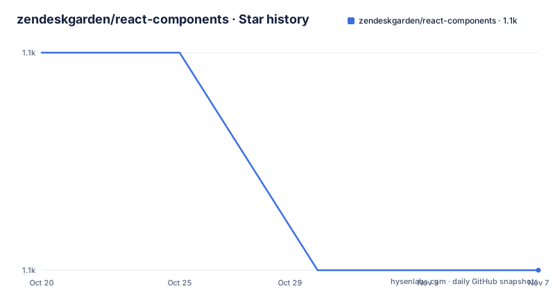
- zendeskgarden/react-components1,110 ★ · -1
| Repository | 2026-10-20 | 2026-11-07 |
|---|---|---|
| zendeskgarden/react-components | 1.1k | 1.1k |
-1 Stars in the last 18 days, measured from the daily GitHub snapshot. Compare with other projects
Editorial analysis
What Garden is and who it is built for
The README calls Garden the design system by Zendesk, and states that Garden React provides consistent styling and behaviour for Garden components. That is the whole positioning, and it is narrower than the marketing of most component libraries.
The design decisions come from a support product. A ticketing interface has dense tables, forms, notification panels and a lot of text, and Garden's components reflect that. The package list in the README includes accordions, avatars, breadcrumbs, buttons, chrome, colorpickers, datepickers, a draggable component, dropdowns, forms, grid, loaders, modals, notifications, pagination, tabs, tables, tags, theming, tooltips and typography. Notably absent is a chart library or a rich text editor, and the presence of a colorpicker and a draggable component points to internal tooling and configuration surfaces rather than a consumer product.
The homepage in package.json points at garden.zendesk.com, and the package author is Zendesk Garden with a contact address at [email protected]. The documentation site for the React components is at zendeskgarden.github.io/react-components.
The audience is therefore two groups. The first is anyone building on top of Zendesk products who wants the interface to match. The second is outside developers who want a plain, unopinionated-by-Zendesk set of React components with a permissive licence and no vendor paywall.
One package per component and why that matters for your bundle
The architectural decision that defines this repository is stated in the README. React components are maintained following a multi-package approach where components are packaged and published individually, but combined under this single repository.
So the repository is a monorepo, and the npm registry is not. Each component ships as its own package under the @zendeskgarden scope, and the README's table lists them with a version badge and a bundle size badge for each, sourced from npm and bundlephobia. The installation instruction is deliberately not a single command. It says to see the individual package README for the React component you would like to install.
That is the practical point for anyone adding this to an application. A project that needs a table and a tooltip installs two packages and pulls in the container packages those two depend on, and nothing else. A project that installs the whole set inherits the cost of the whole set, which is exactly what the per package layout exists to prevent.
The table also shows how the project handles deprecation. Alongside @zendeskgarden/react-dropdowns there is a separate @zendeskgarden/react-dropdowns.legacy package. The legacy package remains installable, so an existing consumer does not break when the new dropdowns package lands, and the two can coexist in one application during a migration. That is a more careful deprecation story than most component libraries bother with.
The monorepo machinery: pnpm, lerna and a packages directory
The repository root holds lerna.json, pnpm-lock.yaml, alongside a.packages/ directory, a config/ directory, a scripts/ directory and the src/ tree. That combination is the standard pnpm workspace plus lerna for version coordination, and the presence of both is a signal about how releases are cut rather than about the day to day development loop.
The package.json scripts show the split between tooling. The build script compiles the TypeScript project references and then bundles with tsdown.
"build": "tsc -b && tsdown --config config/tsdown.config.ts",
"start": "storybook dev --config-dir config/storybook --no-version-updates -p 6006",
"test": "vitest --config config/vitest.config.ts",
"tag": "scripts/tag.js"
The start script runs Storybook on port 6006, which is where you look at the components. The demo/ directory in the repository holds one folder per component, and the build:demo script produces a static Storybook into.cache/demo.
The lint setup is layered and worth copying if you like the idea. A single lint:ci script chains a format check, the oxlint pass, a stylelint pass over the view styles and an eslint pass with max-warnings 0, so a pull request cannot slip a warning past CI. Formatting is handled by oxfmt with its own config, and stylelint runs against src/views/**/*.ts, which suggests the component styles live in TypeScript files rather than in separate CSS files.
The tag script, scripts/tag.js, is the release entry point. It is a custom script rather than a lerna publish call, which is how the project can tag individual packages at their own versions inside one repository.
The headless container packages underneath the styled components
The dependency list in package.json shows a second layer to the system. The visible components depend on packages named @zendeskgarden/container-accordion, container-breadcrumb, container-combobox, container-field, container-grid and container-menu, and the top of the list includes @floating-ui/react-dom at 2.0 or newer.
The pattern is a headless behaviour layer under a styled view layer. The container packages handle the interaction logic, keyboard handling, positioning and state, and the react- packages provide the Garden styling on top. Floating UI is what does the positioning work for anything that floats, which is why dropdowns, menus, comboboxes and tooltips share it.
The practical consequence is that the behaviour layer is not tied to Garden styling. That is the useful part for an outside adopter: the container packages give you accessible, keyboard-driven behaviour without importing a single Garden visual, so a team that wants the mechanics but has its own visual language does not have to fight the design system.
It also explains the per package distribution. Each visible component package is a thin view over one or more container packages, which is why the bundle size column in the README table varies so much between entries, and why the theming package exists as a separate package rather than as a dependency of every component.
Versioning: the 9.x line, the 10.0.0-next root and the independent tags
The published release history shows three tags in quick succession, v9.15.9 and v9.16.0 on 2026-09-22 and v9.16.1 on 2026-09-25. That pattern is the signature of a multi-package release, where several packages are tagged as part of one change and the patch versions move independently.
The root package.json says something different. It declares version 10.0.0-next.2 for @zendeskgarden/react-components, the aggregate package that pulls in the individual ones. The repository is therefore mid-major, on a prerelease of the next line, while the individual component packages that most consumers install are still on their own 9.x versions.
For an adopter this is the single most important operational detail. Because the packages are published independently, you can end up with a mix of versions in one application, and the aggregate package exists precisely so that consumers who want a consistent set can pin one thing. The decision to take is between pinning each package yourself and letting your dependency resolver float, or depending on the aggregate package and letting it pull a matched set.
The tag script in scripts/ is what makes independent tagging possible, and lerna.json sits in the root to coordinate it. The scripts/tag.js entry in package.json is the only release related command, and there is a CHANGELOG.md at the root for the aggregate package.
Where Garden React is the wrong choice
The first limitation is scope. The component list is wide but not universal. There is no chart component, no data table with the feature set a reporting product needs, no rich text editor, no virtualised list, and no file upload component in the package table. If your product is analytics-heavy or document-editing-heavy, you will be assembling much of the interface yourself on top of Garden.
The second limitation is that the design system is a reflection of one product. A component that solves a Zendesk problem, a dense form field with a particular validation treatment for instance, may be a poor fit for your domain, and you will find yourself overriding styles rather than using the system. That is the tax of a vendor-specific design system, and it is why the container packages exist, since they let you keep the behaviour and drop the styling.
The third limitation is the version spread. Published component packages on 9.x against a root at 10.0.0-next.2 means the monorepo is mid-transition, and a consumer pinning across the boundary inherits whatever the maintainers intended for that combination. There is no single rule you can apply; you have to look at each package you use.
The fourth limitation is the toolchain requirement. The build and test path assumes a pnpm workspace, lerna, TypeScript project references, tsdown, Storybook, vitest, oxlint, oxfmt and stylelint. That is a heavy setup for a team that only wants to consume the components, though consuming them does not require any of it, only installing the published npm package.
Garden React next to Material UI, Radix and Ant Design
The alternatives split by what they give you, and the useful comparison is with Radix UI and with a full suite like Ant Design.
Radix UI is headless. It provides accessible behaviour and lets you style everything yourself, which is the opposite of what Garden's react- packages do. The reason to prefer Garden over Radix is that you get the finished visual layer and the behaviour already agreed with a design system, so your product does not look like every other Radix app. The reason to prefer Radix is total control, and the absence of a vendor's design opinions.
Ant Design is a full suite in the other direction, with a very large component set, its own theming, and it is a better fit when you need enterprise components such as tables, forms and uploaders out of the box. Garden is smaller and more opinionated about the look.
Material UI sits closest to Garden in spirit, as a complete styled suite with a theming layer, and its main advantage is community scale. The difference in approach for Garden is that it comes out of a support product, so its components are shaped by dense, text heavy, form heavy interfaces rather than by consumer app conventions, and the per component packaging means you can take one piece without taking the system.
None of these is a drop-in replacement for the others. Switching a product from Garden to another suite is a styling project, not an import change, and that cost applies whichever way you go.
Editorial conclusion
Adopt Zendesk Garden React if you are building a Zendesk product and want the same components the vendor ships, or you want a design system you can adopt one package at a time. Skip it if you need a general purpose component library with a large community, because Garden optimises for one company's product surface. Before upgrading, check which version each installed @zendeskgarden package is on, because the repository root already carries 10.0.0-next.2 while the published tags are still on the 9.x line.
Frequently asked questions
How do I install a Zendesk Garden React component?
Each component is published as its own package under the @zendeskgarden scope, and the README tells you to check the individual package README for the component you want. The repository root also publishes an aggregate @zendeskgarden/react-components package.
What is the difference between Garden React and the Garden container packages?
The @zendeskgarden/container- packages hold the behaviour, keyboard handling and positioning, while the @zendeskgarden/react- packages add the Garden styling on top, and the container layer is usable with your own styles.
How does Garden React handle breaking changes in a component?
Old versions stay installable, as the separate @zendeskgarden/react-dropdowns.legacy package shows, so an application can migrate a component while keeping the legacy package installed alongside the new one.
How do I run the component demos locally?
The start script runs storybook dev --config-dir config/storybook --no-version-updates -p 6006, so the demos are served on port 6006, and each component also has a folder under demo/.
Which versions of the Garden React packages are current?
The published tags were v9.15.9 and v9.16.0 on 2026-09-22 and v9.16.1 on 2026-09-25, while the aggregate package at the repository root is on 10.0.0-next.2, so the monorepo is partway through a major transition.
Official sources
Add this badge to your README
If you maintain this project, the badge below links readers to this analysis and shows its maintenance status from the daily GitHub snapshot. Paste the markdown into your README; add ?metric=license or ?metric=stars to the image URL for a different field.

[](https://hysenlabs.com/projects/zendeskgarden-react-components)Star history chart for your README
[](https://hysenlabs.com/projects/zendeskgarden-react-components)Was this useful?